Category: Software Tips

Cloud Backup Provider Crashplan Deserts Domestic Customers

If you have your Cloud backup with Crashplan you will have been informed that, while they will honour your subscription to the end of the current period, they won’t be renewing it. They also will have a 60 day grace period where they will hold your data while you get backed up to another provider. This is not good news when you have spent much time uploading potentially terabytes of data to them, but they have made a commercial decision to focus on business customers.

So you need to get your data backed up to a new provider. Who should you choose?

I have done extensive research and I use Backblaze. I have done for some time now. The service has been perfect with no issues whatsoever. The upload speed is blazingly fast (dependant on your broadband speed, obviously) and you get unlimited storage for your data for $5 a month (thats around £3.85 in the UK). I currently have almost 2 TB with them. I have only ever had to pull one file back from them when I had deleted a file in error and my on site back up also had an issue with the same file, and it worked flawlessly and ‘saved my life’.

If you use CLICK HERE to sign up with Backblaze you will get a free months use with them (and so will I, thank you!)

Please feel free to use this link whether you are a Crashplan user or if you have been meaning to get around to backing up to the Cloud but just haven’t done it yet.

I can highly recommend them for their security, speed (no throttling unless you control it at your end), ease of data retrieval and it is so simple to use – just set it up and forget it – it runs in the background and you are always backed up to the cloud.

Remember, every hard drive WILL fail one day – backing up is vital. Just backing up at home is not enough (but make sure you don’t rely on this alone – also have adequate on-site backups too). If you are burgled, flooded or have a fire you will still lose all your data. A cloud backup is the safest solution.

I hope you find this useful.

Being Interviewed on the Togcast

Some time back I was surprised and humbled to be asked to an interviewee on the excellent ‘Togcast’ podcast which is run by two very capable and nice gentlemen, Sam Gregory and my fellow Light and Land leader, Paul Sanders. (I would highly recommend you use your podcast software on your smart phone to subscribe to the Togcast and listen weekly – it is interesting, entertaining and you get to know many photographers we know from social media so much better.)

You can find more information about the Togcast HERE you can subscribe via Apple podcasts HERE, and you can visit the Togcast website HERE

So it was a few weeks ago, Sam arrived at my home early one morning on a whistle stop tour of the North. He was cramming in several interviews with other far more worthy photographers than me on a marathon journey up ones side of the country and back down the other. Sam has a very engaging manner and I soon forgot I was being interviewed and we nattered away about photography for a couple of hours. I am very grateful to Sam for taking the time in his busy schedule to come and talk to me and I hope you find our chat interesting.

I have no recollection of what we spoke about and I am horrified to think what I must sound like or what I waffled on about. I am certainly not prepared to listen to myself back again. (After all, I have to listen to myself all the time, and that is quite enough, I can assure you).

He not only did an audio interview for the podcast, but he tried out doing a video session too, where we discussed three portfolios of my images in my Lightroom catalogue and he has released this as a separate video.

So, if you have nothing to do. And I mean absolutely nothing to do, if you have cleaned the oven out, sorted all your carpet tacs into jam jars by size, and organised your photo book collection alphabetically, then you might just want to have a watch and listen. But if you still haven’t got around to creosoting the fence, I would probably get that done first. Really.

Here is the video of our discussion of some of my images

And here is the audio Podcast

Working with Fotospeeds New Square Fine Art Papers

Fotospeed

The new Fotospeed 12 x 12 inch square paper range

Many of us love making images in the square format. We either ‘see’ our photographs that way and compose for them in the field, often aided by the clever way many digital cameras these days allow us to display a square mask on the rear view screen. I love this feature and use it all the time on my Fuji X-Pro 2. Shooting in raw, I still have the option back in the studio to use the entire sensor area, but in the field it is so helpful to see the image on the screen cropped square. It makes composition so much easier. (If you shoot in jpeg, the file will be square and the data beyond the boundaries of the square is lost forever).

Sleeklens Landscape Plugin Review

Sleeklens

I was contacted recently by sleeklens.com who asked me to put one of their plugin packs for Adobe Photoshop through its paces. They make plugins for all types of photography, particularly portraiture and architecture but they also have a pack designed for landscape photographers so it seemed appropriate to give that a try. I opted for the Photoshop version, although they do a Lightroom version of all their plugins too for those who like to keep their workflows just within the Lightroom environment.

New Dropbox Style Cloud Service I Am Trying – Sync

Sync

20160208-_DSF8875

I have been looking for a more flexible and better priced service than Dropbox for a while. I think I have found it. It is called Sync. They give you 5GB of free cloud storage, which I am currently testing (and if you USE THIS LINK I think you will get an extra GB, so 6GB in total, and I will get 1GB for referring you – https://www.sync.com/?_sync_refer=de5f7b0 )

The paid service gives you 500GB for $49 a year and 2TB for $98 a year, which is very competitive and will allow me to store virtually all of my data, including all of my images on the service.

Printing With Fotospeed’s Panoramic Papers & Creating Custom Paper Templates in Lightroom

Fotospeed Panoramic

20150907-IMG_1369

Fotospeed are the only fine art paper company I am aware of who provide us with custom made panoramic papers. I shoot a lot of panoramas in my work, both combining exposures in software (now a feature of Lightroom CC as well as Photoshop, a welcome development) and by cropping into a single image to a ratio which yields an image with the characteristic panoramic ‘letterbox’ format. I am not a lover of really wide angle lenses having grown tired of the distortion they produce. I prefer, when I want to show the wide sweep of the landscape, to reveal it in a panorama. (I know wide angle lenses can be used to inject drama into images, but again, I am finding myself moving towards quieter, less dramatic images in my work and so I have sold on my super wide lenses now due to lack of use.

Hard Proofing Techniques – A Practical Example

Chris Friel
©Chris Friel

©Chris Friel

Today I had a client order for one of Chris Friels prints (the image above) to prepare and thought it would make a good subject for a blog post on hard proofing techniques.

Chris’s images can be very hard to print. He uses strong colours with low contrast and they look best printed on very matt paper. My paper of choice for most of his work is Fotospeeds superb Platinum Etching – a heavy-weight matt paper with a gentle texture which gives landscapes and many other types of images a beautiful feel and ‘presence’. Matt papers do bring with them challenges though. The matt surface reduces the gamut of colours they can display and so it can often take some work to translate what you are seeing on your screen on to the paper, even with a fully colour managed workflow. You can check out Fotospeeds papers on their website HERE – they are a great company to deal with.

What Are ‘Rendering Intents’ and How Should I Use Them?

Rendering Intents

I don’t know about you, but I love to print my favourite images. It seems such a shame that so many images today lie unseen on hard drives, when really an image is not fully realised until it is printed. There is just something about holding a well made print in the hand which brings out the full beauty of an image.

For many, though, printing is a bit of a dark art and there is much confusion about ICC profiles, paper profiles, gamuts and such like that can be daunting. One area that seems to cause confusion and is not well understood by many is ‘rendering intents’.

Before I begin, a disclaimer. I am not a colour scientist, not do I claim to be a world expert on colour management. My understanding is based on my own learning. I am sure there may well be much more to what I explain below and so if you are an expert, please feel free to add some comments below the post to add to (or correct) what I have said. I am keen to learn!

Rendering intents is a system built into ICC profiles that we see in print dialogues and we are asked to make a decision about which one to use. There are four main rendering intents and, in reality, only two are of real interest to us as photographers.

The usual advice we are given is to ‘try both and see which you prefer’ (I have even said this myself), but it is not really a very satisfactory way of working. Much better to understand what they are and what they do, then we can make a well informed decision and understand what effect they will have on the results.

Firstly, its important to say, we are dealing with the fine tuning of colour management here. Often you can print an image using both of the main rendering intents and it is hard for us to see any difference between them. At other times, though, it can make a huge difference to how our final print will look.

So what are they? As I mentioned, they are built in to ICC profiles. These profiles are the way different devices (cameras, computers and printers for example) communicate the colour (Hue, saturation and luminance) of each pixel an image to each other in an effort to maintain colour consistency.

Rendering intents are there for those situations when we have pixels of certain colours in our image which go beyond the capabilities of the ICC colour space we are working in. Briefly, colour spaces are, for example, sRGB or Adobe RGB, and each space is used for a different purpose. sRGB is the space used for monitors and ‘the internet’, for example, it is a smaller colour space than Adobe RGB, capable of displaying far fewer shades of colour. The range of colours a profile can display is galled its ‘Gamut’.

So situations arise where, if your image has a wide range of colours which exceeds those of the colour space you are printing in or exporting to (say, to upload an image to your website) then the profile needs a ‘map’. This map tells it what colours to swap the colours it can’t reproduce for. So, if you have been working in Adobe RGB (or ProPhoto RGB) and now are about to upload an image to your website which requires the file to be converted to sRGB so that it displays properly on the (uncalibrated) monitors of your websites visitors from all over the world, the profile needs to know how to handle these ‘out of gamut’ colours. You might have a green which displays fine in Adobe RGB but isn’t available in sRGB and so the profile asks you to choose a ‘rendering intent’. This is the map which tells it, when it sees this particular shade of green that it can’t display then change it to this other shade of green which it can show.

Its a bit like having a recipe book for Indian food. It might show a list of rare spices but, knowing they may not be available in your country, it says ‘if spice X is unavailable, then spice Y will do nicely’.

Its this ‘nicely’ bit that causes the issue.

Each rendering intent is a different type of map, a different way of substituting one colour for another, and like spices in a curry – we all have our own tastes. Some like them hot, others aromatic and so the substitute choice can be critical. So to make the right choice for us we need to understand how each rendering intent is programmed and how it is likely to affect the results in our images, especially prints or images uploaded to the web.

No rendering intent will be perfect and you can’t really say that one is ideal to use all the time. This is because each is a compromise and will affect the colours in our image differently. Depending on the image and our goals for that image, we need to choose the right intent, or map.

So what are they and what does each one do;

1. Perceptual Intent – This can compress or expand the full gamut of colours in the source profile in order to make them fit into the destination profile. What on earth does that mean in reality? Perceptual intent is designed to maintain the relationships between colours and often gives a more natural look to the final image. It should be noted that this can mean that it also alters colours which are in the destination profiles gamut already (so they don’t actually NEED to change). It does this to maintain the balance between all the colours in the image and to keep everything looking natural.

It should also be noted that each companies perceptual intent mapping in its own ICC profiles are unique to that company, so the same image put through different company profiles using this intent can produce quite different results.

Perceptual Intent, then, is often the best one to use if both saturation and the relationship between colours is of primary concern to us.

2.The second and other most common intent (indeed Adobe Lightroom ONLY allows a choice between Perceptual and Relative Colourmetric intents) is Relative Colourmetric Intent. This does not allow colours which are in gamut in the destination profile to be changed, they must stay unaltered. It only alters out of gamut colours. Additionally, it only alters these just enough to bring them in to gamut so the relationship between colours in our images change. (Most natural colours which have not been enhanced or played with too much in software, will fit into the gamut of inkjet printers – it is mainly colours which we have enhanced which cause issues).

This rendering intent does not reduce saturation, whereas Perceptual intent can. However, this intent can drastically alter the way an image looks to our eyes as regards the way the colours relate to each other.

Relative Intent is often the best to use if tonal relationships are more important to us in the image then the exact colours, and certainly in black and white printing this is probably the case.

(if you are making a big jump, from ProPhoto to sRGB profiles then, even if the profile offers you two choices of rendering intent, in actual fact it will only use Relative Colourmetric to do the mapping of out of gamut colours).

In the illustration above you can see an approximation of what is happening with each rendering intent. The white dots are the colours in the original image profile which are out of gamut in the destination profile. The lines lead from them showing how each is mapped into the new profile resulting in the destination colour at the black dot. In the left illustration we can see the Perceptual Intent at work. Notice how the colours all maintain their relationships to each other (spacings) for a natural look. In the right hand image we see the effect of Relative Intent mapping the colours. They are only pulled as far as each needs to be pulled to just get them in gamut and this alters how they look in relationship to each other.

It might seem from this that Perceptual is the logical choice in all situations, but it isn’t. Sometimes Relative does a more effective job, especially where tonality is more important.

The other two intents which are of less interest to us are

3.Saturation Intent – This is designed to give priority, as you would expect, to saturation of colour but in doing so, to get colours into a new gamut, will sacrifice hue and lightness of colours. It is of most use in technical printing when hue and lightness are not really important, but when saturation is, such as when printing mathematical charts and graphs.

4. Absolute Colourmetric Rendering Intent – This is a tricky one to describe but bases its calculations on the white point. It is used, for example, when converting to CMYK for images to be printed on papers which are below bright white (maybe a bit yellowy) and so it can show the effect of this on colours. Not generally something we, as photographers, have to worry about. But it is something that graphic designers and printers lay awake at night worrying about.

After all this is said, the only real way to know which is best for a particular image is to soft proof it in both relative and perceptual intents and choose the one we prefer for that image. In some cases the difference will be hard to see, in others it will be huge.

I hope this helps you understand a bit more about rendering intents and the need for us to focus on perceptual and relative intents in our work as photographers.

Remember – Perceptual is all about maintaining colour balance and saturation (and I think you will find in most colour photography this is the one you will find works best as it keeps your image as close to how you intended it to look as possible in most cases). Relative is more focused on tonal relationships and so will probably be your choice when printing in black and white or when printing in colour when the tones are more important than the exact shades.

(P.S. I will to be running another Print Masterclass workshop with master printer Jack Lowe in the New Year. These run over two days with Jack and I helping you to really understand and master colour management, soft proofing and printing. Jack has been a printer for over 15 years and is recognised world-wide as a master of his trade, used by many artists and professional fine art photographers for printing their work for exhibitions and portfolios. If you would like to join the no obligation shortlist, please just CLICK HERE to email me and I will add you to the list.)

A New App from the Maker of the Photographers Ephemeris

new app ephemeris

I was very privileged to be asked by Stephen Trainor earlier this year to be one of the beta testers of a new app he has designed to complement the hugely successful and absolutely essential photographers app, The Photograpers Ephemeris (TPE).


TPE has been around for a while now and is available as a desktop program or as an iOS or Android app. For most landscape and outdoor photographers it has become an essential part of their location planning kit. I couldn’t imagine doing my job without it. I also can’t imagine the brains and ability that has gone into designing such a complex and useful program.

Not content with TPE, though, Stephen has forged ahead and designed a new app for us photographers called, officially, “The Photographers Transit” but it is shortened to “Photo-Transit”. This is an app which again uses Google Maps as it’s foundation. The app then adds the ability to place yourself at any point on Earth and face in any direction. You can then select any lens for your camera (and it takes into account you sensor/film size) and it shows you what field of view you will achieve at any given focal length. This means, no more worrying if you have packed the right lenses for a long hike or a flight where bag weight is critical. It also means you can plan key shots in advance based on your kit. You will know if your lenses have the width or reach you need for the shot you envisage. Or, before arriving at a location you will know exactly where to be to make best, use of your lenses to get the optimum image. This is location planning in real detail.


There is also the ability to look at elevation data in the app to give an idea of how the land rises and falls. This helps with understanding how shadows will appear, when the sun will break the actual horizon and so on. You can also flip from the app over into TPE to work with both apps together which is very useful. The app can be used offline with available data and to help visualise potential images close to roads you can combine the app with Google Streetview. Added to this is the unique ability to save location information as you plan it, or to take images at a location and tie the image together with the map/lens/body/field of view information and save it for future reference. There is also a linked website sharing facility so you can share this data with your friends, camera club members and so on, including sharing via message, email, Facebook, Twitter etc.


I was pleased to be able to grab some time with Stephen in his frenetic schedule to interview him about Photo-Transit and here is what he had to say.


DC: Thank you for agreeing to be interviewed Stephen. Can I ask first about your background and how did you come to design and program TPE?

SJT: Thanks for the opportunity, Doug. Maybe somewhere in my background is the semblance of a career plan, but if there is one, I haven’t found it yet! Over the years I’ve worked in classical music and opera, advertising, theatre engineering, telecoms and consulting, doing a variety of things along the way, including software engineering. I moved to Colorado from the UK in 2007 and started doing more landscape photography. Around a year later I signed up for a weekend workshop in nearby Rocky Mountain National Park . The workshop offered a ton of great advice and information on how to plan a shoot for the best light. Participants were asked to bring a number of items to the workshop, including paper topographic maps, rulers, protractors, calculators, pencils etc. It occurred to me that things in the digital world were by then at the point where all of this could be done in software. When I discovered that no such tool apparently existed already, TPE was born.

DC: Were you surprised at how popular TPE has become? Do you have any idea how many users there are now?

SJT: Very pleasantly surprised, yes! Across the various platforms we now have tens of thousands of monthly active users. The desktop version is downloaded around 75,000 times a year.

DC: Has anyone used TPE in ways you didn’t anticipate?

SJT: We’ve had some uses by archeologists looking for historical sun/moon positioning. Also, I’ve read about it being used by hunters, in the US mainly. Oh yes – and the trainspotters too!

DC: Is developing TPE and other photography apps your full time work, or do you have a ‘day job’?

SJT: I spend around half my time developing apps and the other half I do technology consulting, mostly in the area of digital media and online video.

DC: Are you a keen photographer yourself? If so, what style of photography do you like? Do you have a personal website where we can see your images?

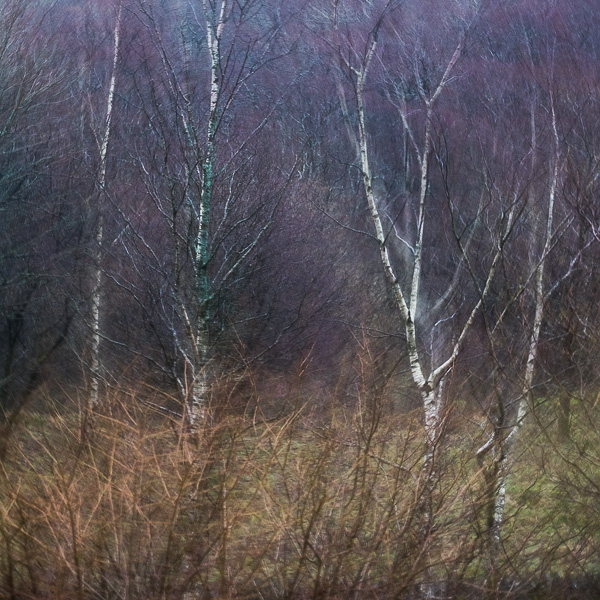
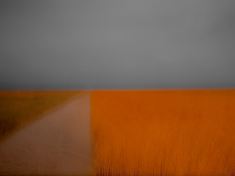
SJT: I am. I like to shoot landscape primarily. I prefer a simple, clean style without too much post-processing. Photos that are “overdone” are all too common nowadays. At the same time, I’ve never much cared for the well-worn line of “my photography is an unaltered reproduction of what my eyes saw that day” and its variants. No matter how little processing is done, that’s clearly untrue, as cameras and photographic media, whether digital or film, just don’t work the same way as the eye. I’m definitely a fan of simpler compositions, although that’s something I continue to struggle to achieve in my own photography! I have a (slightly neglected) website at http://stephentrainor.com

DC: What are some of the technical issues in developing a program like TPE?

SJT: The initial challenge is implementing the various algorithms required to calculate accurate sun and moon data. Nowadays there are a few implementations out there, but the accuracy and sophistication does vary. Not all algorithms account well for factors such as atmospheric refraction, for example. (I certainly can’t take any credit for the algorithms themselves – in that regard, I’m standing on the shoulders of mathematical and astronomical giants!) Maintenance of the software becomes a bigger issue over time as the code ages and grows. I’m currently in the middle of a major modernisation of the TPE for iOS code base, much of which dates from 2009-2010 – the middle ages, in terms of iOS software. Once that’s done, the Desktop version will need to be reimplemented as a web app – all required to keep up with the technology of the day.

DC: What then gave you the idea to develop this new program, The Photographers Transit? (TPT)

The concept of displaying the field of view on a map was a suggestion made independently by a few different TPE users. I liked the idea very much and wanted to think about how to incorporate it into the app. However, after thinking it through, I decided to develop it as a separate app for the primary reason that there would be a lot more inputs required of the user to make it work: which camera? which lens? what orientation? where are you pointing it? etc. One of the keys to simplicity of use in an app is minimising the amount of input you require of the user. I think – and many would agree – that TPE is quite complex enough already without piling on yet more functionality.

DC: What is TPT designed to do for the photographer?

SJT: I think of Photo Transit as a general purpose digital planning tool for outdoor photographers. It provides a mix of digital “surveying” tools that you won’t find elsewhere, so far as I know: a horizontal field of view indicator overlaid on a map and a vertical field of view chart plus elevation profiler that shows what terrain is visible. In addition, we spent quite a lot of time on shot saving and sharing. You can create projects that contain multiple shots and share these easily with friends, colleagues, workshop participants etc. from the app. We were keen to make sure that any information you put into the app is easy to get out of it, so there’s the ability to email shots/projects, view them on a freely available web-site (http://share.phototransit.com) and to export as KML. You don’t need to own PhotoTransit to be able to view shots that have been planned using it. (BTW, ‘we’ is my wife, Alice, who does all of our graphic design, and I…)

DC: How do you see photographers putting TPT to use in their work?

SJT: It’s an advance planning tool, first and foremost: you can use it to build up a list of shots that you’d like to capture on forthcoming trips or shoots, having explored the compositional constraints of the location, your camera and lens ahead of time. Beyond that, I’d like to see photographers using it to share ideas for shots with one another. It provides an easy and complete way to share the physical setup for any stills image. I think it also has an educative role. Many people find numerical values such as field of view or focal length easier to understand when they can be visualized and, like TPE, Photo Transit is a visualization tool.

DC: How does TPT work with TPE?

SJT: Currently, you can open TPE directly from Photo Transit and match the same subject location. The next update to TPE will add the ability to open Photo Transit directly from TPE to go in the reverse direction. We have some further bells and whistles in the works too that will improve the interaction between the apps even more.

DC: What hurdles did you have to overcome to get TPT working?

SJT: Not too many – fewer than for TPE, I’d say. The data model in Photo Transit is definitely more complex (projects, shots, locations, cameras, sensors, lenses), so that took more work. However, many of the harder lessons were already learned with TPE. The Apple maps saga of 2012 cost many hours, but the lessons learned made the mapping choices and implementation for Photo Transit much more straightforward.

DC: Can you give us any clues as to your next project? or is it a secret? or are you still so tired after working to get TPT out that you haven’t had time to think about it yet?

SJT: We have another app in the works that we’re dusting off – it was shelved at the start of the aforementioned maps saga last year. It’s not directly photography related, but more than that I can’t say quite yet. We also have multiple TPE and Photo Transit updates and improvements planned.

DC: Final question, can you recommend websites of any photographers whose work you love? Who are some of your photographic heroes?

SJT: Some names that spring immediately to mind: Bruce Percy (http://brucepercy.com): I think Bruce’s photography was the first that really conveyed to me a sense of personal style. He does a great job of distilling, culling and crafting to achieve a portfolio that has an amazingly consistent ‘voice’. Jack Brauer (http://www.mountainphotography.com): Jack has an incredible collection of beautifully produced photography covering mountains all over the world. He produces wonderful photographs of places that I don’t ever expect I’ll have the strength or fortitude to reach! Guy Tal (http://guytal.com): Guy’s work from around the desert southwest of the USA is probably the most original and distinctive being produced today. He has a great eye for compositional simplicity.

 
You can visit the Photo Transit website HERE and you can follow on Twitter @photoTransit
 

Aspect Ratios

aspect ratios

3:2, 1:1, 5:4, 16:9 and so on. When we get a camera it comes complete with an aspect ratio. Indeed, some now come with a switch or menu item to simulate various aspect ratios, but basically our sensor size, film size, glass plate or paper negative gives us our aspect ratio.

And off we go and play with it.

It becomes our frame. The border we work within. It confines our vision and gives structure to our images. In fact, I struggle to think of anything which has a greater overall influence on our compositions than the aspect ratio of our chosen camera. It has a tendency to dictate to us how we compose our images. 

But we don’t have to be limited by the ratio we are given by the camera. In fact I would put it more strongly than that. Our choice of aspect ratio shouldn’t be determined by our sensor ratio or film size. Rather, it should be governed by our subject matter and composition. We should be looking at our image making in the opposite way than most of us do. 

It is so easy on location to work exclusively with the frame we are presented with, trying to fit the components before us into our rectangle. But in many cases this does not produce the strongest image. It is harder, but it is worth the effort, to look more closely at what the key elements of our image are and then visualise what aspect ratio best contains them.

This means either having a good visual ability to frame the scene in our head, or, it is very worthwhile to carry some of those cardboard frames in different ratios through which we can view the scene and examine carefully the possibilities. We may have seen photographers using them and thought they look a bit pretentious or silly, but in fact, this approach works really well. We can both use frames with different aspect ratios and move them closer to our eyes or further away to simulate the effect of shooting at different focal lengths. We can then select the appropriate lens and frame the image, admittedly using the ratio of our camera, but placing objects in the frame in readiness for cropping the image later.

Some photographers are using compact cameras with aspect ratio switches to make test shots, experimenting with framing options before setting up and framing accordingly with their main camera (Joe Cornish, for example, is seen doing this in his superb video, “With Landscape in Mind”  http://tinyurl.com/8z9k9dc  , if you haven’t bought the DVD yet, I really recommend you do.)

You might feel you can just frame up the image with your sensor aspect ratio and crop later (and you can) but a more thoughtful and considered approach will nearly always lead to a better image. 

Something I notice when teaching my workshops is, relatively, how rarely most camera users think in portrait orientation. Most cameras are designed in landscape orientation and so it is much easier to work that way. But so many images are stronger in the vertical.

How do you decide? Personally, I look at the “shape” of what I am photographing. Does the interest spread width ways, or does it run vertically? Is what is off to the left and right of interest, or is it dull? How best can I fill the frame with interest? Or, conversely, if working on a minimalist image, which orientation gives the greatest feeling of space or places the space in the most effect place in the frame?

Many landscapers choose a camera with a ‘full frame’, that is with a 3:2 aspect ratio mimicking the ratio of 35mm film cameras. This gives a bright viewfinder and a feeling of space and ‘width’ which landscapers tend to want. However, and this is just my personal view, this aspect ratio tends to give slightly long, thin images, especially when viewed in portrait orientation. Sometimes this can be used to advantage such as when shooting wide sweeping landscapes. But I find it often makes for a more pleasing composition with better balance to crop these images to the 5 x 4 format used by the large format camera users. This gives a closer ratio between the width and height which seems, to my eye at least, to be sensibly weighted without the stretch of the 3:2. I have seen full frame users who mask off the live view screen on their camera with tape to a 5:4 ratio to help them compose this way.

Mr. Hasselblad had a different view on aspect ratios. He felt, rightly in my view, that the most sensible ratio for a round lens was 1:1, the famous square frame of the Blad. This makes the best use of the image projected by the lens. The square format is one photographers seem to either love or hate. For me, it is my favorite format. It suits my love of symmetry and it gives a certain ‘constraint’ to images which is hard to describe, but when used well, images in 1:1 seem well balanced. For me they have a purity about them. I am delighted to see many modern digital cameras will allow a 1:1 view on the live view screen, cropping the image for you in camera.

So I would urge you to consider the final crop/aspect ratio right at the beginning of the composition process, not as an afterthought later. While sometimes after the event, when we view our images on the large screen of our computer we do become aware of images within images, or more pleasing crops, I am convinced it will lead to stronger images in the majority of cases if we make this choice a conscious creative decision as we place key objects in the frame. If this is something you don’t currently do, try it, see what you think.

Adobe announce new Creative Cloud package for photographers

Adobe caused a huge amount of anger, resentment and upset with its surprise announcement some months ago that along with launching its Creative Cloud service it would no longer be releasing any of its Creative Suite products (including Photoshop) in any other format in future. No more downloadable version to own. No more DVD’s.

Basically, the Creative Cloud allows you to have any of the Adobe Creative Suite program’s installed on your computer and for this ‘privilege’ you pay a monthly subscription. It was a brave move by Adobe to make this move so decisively. I believe this model is the one all major software manufacturers will want to move us to in order to guarantee cash flow into their coffers. Anything other than a complete termination of supplying the software by other means will mean few would opt for this system. We naturally don’t like it. We don’t own the software, we are leasing it. We have no way to decide if we want to upgrade or not.

Hence the anger amongst many of Adobes customers. But perhaps I ought to be more specific. The anger was chiefly raised among lone users, hobby photographers, one person businesses and so on. Adobes main customers,  graphics companies, design agencies, large academic institutions and so on, were delighted with the plan on the whole. The pricing works for them, access to all the programs, free updates and monthly pricing works well for business, it helps with cash flow and budgeting.

For most small users it was a disaster. Adobe had not thought through the impact on these small users who only use Photoshop and Lightroom. For us the model is hugely overpriced. The outcry was massive. It took Adobe by surprise. It led to lots of bad publicity. 

It seems Adobe listened to the outcry. They have just announced a new level of membership aimed at users of just Photoshop and Lightroom. 

This is how it will work. If you have bought a legitimate copy of Photoshop CS3 or above you will qualify. Between now and the end of the year you will be able to subscribe to the Creative Cloud. In the US the price is $9.99 per month. In the UK I thought it would be jacked up to £9.99 but in fact it will be £8.78 per month and it starts in two weeks time.

For this you will get unlimited use of Photoshop CC, Lightroom 5, all updates which are released as soon as they are available, 20gb of Cloud storage, a free Pro Behance portfolio website and free support. If you already subscribe to the Photoshop only version of the Cloud you will be moved automatically to this new level when it goes live.

For those who now feel aggrieved that this offer is just for those who have bought CS3 and above please spare a thought for those who have. They have spent in excess of £600 on the program and then upgrades have added more to this investment. It is only right that they be compensated for this outlay and loyalty to Adobe. We don’t yet know how much the subscription will be for those who are currently Elements users or who have never bought a legitimate copy of Photoshop. I estimate £12 to £14 a month, but this is only my guess.

For those who qualify for the £8.78 price point I feel this is an exceptionally good deal. Do the maths. How much do Dropbox charge for 20gb of storage? You can’t by just 20gb but 100gb, the lowest amount is $9.99 a month so 20gb has to be worth $2 a month. A Behance Pro site, which is a good portfolio site, costs $99 a year – so those two features alone cover the subscription. Now most of us wouldn’t go for a Behance site, but if you currently are paying for a Smugmug, Clikpic or other site you might use this to save that subscription and move to Behance (which is professionally recognised and viewed by many creatives). If you are paying for Cloud storage you could save that cash and use the Adobe space instead.

Besides this you are getting £600 plus of Photoshop and the very latest version of Lightroom along with all future updates. Already Photoshop CC has some great new features and no doubt over time more will follow. How much do you spend on Photoshop and Lightroom purchases and upgrades over, say, three to five years? Add it all up and I think the subscription represents good value.

Even if you don’t have CS3 or a newer version of PS, decide you want to buy in to the Creative Cloud and have to pay, say £12 or £14 a month, I still believe it represents good value for money.

I think, despite our reluctance to accept the leasing model, we are going to have to get used to it. Other software companies will soon follow Adobes lead. Microsoft is already offering, but not forcing, a Cloud edition of Office. The others will follow. It makes sense for them and they have us where they want us. We can resist for a while by not upgrading but gradually the new features will draw us in. Or, our current computers will get old, our version will not run well on new operating systems, file formats will change. Bit by bit it will become impossible to resist for all but the most determined.

In the meantime hopefully this news from Adobe will cheer some up who were rightly aggrieved by Adobes heavy handed and thoughtless first offering of the Creative Cloud. I think they should be given credit for at least listening to and responding to what their smaller and less profitable customers said. Quite refreshing in today’s corporate world.

 
Here are some FAQ’s to help explain things further, taken from Terry Whites excellent tech blog
 
Q: What is the Photoshop Photography Program Offer?
A: This offer includes access to Photoshop CC and Lightroom 5, plus feature updates and upgrades as they are available, 20GB of cloud storage for file sharing and collaboration, a Behance ProSite, and access to the full library of video tutorials in Creative Cloud Learn.
This offer is available to customers who own a previous version of Photoshop or Photoshop Extended product, version CS3 or later (CS3.x, CS4, CS5.x, or CS6). Suites do not qualify. Requires annual commitment, billed monthly.
Offer valid through December 31, 2013 and is available in countries where Creative Cloud is purchased directly from Adobe.com. This offer is not available in China, Vietnam or Turkey.
Q: Can I get Adobe Bridge CC with the Photoshop Photography Program Offer?
A: Yes. Bridge CC is available for download and use as part of your Creative Cloud membership.
Q: I am already a Creative Cloud member; do I qualify for this offer?
Existing Creative Cloud members who wish to transition to this offer must own a previous version of Photoshop or Photoshop Extended product, version CS3 or later (CS3.x, CS4, CS5.x, or CS6). Suites do not qualify.
Those who meet the qualifications have two options:
Creative Cloud Single App members for Photoshop CC who already completed the qualification process when they originally signed up for their membership will be automatically transitioned to this new program when it ships, with the additional benefits and lower ongoing price.
All other Creative Cloud members who meet the qualification requirements may contact Adobe Customer Service to discuss transitioning their membership to this new offer.
Q: I own an earlier version of Lightroom but not Photoshop. Do I qualify for this Photoshop Photography Program offer?
A: Only customers who own a previous version of Photoshop CS3 or later qualify for this offer.
Q: Will the cost of my membership increase?
A: This price is not a special introductory price for your first year only; it is the standard price for this level of membership. Customers who sign up by December 31, 2013 will be able to continue their membership at the same price. But if you cancel your membership in the future, you will not be able to re-join at this special price.

New Dropbox Style Cloud Based Service with 20gb Free Space

Copy

As followers of my blog are aware, I am a keen backer up of my files and advocate using off site cloud based services, such as Dropox, Skydrive, Googledrive etc.

Each of these companies gives its users a small amount of storage space for free to get them used to using the cloud. They also hope that soon we will want more space and so sign up for their paid service. Here you pay for how much space you require per month.

I use all of these services, just accessing the free space each gives. I find Dropbox is very user friendly, especially as they have free apps to help you access your files from your smartphone, tablet and computer as well as via a browser. If you would like to try Dropbox, please CLICK HERE to get your free space and the I will get some extra space for referring you, thank you.

I also want to tell you about a new service called “Copy”, which is being very generous in the free space they are giving us. Currently you get 15gb free when you sign up. But even better, if you use THIS LINK to sign up you will get an extra 5gb of free space. You need to send back the confirmation email to confirm your email address and download the Copy app to manage your space. This will activate your free space.

I use this space to back up my important files and also to share large files with friends, family and customers (you can send them links to files you want to share). While 20gb is not enough to back up all our photos and music, in most cases, it is usually ample for backing up all of our other documents and files so at least these are protected.

I find cloud storage is also useful when away from home. You can access files you have uploaded from any computer which has web access from anywhere in the world. It has saved me many times. (for example, I copy all my flight tickets, hotel reservations, scans of my passport, airport parking details, travel insurance, emergency contact numbers etc to the cloud before a trip. If anything gets lost or stolen, you can recover the details from wherever you are).

I hope you find these links useful and get your stuff backed up safely.

Amazing one day only deal on Adobe Elements 11 on Amazon

This is just a very quick post as I have just found out Amazon are doing a one day deal on Adobe Photoshop Elements 11 today (10.12.12). They have the full official version for £32.97 which is way below half price for a superb piece of software which has almost everything we need as photographers and is a huge saving over the full version of Photoshop. You can check it out HERE – so grab yourself a real bargain.

My back up strategy

back up

Lakeland River


It has been a while since I blogged about my backing up strategy and I have made some changes to make my systems more secure, so now seems a good time to update you on how I protect my data.
 
I regularly have friends and customers who tell me stories of how they have lost prized images, even their entire library, due to equipment failure or theft of their computers which they didn’t have backed up. They go pale as they speak about it. Some even break down and cry 🙂
 
If your system experienced a complete failure this minute, how much would you lose?
 
If your computer and the drives with it in the same room were stolen today, how much data would you lose?
 
How would that make you feel. Your wedding pictures. The pictures of your children growing up. The images of your loved ones who have passed away. Those landscapes you toiled so hard to capture. Need I go on.
 
Sobering questions, aren’t they?
 
It is crucial to understand that EVERY hard drive WILL fail. It is just a question of when, and they often don’t give any notice. One minute you are happily using your computer and the next you are looking at a blank screen. As with so many things in life, we think it won’t happen to us or we think we have time to back up next week. You just have to decide how much data you are prepared to lose and tailor your system to protect you to this level.
 
I had a brand new drive in a brand new computer fail completely just three days after buying it. I had just finished setting the system up with all of my programs, settings and data. I had also set up my back up solution and so was fully protected.
 
The issue is many people feel that backing up is a nuisance. They feel they don’t have time. Often, it is also because they don’t really understand how to do it, or how to set up a good reliable system which is easy to run.
 
I can’t afford to lose my data. As a freelance photographer my images are my business. If I lose them, I don’t pay my bills. They cannot be replaced so it that is a great motivation to have a good system in place.
 
So how am I organised and how do I make it easy to have a bullet proof back up solution working for me?
 
My first layer of protection
 
When in the field, especially on longer trips, I copy all my compact flash cards to my iPad. I don’t format the compact flash cards until the images are copied to my computer back at the studio. This gives me two copies of my images while I am away from home. I keep the compact flash cards in a holder with me and the iPad is left hidden in my vehicle. I may also copy the images on to my Mac Book Pro while I am away which then gives me three copies in the field.
 
My second layer of protection
 
My main computer is a 27 inch iMac with a 1tb  drive. I have a 1tb drive attached (I recommend this one – http://tinyurl.com/bs4vhcm – the WD drives have always performed perfectly for me). This is set up to use Apples Time Machine back up system which is built into all Macs. It has saved my life several times and is so easy to use. Just select the drive to back up to and the system backs up every hour. It deletes the oldest back ups once the drive is full. The most data you can lose is one hours work. Frustrating, yes, but not critical.
 
Layer three
 
I also have another two 1tb drives which are kept onsite, but away from the computer (in the hope that if we have a burglary and the computer and back drive which sits next to it are stolen, then this drive may be missed).
 
To copy files to this from my iMac I use a great easy piece of software called Superduper. You will find it HERE
 
(if you are a Windows user I would highly recommend using Microsofts free SyncToy which does a very similar job and is also so simple to use. You will find it HERE. Please note, I stopped using Windows a couple of years ago so this may not work with the latest versions of Windows or other solutions may now be available which I am unaware of).
 
This makes a carbon copy of your entire hard drive. The first back up you run with it takes a while as it is copying every file (as does Time Machine) but subsequent backups are much faster as only files you have added, deleted or changed are updated. This system does not hold on to old copies of files, so you can’t go back to a file which was deleted weeks ago in error  to restore it, like you can with Time Machine. The drive is always a copy of your computers hard drive on the last day you backed up with it.
 
Superduper can be set to run on a schedule so you don’t have to do anything as long as the back up drive is connected to the computer, or it can be run manually at a time you choose (this is how I use it as my drive is hidden and not permanently connected to the computer).
 
It is also fully bootable so in the event of a hard drive failure you can boot your computer using it and get working straight away. If you want to have several carbon copy drives you can. You give each drive a name and Superduper remembers each drive.
 
When I am on the road I take one of the Superduper drives with me. This gives me an offsite backup and it also means I have all my files with me so I can work on the road. If I do this I just have to keep a copy of the changed/added files and update my iMac with them when I get home.
 

Mist in the Woods


The final layer
 
The last layer of protection is the one which gets neglected by most people because it is the most difficult to manage. This is the offsite backup.
 
This protects you in case of theft or the destruction of your property by flood, fire and so on. I wonder how many people have lost all their files this week in the floods?
 
My old system, which was flawed, but better than nothing, was to have a third 1tb drive backed up to using Superduper which I then stored at my parents home. This is fine if you remember/bother to go and get it and update it regularly (and to be honest, this needs to be weekly as a minimum). I just didn’t do this often enough, it becomes too much hassle.
 
Prior to this year my new solution would not have been feasible as my broadband speeds were just too low. I now am blessed with BT Infinity 2 and this makes backing up to a Cloud service easy.
 
There are lots of options out there but most are very expensive for large amounts of data. They are really designed for smaller amounts of file storage and also geared for you to be uploading and downloading the files on a regular basis.
 
Amazon Glacier
 
Fortunately, Amazon has identified this issue and set up a brilliant new service to remedy this. It is called “Glacier”. Anyone can use it, from home users to world-wide corporations and it is purely designed to store large amounts of data you will probably never need again… unless something goes badly wrong with your primary layers of protection which I have described above. You can find it HERE
 
The basic things to know are;
 

  • The cost is very, very low, just $0.01 per gigabyte of data per month for storage, so if you have 200gb of data with them it costs just $24 a year. Compare that with the true cost of buying external drives and then keeping one off site and up to date!
  • There is a fee if you delete backups within 3 months of uploading then
  • There is a fee to download data, although you do get a free allowance per month, but as this is designed for long term storage (in fact, its for data you hope you will never have to download) it is not a major issue
  • Data that is uploaded takes several hours to be processed by Glacier and it takes several hours to start downloading back to you if you need it – this is how they keep the costs so low – so don’t view it like you do Dropbox, for example.
  • You need to break your data down into zip files that are no bigger than 4gb and this is a hassle when you first get set up.
  • You can’t update a backup zip file once it is uploaded. If you make changes to files at your end you need to upload them again and delete the old one if necessary. For this reason I am using it for archives. I back up the files I am working on all the time to Dropbox (or Skydrive etc) Sign up for Dropbox HERE
  • Glacier have yet to release a program to handle the uploading but two free programs are available from others. The Windows one is Fastglacier and the Mac client is Simpleglacier. I use Arc back up which is a paid for program.
  • Your data is encrypted using 128bit encryption keys – so extremely secure. The server farms also sit behind very secure firewall systems.
  • Glacier claims 99.999999999999% protection. The server farms are held in extremely secure bunkers and there are several of them around the planet. Your data will exist in three locations in at least two countries. So you are pretty much protected form everything except Armageddon, when, lets face it, the last thing we will be bothered about are our files 🙂

 
I am currently going through the tedious process of zipping all of my data (images and files) into 4gb batches and doing an upload overnight each night. I can upload about 60gb a night with my connection. I have done several years worth of files and just have 2010 to today still to do. I have just got my head down and started working through this methodically. It has also helped me delete over 200gb of useless and duplicated data which was clogging up my system – a really nice feeling having a spring clean 🙂
 
Once it is all there, plan to upload weekly the latest images although it may end up being monthly. I am expecting to have around 600gb of zipped data on Glacier by the end of 2012 with a cost to me of about £3.75 a month at current rates. I think that is exceptional value.
 
Conclusion
 
This all might sound like the ravings of an obsessive compulsive with a disaster fixation but I have my livelihood to think about and I hold work which is critical to my customers too. You can go as far as you feel you need to in order to get the level of protection you need.
 
As a minimum get Time Machine working for you if you are a Mac user, or something similar if you are a Windows user. I also recommend getting in to the habit of backing up each days work at the end of the day – let it run overnight. in reality, on most days, if you do it daily, an incremental backup will run in a few minutes. As a minimum get into the habit of having a ‘Backup Friday’ or similar so at least your weeks work is protected.
 
I highly recommend you also get set up with Dropbox – you can sign up here – as this will give you 2gb of free storage accessible world wide for regularly used files and for sharing files with friends and family. You can also access it from your iPhone, Smartphone and iPad etc It is brilliant and I use it daily.
 
Alternatively you can have the thrill of being a gambler and live life on the edge and not bother backing up at all (or have that back up you did months or years ago and always mean to get around to updating, maybe next week when your not so busy). Enjoy the ride! Me, as you can see, I am more a belt and braces kind of guy who likes to sleep well at night.

How do I create Panoramas?

Panoramas

Before getting in to answering this question I just wanted to mention I am running a “Capture-to-Computer” workshop in Skegness, Lincolnshire on Saturday 21st January 2012. One place is taken but there is one free place left. The basis of the workshop is creative and artistic photography – blur, ICM (Intentional Camera Movement) and textures. The morning will be spent with me showing you the techniques for shooting this style of image and then after a meal (included) I will spend the second half of the workshop showing you how to process these images in Lightroom and Photoshop. If you would like to book the second place the price is £149. Please drop me a message and I will organise it for you. Right, now on with the business of making panoramas!

I love panoramic images and with modern digital cameras and software they are easy to make. I find myself rejecting the use of super wide lenses in favour of making panoramas more and more in my photography. I am not keen on the heavy distortion that comes with the super wides and the converging verticals they create. With a panorama I can get in even more width and maintain a natural looking image with far less distortion.

You can by purpose made panoramic tripod heads, such as the Panosaurus, which are designed to rotate the camera on the ‘nodal point’. If the camera is rotated while held on this point and kept absolutely level will allow it to create almost perfect panoramas with little distortion and a very natural look. However the heads are expensive and you either have to have them fitted to a dedicated tripod or be prepared to switch heads in the field, and few of us are that dedicated or have the backpack space to carry two tripod heads.

There are two very acceptable alternatives which are ideal for most of us and I use both in my image making. I will cover both methods here. You can use a tilt and shift lens (the expensive but easier option) or you can use a standard prime or zoom lens. Both require stitching images together in software and both produce great images if done carefully.

So, if you want to make high quality panoramas, how should you go about it? The first step is to get your tripod as level as possible and make sure the camera is as level as possible on the head. This is far better than angling the camera slightly upwards or downwards. The more our of level the tripod and camera are, the more distorted the final image and the area you will need to crop away from the edges of the pano will be larger. I use the small round level bubble on the top of my tripod below the head to level the tripod itself. This can be fiddly as you need to tweak the leg lengths to get it right but it is worth doing. I then level the camera on the head using my hotshot spirit level.

Next is getting the settings in the camera right before you start shooting. It is critical that nothing changes between shots or you will not be able to seamlessly stitch the image. Turn off auto focusing on your lens so the focus point does not change between shots. Switch the white balance to daylight so it doesn’t alter between shots. Zoom out further than you want to to allow for cropping the stitched image which you will have to do to a greater or lesser extent. Don’t frame the image as you want it to finally appear as some of the edges will be lost. Start the panorama further to the left or right than you want to for the same reason. I use the camera in portrait orientation for panoramas to give a larger file size and more depth for cropping (unless I am using a tilt and shift lens, but I will come to that later).

Working in aperture priority or manual, choose one area of the pano to set your exposure and focus. The exposure is often the tricky part, especially around dawn and dusk or when the scene has high contrast. I tend to aim to set my exposure based on the area of the pano which is almost the brightest. I take a test shot to get the histogram across to the right. You have to accept then, that as the camera moves to wares the darker area of the pano it will begin to under expose but we can tweak this later in the software to balance the image. I set my neutral density graduated filters for the same frame as the one I use to set the exposure. You have to accept that as you take the other frames the positioning of the grad may not be quite perfect, especially if the land rises or falls across the width of the range of shots but it will look worse if you try and move the grad up and down for each image. (I prefer to use soft grads for panos to make the transition line less obvious).Do not use a polarising filter when doing panos as this will cause havoc with the look of each frame and you won’t be able to stitch the images acceptably. Focus hyper focally or on a point very close to the base of the frame. I usually use f16 for panoramas to give a bit more latitude on depth of field, whereas in my other landscape work I am usually trying to get the aperture to f13 or f11.

Once you are all set up rotate the camera to the left or right hand end of the pano sequence. Remember go further left, or right, than you want to include in the final image you have in mind. I then take a single shot with my hand in front of the lens with my thumb up. This tells me the next image is the start of a pano sequence. Once I have taken the final shot in the sequence I take another with my thumb down. This indicates the end of a sequence. Believe me, you will be pleased you did when you get home as it can be hard to tell which images are for panos.

Take the first shot and then rotate the camera for the next as quickly as possible. The absolutely critical thing to remember is to overlap each frame by at least 30%. It is better to overlap by 50% than to go lower than 30%. The more data and overlap Photoshop has to work with the better the quality of the panorama you will get. The reason for working quickly during the sequence shooting is to minimise movement of objects in the pano. Anything moving makes it harder for the software to do the stitch, so scudding clouds, branches of trees blowing in the wind and so on can cause issues.

Don’t forget, panoramas don’t have to be horizontal. For a really different type of image use the same system but shoot vertically. Vertical panoramas look great on the wall.

Back at home on the computer there is some very specific things you can do to make the panorama stitching go well. I use Lightroom to work on my raw files so the screenshots below will show that, along with Photoshop for the stitching but Elements works in just the same way although the menu items might be in slightly different places. You can also get specific panorama stitching software but I have never used this so can’t comment on it.

Import the raw files into Lightroom. Do not allow the import dialog box to apply any changes to the images on import such as adjusting white balance or applying some preset as this will make stitching difficult or impossible to do seamlessly. It is vital you don’t do any work on them whatsoever before they are stitched. Find the sequence of images and shift click to elect them (this is when the thumbs up and thumbs down shots are a big help, but obviously don’t include them in the stitch!). Right click the selected images and select Edit in >> Merge to panorama in Photoshop. (see screenshot below)


This will open Photoshop (or Elements) with the following dialog box open


On the left hand side select the Auto  radio button and in the centre area of the window you will see the list of raw files you are using. Click OK. Now just leave Photoshop to do its thing. It will take a while depending on how many raw files you are stitching and how fast your computer is. On slower machines you will have tome to go and make coffee :).

Once stitched the image will look something like this;

Now you can see why cropping is required. In the layers panel you can see how Photoshop has stacked the three images and then masked them to achieve the stitch. The next step is to flatten the layers and then crop the image to the panoramic shape, losing all of the irregular edges. I then save this image as a tiff (or psd, if you prefer) and take it back into Lightroom. Now you can start making adjustments to the exposure, contrast, clarity and so on because now it will be across the whole image and will look right.

Once you have made the adjustments you want in Lightroom, move the image back to Photoshop for any final tweaks and adjustments there, and you are done.

The process is identical with Tilt and Shift lenses, with a few differences. Firstly, when doing horizontal panos you keep the camera in Landscape orientation. You make the sequence of images by using the shift mechanism and make three images, one shifted all the way to the left, one in the centre position and the final one shifted all the way to the right. All the information above about levelling and camera settings still apply and the stitching process is identical, you just need the three shots. The advantage of this method is the overlap the TSE lens produces is way beyond 30% so the stitch works well and the amount that needs to be cropped away is usually less as the lens tends to give a clean stitch if the tripod and camera have been set level.


So, why not have a go next time you are out with your camera. They are great fun to make and can be quite addictive. Enjoy!


A Tip for Using the Photographers Ephemeris

ephemeris tip

There can be few landscape photographers who don’t use Stephen Trainors brilliant piece of software, The Photographers Ephemeris. You can download it for free from http://photoephemeris.com/ There are also versions for the iPad and iPhone available from the Apple app store (for a small and very reasonable fee). It is also available in the Android Marketplace.

The software basically uses Google Earth mapping to show us the exact point and time of sun and moon rise and set for every day at any point on the surface of the Earth. The concept is simple and it delivers it perfectly.

I have used it since it was first released and it has become an essential part of my location planning. However, I learnt a new feature this past weekend which I thought was really useful from Antony Spencer.

When you click on the map to identify your location in relation to the sunrise and sunset points you see four lines radiating from the pin. These represent the direction of the moon rise and set and the sun rise and set on the day of your choice. I have always viewed the map at quite a close zoom and so these radiating lines disappear out of the edges of the screen. However, Tony explained that if you zoom out on the map, eventually you see the lines terminate. This point is some 160 to 170 miles from the location where you dropped the pin.

Far from being a random point to terminate the line, where the line finishes is the point on the Earths surface where the sun appears at the time of sunrise relative to your chosen location. This is actually quite a useful bit of information for us. If we combine this knowledge with a cloud forecast we can anticipate the type of sunrise we will get.

For example, for Antony & I leading a workshop on Dorsets Jurassic Coast last weekend we could see the sun would be breaking past the curve of the Earth close to Paris in relation to our sunrise locations of Lyme Regis & Durdle Door. Looking at the cloud radar on those mornings we could see the cloud between Paris and our stretch of the coast was well broken which therefore hinted at the dramatic sunrise we experienced on Saturday.

It is just a small piece of intelligence but it adds to the thoroughness of our location planning and may well help us to plan which trips may be worthwhile and which might be best missed.

How do I dodge and burn in Photoshop?

dodge burn


Dodging and burning is a technique which harks back to the days of film and darkroom developing. In the darkroom film users employ strange techniques to darken areas of their prints and lighten others to improve the look of the image. For those of us working digitally it falls to Photoshop to act as our digital darkroom to achieve the same effect.

‘Dodging’ refers to the lightening process while ‘Burning’ is the darkening of areas in the image. I remember which is which by thinking that burning an object blackens it, so burning = darkening. The goal is to introduce contrast into the image in such a way that the impression is of light falling on the subject in very controlled ways, highlighting the beauty or key aspects of the image. In my photograph above (and I have selected an extreme example rather than a subtle one) you will see I have burned the tractor tracks, areas of the clouds and areas of the surface of the wheat. To contrast with this I have dodged areas of cloud and highlighted the light falling on the barn with dodging. I was aiming for a dramatic image.

The biggest tip I can give you with this process is to do it very gradually, to be patient. Most people I see using this technique want to see dramatic effects too quickly and end up spoiling their image by creating a patchy look. The process is simple but it takes time and the vision to visualise the final result before you start. It is not good to approach it in a random way and hope the end result is going to be effective.

Now to the process. Firstly convert your image to black and white using your preferred method, either in Photoshop or a plugin such as Silver EfEx Pro 2. At the conversion stage, beware making the image too contrasty as you are going to tune the contrast carefully using the dodge and burn tools. Open the mono image in Photoshop.

Duplicate the background layer by selecting it in the layers panel and pressing cmd+J (windows = ctrl+J). Always do this and dodge and burn this new layer so that if you make a mistake you can always delete it an start again without spoiling the base layer. The layers panel should now look like the image below.


I decide whether to start with dodging or burning depending on the image but in reality it usually doesn’t matter which you start with as you will be alternating between the two. The image below shows the flyout toolbox from the main toolbox which shows the two tools.


I am going to select the burn tool first. The icon looks like a clenched fist. (don’t ask me why). The next step is to set the burn brush up correctly. This is done on the top toolbar as in the image below.

You will see I have selected a very soft brush and set the hardness to zero. This really feathers the effect and helps prevent hard edges to the burned areas. In the range drop down box you can see I have selected ‘shadows’. This is something important to understand when dodging and burning. The tones you select in this box tell the brush the only tones to affect. So if shadows is selected when you brush over pixels in the image the brush will only darken shadow, the darkest, pixels. It won’t touch mid-tones or highlights. Similarly, if you select mid-tones then only they will be darkened. Shadows and highlights will be unaffected. The same applies to the dodge brush. In most cases the other thing to remember is do not burn highlights and do not dodge shadows. If you do it usually gives the pixels a ‘damaged’ look because the change is too dramatic. Stick to burning shadows and mid-tones and dodging mid-tones and highlights.

The next vital thing to note in the above screenshot is the exposure level I have selected. In the shot above it is at 3%. This is where most people go wrong, they set the percentage too high. I work between 1 and 5%. I never go higher than 5% and rarely use that. I am usual working between 1 and 3%. When you use this setting the effect builds up very slowly and delicately giving you control. If you go higher you loose control and damage the image.

Now size the brush using the [ ] keys as usual and start brushing over the image. Use large flowing strokes. Avoid at all costs scrubbing away wit the brush at small areas as this soon creates a blotchy look. Keep switching between dodging and burning and build both together gradually. Keep changing between working on the shadows, mid-tones and highlights. Keep turning the layer on and off by clicking the ‘eye-con’ on the layers pane so you can see how far you are going and how far you have come. Work towards your pre-visualised goal. Take your time and don’t overdo it!

Here is my image. The first screen shot shows the basic mono conversion. The second it the dodged and burned final image. I have created a vignette to draw the eye to the water flow. I have brightened the water to give sparkle and punch and added a bit more drama to the sky.

Most mono film photographers would not consider printing an image without some dodging and burning to enhance it. Read what Ansel Adams wrote about this process as part of his print making to see how important he felt it was. He was a master of the technique. I hope you enjoy practising the effect and feel sure your mono images will improve dramatically as a result.

To learn much more about dodging and burning and all the other aspects of mono image making, why not consider coming on one of my specialist mono workshops where we work on thinking in mono, composing for mono and then processing to make mono images full of drama, light and character. You will find full details on the workshops pages of my website.


How do I put a simple border around my images?

I get asked a lot how to put a simple frame border around images, like this one. It is very simple.

These instructions apply to Photoshop, but also work in Elements and no doubt you can work out a similar way if you use some other software. For Elements and others the menu locations may be different but the commands similar.

1. Prepare your photo as usual – the border is the last thing to add.

2. Click the Image Menu and select Canvas Size

3. Make sure the ‘Relative’ box is ticked

4. In the Height and Width box enter a figure – I work in metric so I usually first put in, say 0.2 cm in each box

5. Make sure the centre box in the icon below this is selected (the one with arrows all round it – you will see what I mean when you are there!)

6. In the Canvas Extension drop down box select a colour – in this example above, I chose White – usually, depending on the colours in the image, white or black work best for this inner pin stripe.

7. Click Okay

Now you will see the fine border around your image.

Repeat the process above to add the thicker, outer frame but increase the dimensions to suit what you want – I often use 7, 9, 11 or even 13cm – I find odd numbers work best.

You can experiment with several borders of varying thicknesses – it sometimes looks good to put a 0.2cm white, then a 0.2cm black followed by a 11cm White and finish the outer edge with another 0.2cm black border.

If you are uploading to Flickr and want a white outer border it is always best to put a fine black border around as the page background on Flickr is white and this fine outer pinstripe defines your white border – otherwise it is lost on the page.

Combine a border with a signature – the instructions for which I blogged here a few days ago, and you are developing your own signed piece of artwork

How do I re-size images for Alamy?

Many people how to get their images prepared for Alamy, especially their request for 48mb images. It is a bit confusing, so here is my method using Photoshop – but if you use Elements or some other software it may help you too.

The file you upload doesn’t have to be 48MB in itself – but has to be able to be converted by their customer to a 48mb TIFF.

This means you have to upscale the size of the file yourself before sending it as a jpeg.

To do this – Make sure you shoot in RAW (although jpeg, may work – it’s just I always shoot in RAW) and work on the image in Photoshop in 16 bit colour (which you will be automatically if you have opened the RAW file in Photoshop via Lightroom or Canon Camera RAW software) , cloning out dust, tweaking the levels etc (For stock libraries, don’t saturate the colours or do any sharpening – they want their customers to be able to do this to their own tastes/needs).

Then, when all is done, click the Image menu and select Image Size

In that dialog box make sure all three tick boxes are ticked and that ‘Bicubic Smoother’ is selected in the drop down box. Set the resolution to 300 pixels per inch (240 pixels minimum)

In the top width and height windows make the longest edge (depending on if the image is portrait or landscape orientation) around 5000 pixels – you will need to play with this figure to get the right length for your camera – the aim is to get the pixels dimensions figure at the top of the box to 96mb or above – but get as close to 96mb – as the higher you go the more chance there is of the quality deteriorating. Click okay.

Now click the Image menu again – select mode and select 8 bits

This will halve the file size (from 96mb to the magic 48mb). Now save in the normal way as the highest quality jpeg. The jpeg will vary in size depending on the type of image, how many colours in it etc and could be 8mb up to 16mb or more – but probably never above 20mb. The important thing is Alamy can now convert it back to a 96mb TIFF or PSD file for their customer.

I hope this demistifies the process for you?

And I haven’t forgotten I said I would do a tutorial on adding titles to your borders in Photoshop – it’s just this question came up from one of my students and as I had written it all down for him, I thought you could use it too.

Happy shooting!

How do I put a watermark on my photos?

I get asked this a lot by students so here is a post to provide the answer – it works in Photoshop or Elements (and the print and export modules of Lightroom have a custom function to add one also).

Watermarking your images is not a foolproof way to stop people using them without your permission. Some will ignore it and use it anyway. Others will spend a few minutes in Photoshop and remove it – with basic cloning skills it is usually not hard to do.

What watermarking your pictures does do is put off some who would steal your images and just emphasizes that it is against your wishes.

More effective is converting the image to 72ppi and reducing the size to say 1000 pixels on the longest side before uploading them. This makes the image unusable in any printed form. It will still display perfectly on a screen as these work at 72ppi – but printing will be useless. If you are using Flickr to display your images you can also switch off the ‘all sizes’ option in your account preferences which will make it much harder for people to steal your photos.

Anyway, on with the tutorial. There are two ways of doing this – by creating an Action or by making a Copyright brush. I tend to use the brush method.

1. In Photoshop create a new blank document. (click file, new). This should put a blank white page in front of you.

2. Next create a new blank layer

3. Select the Type tool to type your text – in my case I would then select a font and font size and type – Copyright 2010 © Doug Chinnery – (you can hold down the Alt key and type 0169 on the number keypad and this will inset the copyright symbol automatically)

4. When you are happy with it select the Rectangular Marquee tool by pressing the M key and drag a rectangle around your line of text.

5. Then go into the Edit menu and select ‘define brush preset’. When the dialog box opens give your brush a name (not a name like ‘Dave’ or ‘Debbie’ but call it Copyright Brush for example.) Then click OK.

6. Now in your brush presets drop down box you will find your copyright brush at the bottom of the grid. It will looked all squashed up but don’t worry, it will display correctly when you use it.

7. To use it, open a photo you want to copyright and add a new blank layer to it.

8. Select either white or black as your foreground colour – press D to set black and white as the foreground and background colours then press the X key to swap them if necessary. I use white mostly unless the image is very bright so white won’t stand out, then I use black.

9. Press B to get the brush tool selected and up on the options bar drop down the brush toolbox and click on your copyright tool brush at the very end of the set.

10. Use the [ or ] keys to make the brush bigger or smaller

11. Click on your image where you want the copyright info to be.

12. The in the layers palette on the blank layer with your copyright brush info use the opacity slider to adjust how the strong the brush is – you can really fade it out so it isn’t distracting or have it more prominent if you prefer.

13. When you are happy, flatten the image.

14. Remember to save the file with a different name so it doesn’t overwrite your master file – otherwise your original file will have your copyright info plastered across it – not good if you want to print it and hand it on your wall!!

I hope this info is helpful?

If you prefer to use Actions then record the above being done but instead of creating a new document just put a blank layer on a photo, type your copyright info, and set the opacity, flatten the image and then stop the action recording. Then it is just a case of running the action on future images – the only problem with this is that it will put the copyright info in the same place and at the same opacity on every image and sometimes this doesn’t look right., but the choice is yours.

High Pass Sharpening

I was so impressed with the quality of sharpening that Chris Upton had used on his images in his exhibition (Masters of Vision, now finished) I decided I needed to re-evaluate my sharpening workflow.

I do not sharpen the psd file I create from my RAW file. I hold that psd file as an unsharpened master. You need to sharpen images to different extents depending on how it will be used. You would sharpen an image differently to be printed on canvas than you would if it was going to be printed on gloss paper. If you were then going to show it on a website it would need a different amount of sharpening also. So I hold my psd as a master and create jpegs from it, sharpen them according to use and then once the jpeg has been used I delete it – there is no need to keep it taking up disk space as I can recreate another from the master psd at any time.

Chris Upton reminded me about ‘High Pass Sharpening’. I had used this in the past but had somehow drifted back to the usual Unsharp Mask (USM) sharpening that most people use. The difficulty with USM is it increases any noise in the image as it works on adding contrast to edges in the image.

High Pass sharpening has the advantage that it is performed on a separate layer so it can be masked out of some areas and it can be strengthened or reduced in effect by using the opacity slider. If you don’t like it, it can be deleted and you can turn the layer on and off to check the effect.

So how do you do it. It is very easy

1. Duplicate your image (press ctrl-J)

2. Select Filter>>Other>>High Pass

3. Set the radius to 10

4. Click OK

5. Change the blending mode of the layer to Hard Light

6. Zoom in to 100% to be able to judge the next step

7. Experiment with setting the opacity slider on the layer anywhere from about 20% to 70% to get the amount of sharpening you are after.

8. If some areas do not need sharpening or need to be softer then use a mask and set the opacity of the brush to remove the level of sharpening to the extent you want.

This sharpening process could improve your images a great deal.