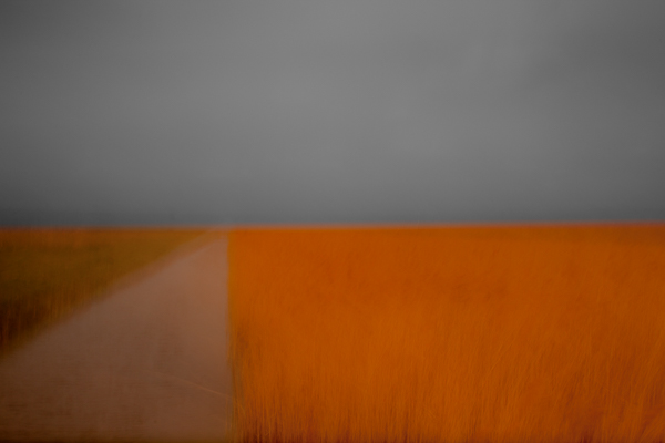
©Chris Friel
Today I had a client order for one of Chris Friels prints (the image above) to prepare and thought it would make a good subject for a blog post on hard proofing techniques.
Chris’s images can be very hard to print. He uses strong colours with low contrast and they look best printed on very matt paper. My paper of choice for most of his work is Fotospeeds superb Platinum Etching – a heavy-weight matt paper with a gentle texture which gives landscapes and many other types of images a beautiful feel and ‘presence’. Matt papers do bring with them challenges though. The matt surface reduces the gamut of colours they can display and so it can often take some work to translate what you are seeing on your screen on to the paper, even with a fully colour managed workflow. You can check out Fotospeeds papers on their website HERE – they are a great company to deal with.
You will notice in the image above that there is a large block of strong orange in the lower right area of the frame. This orange has a richness to it that is hard to display on matt paper. I knew I was in for some fun to get the print to work but knew the results on Platinum Etching would make the work worthwhile.
I am not a huge fan of soft proofing, that is simulating the paper profile on the computer screen in order to adjust the colours and contrast before starting to do test prints. It can be helpful but often I find it throws up potential issues which, if you go ahead and print, are not really issues at all. I prefer to ‘hard proof’, that is, make actual prints and adjust the print based on how the image performs on the paper it is going to be printed on. The issue with this is cost. Both in ink and in paper. Soft proofing was devised to help save some of this cost, but there is a way of hard proofing which works to minimise the cost and delivers good results.
This is where Lightrooms Print Module really comes in to its own. I firstly create a collection in Lightroom with just the image in it. I then tell Lightroom I am using a sheet of A4 paper and use the margin controls in the Print Module to resize the image to a small thumbnail up in the top lefthand corner of the sheet. Using the ICC profile from Fotospeed to control the print I print this image on the paper with no adjustments. This gives me a starting point and lets me see how the image behaves on the paper. It shows up any issues with image brightness and colours.
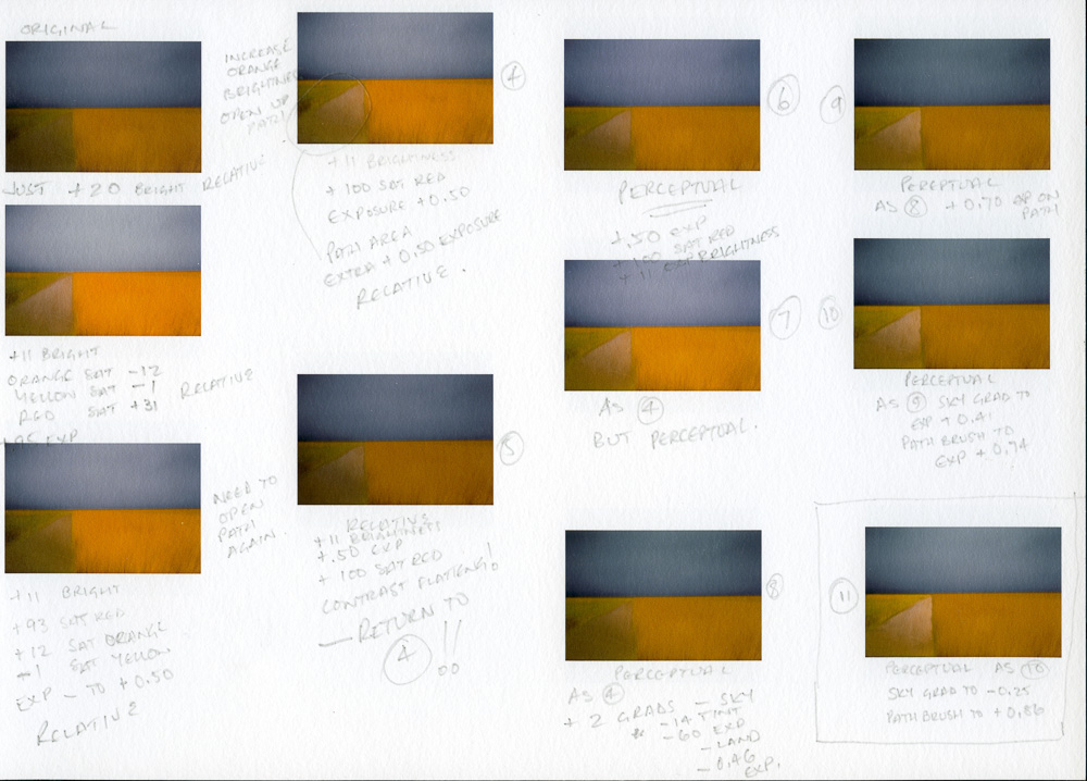
I then create in the Collection a Virtual Copy of the file and start making adjustments to it. I don’t try to correct everything at once but focus on the main issues. Then I move the thumbnail for this Virtual Copy to a new position on the A4 sheet using the margin controls in the Print Module and feed the same piece of paper back in to the printer. This prints the adjusted version below the original. I then write on the sheet beside the image the changes I have made to remind me. Below is one of the Virtual Copies ready to print.

As each print is made on the sheet, I gradually make corrections and note the changes on the hard proof test sheet. Sometimes a change is a retrograde step so I go back to a previous Virtual Copy which was closer to the final image I need. Each set of changes is always made to a new Virtual Copy so that I can go backwards and forwards and see what I have done.
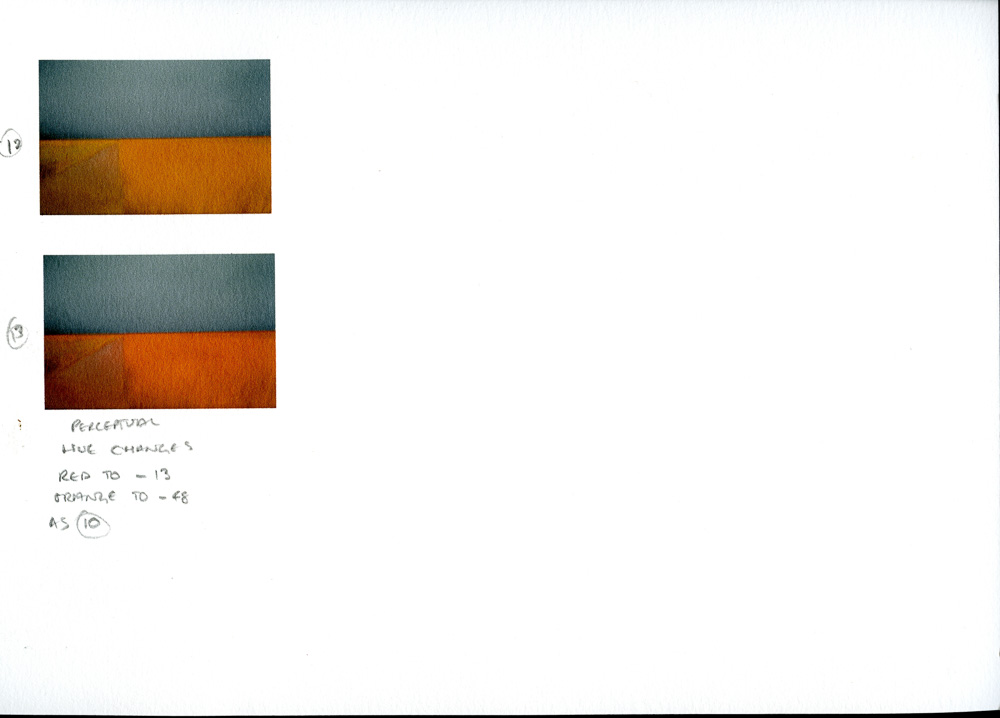
Below are the test sheets for this print. You will see I ended up needing to make 13 prints, which filled one side of the page with two going on to the reverse. You will see my notations in pencil and note how minor some changes actually were. You will also see that I didn’t address the issue of the orange colour until right at the end of the process when everything else was as I wanted. It was print 13 which finally achieved a ‘match’ on paper with Chris’s original file as seen on screen. (larger versions of my test sheet at base of post – so you can see my notations etc more clearly).


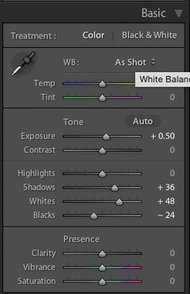
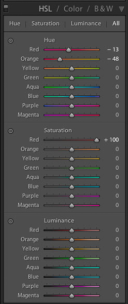
I used a number of tools in Lightroom to make the adjustments – the Exposure control, the Grad Filter (using this, not only to darken the sky, but also to add back the slight greenish white balance tint in the original which was lost on the print), the brush tool, the selective colour tools (both saturation and hue – these were critical to getting the orange colour correct) as well as the contrast channel controls. You can see some of my final settings below.
I also make a point of testing both rendering intents, Perceptual and Relative, as these can make a dramatic difference to the final output. Neither is better than the other, it is just a case of seeing which works best for your particular image.
Below you can see a screen shot showing just how many Virtual Copies I made for this print (Hard Proofing took me about an hour and a half on this image). Because of the time it takes to proof an image, I keep a ‘proof copy’ of the final approved image in case in ever have to print it again.
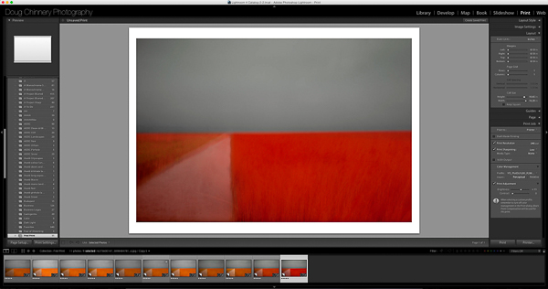
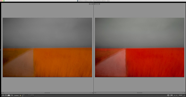
What may surprise you looking at the image above, and in more detail at the comparison images below, is just how radical the colour shifts had to be to get this image to print on matt paper. I really did have to make the grass almost blood red in order to get it to print a rich orange on the paper. The image on the left, below, is Chris Friels original file. The image on the right is the proof copy adjusted and ready to print. Believe it or not, this comes out of the printer matching Chris’s original! This is an extreme example, but it just shows the lengths you have to go to sometimes to get a print to match what you see on your screen and it shows the value of hard proofing. Just because you have calibrated your monitor and are using ICC profiles for your paper it doesn’t mean that you will get on paper exactly what you see on screen with no adjustments required. Some, more ‘normal’ images do print with very little adjustment needed. However, depending on your choice of paper and the colours and luminance levels in your image you may have to do quite a bit of work to get a really good print.
I am sure the client, a collector based in Italy, will be delighted with his Chris Friel print. I just wish he knew how much work had gone in to producing it!
I am running monthly online webinars on Lightroom, Photoshop, the Nik Suite of plugins and other topics of interest to photographers. Costing only £3.99, they last for around an hour and a half and include a downloadable video of the full webinar available from the following day so you can replay it as many times as you wish. If you wish to buy webinars which I have already broadcast on topics such as monochrome conversions, the Library Module in Lightroom and The Lightroom Develop Module, please just drop me an EMAIL using THIS LINK and I will tell you how you can get them. To sign up for forthcoming webinars check my workshops page for details. I hope you can join me soon.
I also run regular print, colour management, Lightroom and Photoshop workshops. Please sign up for my mailing list using the form on my Homepage to get full details or check my Workshops page.

A really interesting blog, Doug – I like the way you use the margin shifter to do your incremental hard proofs – nice idea! By preference I do tend to use photoshop for printing but I can see the merits of your arguments in this scenario and it looks a good one to try!
That said, I can’t imagine many images will offer quite such a challenge as this one! Incredible shift required. Most of the time, I find one or two initial small test prints will get me the result I require but I do find certain images respond better to one paper type than another.
For the most part I use either Canson Edition Etching or Fotospeed Natural Soft Textured Bright White. The former is my favourite paper, no doubt, but is more pricey and for most images, the difference between the two is negligible if it exists at all. However, certain images I have really struggled to make work on the Fotospeed. I could probably do as you did here but, for example, with my Reservoir Bogs print – it just came out lifeless on the Fotospeed yet looked perfect on the Canson.
I can’t really account for it, given I am using profiles and same workflow for both, but I have also noticed with one or two very light and airy, ethereal style prints, they respond far better to the Canson paper.
Anyway, thanks for sharing your system – good to know! Lizzie
What a fascinating and useful article – I had been wasting a lot of paper. No more.
Thanks for this Doug. Great post indeed.
As I’m not a LR user, will need to ascertain a way to do this via PS.
Doug,
thank you for the beautiful print of Chris, I’ve received some days ago but I had time to open the package and appreciate print just now.
True. The craft of the printer is rather underestimated by non-experts. Being myself a printer, but mainly by printing in black and white, I underestimated myself the difficulty of color printing, until I realized my first project in colors two years ago. Produce the prints for an exhibition was a rather long and difficult undertaking, but certainly educational.
Usually, for my prints, I use the Canson Baryta Photographique, that I find beautiful especially for the depth of blacks. As matte paper I used the very nice Canson BFK Rives.
Yes, I find it strange to have had to change the colors so significantly to get a print faithful to the original colors. Perhaps it is due to the brand of paper or perhaps to the ICC profiles that you used. Sometimes I had to create custom profiles using a printer calibrator. But it is a process rather long and laborious (and implies an economic investment quite significant).
Thanks again for the great work you have accomplished, you have certainly been able to exploit this great picture of Chris.