Category: Uncategorized

The Fallow Time

There is a particular silence that falls over a studio when the work has stopped flowing. It is not the comfortable quiet of an afternoon’s concentration, the small companionable hush of brushes drying or a print easing out of the printer tray. It is something heavier. The room holds its breath. The camera sits on the shelf and looks back at you with what feels like reproach, though, of course, it is only a camera, and cameras have no opinions. The reproach is your own, and you have lent it to the lens.

If you have come to abstract work seriously, you will know this silence. Sooner or later it visits every one of us. The ideas thin out. The eye dulls. The hand that reached so readily for the camera last month now finds reasons — small, plausible, almost respectable reasons — to do anything else. The kettle goes on. The emails get answered. The sock draw is tidied (and organised by colour…) with a sudden and suspicious thoroughness. And underneath all of it, a quiet panic begins to gather. *What if it has gone? What if I have nothing more to say?*

This is what I want to talk to you about this week. Not to fix it — there is no fix (sorry to dash your hopes so early in the essay), and anyone who sells you one is selling you something else as well (artistic snake oil, perhaps?) — but to sit with it for a while. To suggest, perhaps, that what feels like a death may be something quite different. It may be a fallow time. And on these islands, we know a thing or two about fallow ground.

When I first came to North Uist, the move itself swallowed the days. Boxes to unpack, a house to make habitable, getting over the stress of the move, the slow learning of where the wind comes from and which lochs catch the morning light. There was no question of making ‘real’ work; the settling was work enough. I told myself, with the easy confidence of someone not yet tested, that once the dust had cleared, I would begin. The landscape was extraordinary. The light was extraordinary. I had moved to the edge of the world, and the work would surely pour out of me.

It did not.

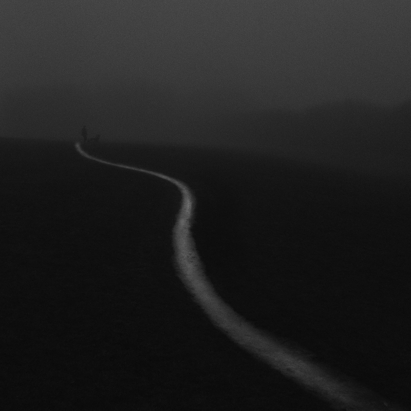
When at last the boxes were broken down and the home felt a bit more like home and the studio was, more or less, a studio, I picked up the camera and went out into the islands expecting some great rush of feeling. What I found instead was a strange flatness. The light was still extraordinary. The machair was still extraordinary. And I was, somehow, mute in front of it. I came home with nothing. I went out again. I came home with nothing again. Days became weeks. The weeks became something I would rather not count.

I did all the things a person does in that state. I rearranged the studio. I bought a book I did not need. I told myself I was *gathering*, which is what we tell ourselves when we are not making. I started three projects and finished none of them. I read about other people’s work and felt smaller. I picked up the camera and put it down again. I told nobody (especially you guys), because to say it out loud felt like an admission that I had made some terrible mistake in coming here at all.

I tell you this not as confession but as a kind of permission. If you are in that place now, you are not alone, and you have not failed, and you have not lost it. You are in the fallow time. And the fallow time, properly understood, is part of the work.

The crofters here know the value of letting ground rest. Talking to my neighbour, Callum John (the people here are often known by two names)I have learned that the soil here is rich and fertile, but thin. Dig down and you soon hit the Lewissian Gneiss, the immensely old and incredibly hard granite these islands are founded on – some of the oldest rocks on our planet. He has told me that if a field is worked too hard, year on year, it gives less and less until at last it gives nothing. The remedy is not to push harder. It is to leave it. To let the rain fall on it and the wind cross it and the small wild things come back into it, and in time — never on a schedule you can name — the ground recovers a richness it could not have held while it was being asked to perform. This is not a failure of the field. It is not the laziness of the farmer. It is how the thing actually works.

Our creative ground is no different. We have been sold, all of us, a peculiar idea that the artist should produce continuously, that any pause is a kind of moral failing, that if we are not posting and uploading and finishing and shipping, then we are somehow not artists at all. This is a story told mostly by the platforms that need our content. The artists I love have all had their fallow years. Hodgkin would work on a single small painting for a decade. Agnes Martin walked away from painting in 1967, drove out to a mesa in New Mexico, and did not lift a brush again for seven years; the work she came back to make is the work the world now queues to see. Cy Twombly went silent for long stretches and then erupted. The list is long and easy to extend. The fallow time is not the enemy of the work. It is, very often, the soil from which the next work grows.

So the first thing I would say to you is this: stop fighting it. The harder you grip the camera in a fallow time, the more it slips. The more you berate yourself for not making, the smaller and more frightened the work becomes. There is a kind of trust required here, and it is hard, and there is no way to learn it except by living through one of these periods and coming out the other side. You will. They end. They always end. But not, I am afraid, on the schedule you (or I) would prefer.

What broke my own fallow time, in the end, was not effort. It was a dog, and other people’s work, and the small histories of a place.

The dog was Eddie, of course – my dear and ever-present friend Eddie. We walked, he and I, day after day, regardless of weather (because having a dog as your best friend means going out for a walk no matter the weather, no matter your tiredness, no matter if your favourite program is on TV or not – you go), regardless of whether I had anything to say. I did not take the camera at first. I took only Eddie, and a coat, and one of my favourite hats (of which I have far too many – but that is a whole other confession) and whatever the day was giving. We walked the same tracks again and again, the same shorelines, the same paths between the lochs. And what I noticed, slowly, was that the repetition was teaching me something the dramatic outings had not. The same patch of machair was different every day. The same stretch of water held a different colour every hour. I was not looking for pictures. I was just looking. And in the not-looking-for, the looking itself began to come back.

This is worth saying plainly. *Looking is not the same as photographing.* In our hurry to make work we sometimes forget that the eye needs feeding, and that feeding the eye is a slow business. The fallow time may be the time when you most need to put the camera down and simply walk. Not as a productive exercise. Not as research. Just as the looking that any artist owes to the world they live in.

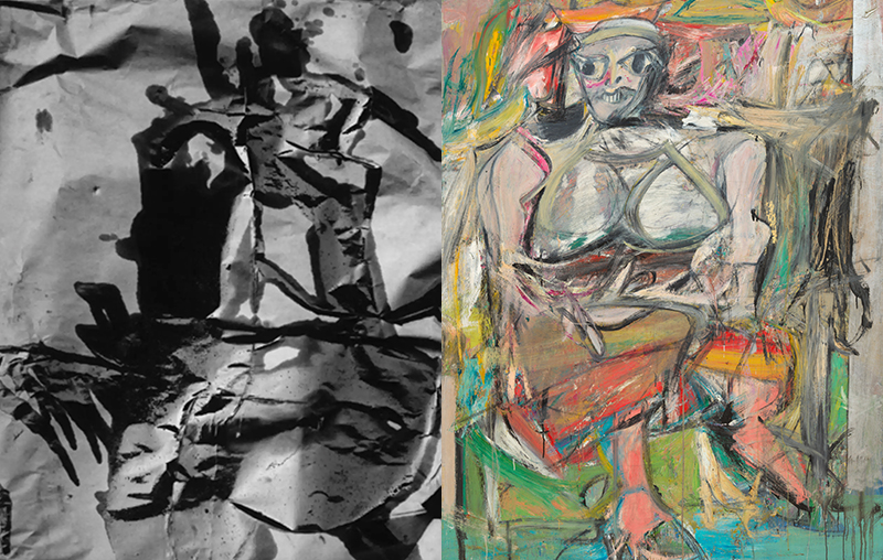
The other thing that broke the silence was looking at other people’s work. I went back, in those listless weeks, to the painters who had always meant something to me. I sat with Howard Hodgkin (and a wee dram beside the peat fire) and his small, dense, emotionally drenched panels, the way he could hold a whole holiday, a whole love affair, inside a frame the size of a book. I went back to Barbara Rae and her electric Hebridean colour, the way she takes a peat hag or a fence line and turns it into a chord. I sat for long evenings with Rothko (and more not-so-wee drams and roaring peat fires), who knew more about silence than most of us will ever learn. I read Sean Scully on the meaning of the stripe and the wall and the door, and I found in his rigour something that loosened my own paralysis.

None of this was research in any professional sense. It was something more like company. I needed to remember that I was part of a long conversation, that other people had stood where I was standing, that the work I admired had been made by humans who also had their dark weeks. Looking at their work did not make me want to copy them — and I would warn you against that always — but it made me want to *make* again. It rekindled something. It reminded me of what was possible.

And then, almost incidentally, I began to read the place itself. The poetry of these islands. The Gaelic place-names, each one a tiny compressed story. The history of Harris Tweed — those extraordinary women dyeing wool with lichen and crotal and the deep peat-brown of the moor, weaving by the rhythm of the sea. I was not, at this point, making any work at all. But I was filling up. I was becoming, very slowly, a person with something to say.

When the work came back, it came back changed. It was the work that walking with Eddie and reading the place and sitting with Hodgkin and Rae had made possible. None of it could have been made by the version of me who had arrived in Uist demanding pictures from the landscape. The fallow time had not been wasted. It had been the necessary preparation for what came next, though I had not been able to see that from inside it.

So if you are in the silence now, here is what I would gently suggest, knowing that none of it is a cure and all of it is only the offering of one person who has been there and come back.

Walk. Take the dog or take only yourself, but walk, and walk the same places again and again. Let the repetition do its slow work. Resist the urge to make every walk productive. Some walks are for the body and the eye and nothing else. The photographs will come back when they are ready, and not before.

Go and look at other people’s work. Not in a panic, not to compare, not to scroll. Sit with one artist for an evening. Choose someone whose work has always moved you, or someone you have been meaning to look at properly, and give them an hour of your full attention. Read what they said about their own practice. Look at how they handled colour or edge or silence. Let them remind you that the conversation you are part of is long and rich and far older than you are.

Read around your place. Whatever place that is. Read its poets, its histories, its makers. Read about the textiles and the songs and the kitchen recipes and the names of the fields. The work that comes out of you eventually will be richer for having a soil to grow in. We are not making pictures in a vacuum. We are making them as people with bodies, in particular places, with particular weather, surrounded by particular ghosts. Feed all of that.

Keep a notebook for the fallow time. Not a list of pictures to make, that pressure is the last thing you need, but a place for the small noticings. A colour you saw on the way to the shop. A shape the gulls made. A phrase from a poem that snagged. Half-thoughts about a project you might one day do. The notebook is for after. When the spark returns, and it will, you will go back to those pages and find the seeds you laid down without knowing.

And, this matters, be kind to yourself. The voice in your head that says *you have lost it, you were never any good, you should give up* is not telling you the truth. It is telling you that you are frightened, which is a different thing entirely. Frightened is a feeling. It is not a verdict. Treat it the way you would treat a friend who came to you in the same state: with patience, with company, with a shared dram, with the assumption that the storm will pass.

The fallow time is part of the work. Say it again, because the culture we live in will keep trying to convince you otherwise. *The fallow time is part of the work.* It is not the absence of practice. It is a different phase of practice. The ground is doing what the ground needs to do. Your job, in these weeks or months, is not to force the field. Your job is to keep walking it, to keep your eyes open, to feed it with whatever rain and wind and small wild noticings come your way.

And then, one morning, with no fanfare and no announcement, you will lift the camera and something will move in you and you will press the shutter and it will feel, again, like the most natural thing in the world. You will wonder why you ever doubted. And you will probably forget, until the next fallow time comes, that you ever did.

But until then, and there is no shame in this, no failure in this, no reason to hide it from yourself or each other, let the field rest. Walk with the dog. Sit with the painters who have gone before. Read the poems of the place you happen to be standing in. Trust that the silence is not the end of the work. It is, very often, the beginning of the work you have not yet been able to imagine.

The spark comes back. It came back for me, and it will come back for you. Our part is to be ready for it when it does, and to have done, in the waiting, the quiet, unglamorous, essential work of keeping ourselves alive to the world.

That is the work too. Perhaps it is the main work. The pictures, when they come, are only what is left over.

When the World Has Become Too Familiar.

A November Day… in Worksop

This morning I walked Eddie along the lane near the cottage in a thin, persistent mizzle.

May, apparently. The Scots have a wonderful word for such days. ‘Driech’.

North Uist had other ideas. The island had put on its November face: low cloud, wet grass, a pewter sky pressed down over the crofts, the road blackened by rain, the lochans half-erased, the distance withdrawn into itself. Somewhere beyond the fence line, a curlew called. That sound always seems to me less like birdsong than a question carried on cold air. An oystercatcher went over, sharp and indignant, stitching its cry across the grey.

There was no drama. No shaft of light. No grand Hebridean revelation. Just damp, sheep, road, wire, grass, breath, dog, weather.

And yet, because this is North Uist, I know how it can look from elsewhere.

It can look as though inspiration is simply lying about here. Empty beaches. Wild skies. Wind-torn machair. Black water. Bleached shells. Rusted gates. Ruined crofts. The cry of birds over land that still feels older than language. I can imagine someone looking at my life here and thinking, well, of course you can make work there. Of course you can feel moved there. Of course the place gives you images.

And yes, sometimes it does.

But not as simply as that.

A beautiful place does not make the work for us. A remote place does not guarantee depth. Weather is not a substitute for attention. A shoreline can become a cliché in your hands as easily as a shopping precinct. A mountain can be used lazily. A beach can become decorative. A big sky can become a way of avoiding the smaller truth at your feet.

I know this because I have made those mistakes.

I also know what it is to live somewhere that does not appear, on the surface, to offer much at all.

Before North Uist, I lived for more than twenty years in Worksop, an old ex-mining town in the Midlands of England. It was beyond ordinary in the way many English towns are so very ordinary. Brick, road, estate, bypass, park, supermarket, industrial edge, municipal planting, wet pavement, winter trees, tired verges, a particular kind of landlocked greyness. It was not a place people travelled to in search of the sublime. Worksop is blandness personified.

For years I struggled to see it.

That is not quite true. I saw it constantly. I drove through it, walked through it, shopped in it, queued in it, waited at its traffic lights, passed the same walls and corners and patches of grass until they sank beneath recognition. They became facts rather than presences. Named things. Known things. Finished things.

A hedge. A wall. A car park. A road. A field. Nothing.

Habit is a kind of weather. It settles over a place until the place disappears.

We tend to think mist hides the world, but familiarity can be far thicker. At least mist makes us aware that something is hidden. Habit does not. Habit convinces us there is nothing more to see.

This, I think, is where many of us become stuck.

Not because our surroundings are empty, but because we have emptied them by naming them too quickly.

The lane is just the lane. The town is just the town. The garden is just the garden. The walk is just the same old walk. The view from the window is just the view from the window. We have looked at these things so often that we no longer look. We recognise them instead.

Recognition is useful for daily life. It gets us through the world efficiently. But art asks something less efficient of us. It asks us to become slightly lost in what we thought we knew.

This morning, the lane near the cottage was hardly a subject at all. It was narrow, wet, familiar. Eddie nosed along the verge with great seriousness, as dogs do, reading a version of the world entirely unavailable to me. The sheep watched us with their usual mixture of suspicion and boredom. Rain gathered on the fence wire. The grasses leaned under the weight of water.

Nothing happened.

But the longer I walked, the less certain the lane became.

The wet road held a dull shine, not quite silver, not quite black. The verge was a tangle of old stems and new green, last year refusing to give way entirely to this year. The fence posts faded one by one into the mist, a broken rhythm. A gate hung limply, tied with straggling lengths of bright blue nylon rope using those unnamed knots only crofters tie. A ditch carried a thread of brown water. Fluttering flags of ragged torn black polythene, once wrapped around sileage, now snagged on barbed wire fencing proudly declared a boundary. Eddie’s paw prints appeared briefly on the tarmac, then vanished.

There was no picture, not in the obvious sense.

There were fragments.

And perhaps fragments are enough.

A great deal of our work begins there, I think. Not with the grand subject, not with the declaration, but with the small tug of attention. Something catches. A colour, a pressure, a rhythm, a surface, a silence. We do not yet know why it matters. It may not matter. But we feel the slightest resistance in the ordinary flow of seeing, and if we are wise, we stay with it.

That staying is difficult.

The world trains us to move on. Cameras can make this worse. We lift them too quickly, hoping they will solve the problem of attention for us. They rarely do. They record our haste with brutal accuracy.

To work with the ordinary, we may have to slow down until the thing in front of us stops being useful, stops being named, stops being background. A wall is no longer a wall. It becomes stain, repair, damp, abrasion, lichen, fracture, time. A puddle is no longer a puddle. It becomes skin, tremor, reflection, oil, sky, interruption. A hedge is no longer a hedge. It becomes density, line, concealment, cut growth, small darkness.

This is one of the reasons abstraction matters to me.

It loosens the grip of the named world.

It allows the hedge to stop being hedge and become edge, rhythm, weight, direction. It allows the road to become a field of greys. It allows the wet gate to become a note of cold light. It allows a neglected corner of a town to become colour, pressure, memory, and mark.

Abstraction does not require us to find extraordinary subjects. It asks us to let ordinary subjects become unstable.

I wish I had understood this better when I lived in Worksop.

I spent too long believing the place lacked poetry. Perhaps what it lacked was my patience. Or perhaps, more honestly, I lacked the courage to admit that the ordinary was worthy of sustained attention. It was easier to blame the town than to look harder. Easier to imagine that elsewhere would make me more alive.

Elsewhere can wake us, of course. Travel can do that. A new landscape can strike the eye clean. There is a gift in unfamiliarity. But there is also a danger. We can become dependent on novelty, always needing the next place to make us feel perceptive.

The deeper practice may be to remain where we are and let the familiar become strange again.

That is not a romantic idea. It can be uncomfortable. To look closely at the everyday is to meet our own boredom, our own impatience, our own dismissals. It is to realise how much of the world we have thrown away because it did not immediately offer itself as beautiful.

But the ordinary is not empty.

It is full of use. Full of weather. Full of human trace. Full of small failures and repairs. Full of repetition. Full of things becoming worn, stained, bent, softened, broken, overgrown. Full of time made visible.

The spectacular place often overwhelms us. The ordinary place waits.

It does not seduce. It does not perform. It asks for a quieter kind of fidelity.

The road you walk every day. The alley behind the shops. The wall beside the car park. The winter tree outside the bedroom window. The garden after rain. The bins, the weeds, the patched tarmac, the steam on glass, the plastic caught in the hedge, the pale rectangle where a sign once hung, the rust bloom around a screw. These things may not announce themselves as subjects, but they hold the world nevertheless.

And they hold us, too.

Because we have lived among them. We have passed them in grief, irritation, haste, tiredness, happiness, distraction. They have been there while our lives quietly happened. Their familiarity is not a weakness. It is a form of intimacy.

Perhaps that is why they are so hard to photograph. They are too close.

The place we know well does not give itself up through spectacle. It gives itself up through repeated attention. Through return. Through noticing the slight change in light, season, mood, surface, self. We do not conquer it with one good image. We enter into a conversation with it, and most of that conversation is silence.

This is why I think the mundane may be one of the richest territories we have.

Not because it is secretly dramatic. Not because every drain cover is a masterpiece waiting to happen. But because the mundane forces us to examine the quality of our attention. It strips away the easy alibi of subject matter. It will not carry us. We have to bring something to it: patience, curiosity, doubt, tenderness, maybe even a little humility.

If we can make work there, in the place we think we already know, then something important has shifted.

We have stopped waiting for the world to impress us.

The lane this morning did not impress me. It did something better. It resisted me. It stayed quiet. It made me work. It asked me to meet it on its own terms: wet grass, dull road, bird cry, mist, dog breath, old stems, wire, water, no drama.

And in that quiet resistance, I felt the beginning of something.

Not an image, perhaps. Not yet.

More like a loosening.

A reminder that seeing is not a matter of finding better things to look at. It is a matter of becoming less blind to what is already here.

So if your own world feels too familiar, too average, too suburban, too urban, too tidy, too messy, too flat, too dull, too known, I would not rush to contradict you. Perhaps it does feel that way. Perhaps it has felt that way for years.

But I would ask you to mistrust the word “just”.

Just a lane. Just a wall. Just a garden. Just a town. Just a wet pavement. Just the same old walk. Just Worksop…

There is a whole world hidden behind that word.

Go back to it. Not hungrily. Not demanding a photograph. Go back as if visiting something you have neglected. Walk it in poor weather. Walk it when the light is flat. Walk it when you are not in the mood. Walk it without the pressure of making anything good.

Look for the small disturbances.

Where does the surface break? Where does colour gather? Where does one thing press against another? Where is the wound, the repair, the rhythm, the stain, the silence? What repeats? What has changed? What have you stopped seeing because it has always been there?

You may come home with nothing.

Or with almost nothing.

A smear of colour. A line. A texture. A small dark shape. A feeling you cannot yet name.

That may be enough. It may be the beginning of the work.

The ordinary does not always yield quickly. It is not there to entertain us. It has no interest in our need for results. But if we return, if we pay attention, if we allow the familiar to become uncertain again, it may begin to open.

Not dramatically.

Not all at once.

More like mist lifting from a field you thought you knew. Slowly, unevenly, with parts still hidden.

And perhaps that is where the real work begins. Not when we find the extraordinary place, but when the ordinary place stops being ordinary in our hands.


If this is the kind of looking you have been hungry for, FYV is a small community of photographers who are quietly leaving the rules behind and finding their own way into more painterly, more abstract, more personal work. We would be very glad to have you with us. You can find out more here. And if you join soon (as I write in May 2026) you can use the code VISION15 to get 15% discount on the annual membership on top of the usual two free months, and two-week free trial period.

Living With Not-Knowing

The cattle grid at the end of the track had been iced over for three days. I had walked past it each morning with Eddie, who paid it no attention because his paws do not slip the way mine do, and each morning I had glanced at the field beyond it and kept moving. Flat winter light, the kind that irons shadows out of the world. Brown grass, grey sky, a smear of darker grey where the lochan sits in the low ground. Nothing to photograph. Or rather: nothing to photograph if what I was looking for was something to explain.

On the fourth day, as we returned from our evening sortie, I stopped. I am not sure why. Probably the evening light changed my perspective. I took the camera out and made a handful of ME burst mode exposures, moving it slowly back and forth, the kind of gesture that produces what might generously be called movement studies and what might more honestly be called ‘mush’. Then I put the camera away, stepped carefully over the grid, and walked on.

When I came to the files that evening, one of them made me sit forward. It did not look like the field. It did not look like the lochan or the cattle grid or the smear of darker grey. It looked like something half-remembered from a place I could not quite name. I kept returning to it. Not because it was resolved, but because it was not. There was something in it that kept asking me back, and that asking was the point.

This is what I has been playing on my mind ever since: the idea of staying with not-knowing, and what it costs us when we refuse.


You are all technically capable here. You can handle the camera, bend the software, manage the layering. That competence is real and hard-won, and there is nothing wrong with it. But it can bring a particular temptation: to reach, too quickly, for clarity. For legibility. For the version of the image that can be explained in a sentence. The competent hand wants to resolve. And sometimes that is exactly the wrong instinct.

The images that have lasted longest in my own practice, the ones I keep returning to across months and years, are almost never the clean ones. They are the ones where the subject is half-remembered, half-imagined. Where I cannot quite name what I am looking at. Where the image holds a question rather than offering an answer. Those are the ones that keep asking me back in. They contain doubt.


I think we need to separate intention from over-determination, because they are not the same thing and we sometimes speak as though they are.

Intention, as I understand it, is about arriving with a question. What am I drawn to here? What am I willing to risk? It is a frame held loosely, a direction rather than a destination. Over-determination is something else entirely. It is when I have already decided what the image must be before I have made it, when I am bending everything, the subject, the gesture, the processing, simply to confirm what I settled on in advance. The image becomes a vehicle for a thesis already written. It arrives pre-sealed. There is no air left in it.

Bruce Percy (who, you will be excited to hear, I am interviewing later in the summer for ARBN) has spoken about allowing the landscape to suggest the photograph rather than imposing a preconceived image onto it. I find this enormously useful, not as a general philosophy but as a practical discipline on any given day. You can arrive at a location with a loose conceptual frame, loss, perhaps, or persistence, or the feeling of something that has just passed through, without already knowing what the images must look like. The work then has the possibility of talking back to you. You are not transcribing; you are listening. I am drawn to the openness of this approach.

When intention holds space for surprise, something more porous emerges. And porousness is worth protecting.


There is a painter whose work I keep returning to when I think about this: Antoni Tàpies. A recent discovery of mine, but I think I am late to the party in this.

His surfaces are not decorative. They carry sand, marble dust, crumbled paint, scratched-back marks, layers that half-reveal and half-conceal what came before. You cannot read a Tàpies painting in the way you read a sign; the marks resist that kind of extraction. They propose. They suggest. They sometimes refuse altogether. And yet the work is never arbitrary. There is intention there, deep and serious intention, but it holds room for the material to speak, for the process to leave its own trace.

What Tàpies understood, I think, is that a surface which has been lived in is not the same as a surface which has been designed. The accumulation of decisions, the traces of earlier states, the marks that were almost erased but not quite: these are not impurities to be cleaned away. They are the record of genuine engagement. The image holds the history of its own making, and that history is part of what makes it resonant.


Frances Walker knows this too, from her end of the practice.

Her paintings and prints of the Hebrides are, in some sense, legible: headlands, water, islands, weather. But there is always something withheld. Edges dissolve into weather. Marks accumulate into dense passages that feel less like depiction and more like the memory of having stood in a place through multiple seasons, in changing light, carrying different things. What I take from Walker is the value of accumulation and erasure as a way of thinking. Her surfaces carry traces of earlier decisions, over-painted forms, ghost marks, passages scraped back, evidence of how the image became itself. The final thing is not separate from its history; it contains it.

In multiple-exposure and ICM work, we have something directly analogous. When we layer exposures that do not align neatly, we allow earlier gestures to remain visible as ghosts within the final frame. The image carries its own archaeology. Ambiguity here is not only in the subject; it is in the visibility of process. You can see, or sense, that there were earlier moments, earlier attempts, earlier ways of looking, and that they have not been tidied away.

The temptation with our tools can be to always tidy. To mask, blend, smooth, until the underlying uncertainty is invisible and the image looks decided. But what if those failed layers, those awkward overlaps, those earlier gestures that did not quite work, are integral to the meaning? What if the final image is less a window and more a record of ongoing negotiation?


There is also something worth saying about ambiguity and the world we are making photographs inside.

The culture we live in produces confident images at extraordinary volume. Advertising, propaganda, social media, they all speak in assertions. They have already decided what you should feel. They are closed, in the way I mean: pre-sealed, the air removed. To make work that refuses this register, work that does not resolve into a quick meaning, work that asks for slower, more uncertain attention, is, in itself, a kind of positioning.

But this comes with its own responsibility. Ambiguity is not automatically a virtue. The question we have to hold honestly is whether we are obscuring in order to reveal something difficult, something that clarity would flatten, or whether we are simply avoiding the work of being clear where clarity is needed. Ambiguity as evasion and ambiguity as depth look identical from the outside. Only the maker knows, or should know, which one they are standing in. And sometimes, if we are being rigorous, we have to admit that we are not entirely sure.


I think we can also learn to tune the degree of not-knowing in our work more deliberately than we sometimes do, rather than treating it as something that simply arrives by accident when the technique is messy enough.

One way is to work with subjects that are already on the edge of dissolving: reflections, weather, foliage in strong wind, shadows on water. And then to push them, deliberately, a little further past recognition than feels comfortable. Not to destroy the image, but to ask yourself, at each stage, how much the viewer actually needs in order for the image to hold. You might be surprised by how little.

Another way is to pay attention to the anchors you habitually give the viewer, and to try, in at least some work, to remove them. No horizon line. No isolated legible object. No colour that says the word forest or the word sunset before the viewer has had time to bring their own weather. These are constraints, but they are generative ones. They define a territory of uncertainty within which you can wander. They also, usefully, reveal where you tend to resolve ambiguity too soon, where your hand reaches for safety before you have asked whether safety is what the image needs.


All of this is easier to write about than to live with.

In practice, doubt shows up. Is this anything, or just a mess? (Just more ‘mush’, Chinnery?) Am I staying with something genuine, or have I simply avoided doing the work? The question comes at different points for different people. For me it often comes in the evening, looking at what I made in the morning, when the cold of the field has worn off and the slightly magical version of the day has been replaced by its more ordinary self.

I made an image some months ago as I struggled with my current project, something that felt, when I set it aside, like a failure. It had not done what I hoped. It fell short. I left it open in Photoshop and moved on. A day later I came past it, still sitting there on the screen, and something made me pause. I looked at it again. It was not, it turned out, the total loss I had decided it was. There was something in it, something lurking in the tonal relationships, something in the way the layers had disagreed with each other. Five minutes of attention, not rescue, just attention, and it had found its way into my saved collection. It is still there. I still do not entirely know what it is about. And I find I am content with that. Whether it makes the final cut is not, right now, of any importance. I am just content to cogitate on it for a while longer. I am learning up here that there really is no rush in all this.

I do not think the answer to doubt is to eliminate it. I think the answer is to learn to navigate inside it without being paralysed. This means, in practice, separating making from judging: giving yourself permission to produce unresolved work, and resisting the urge to immediately classify it as success or failure. Letting images sit. Returning to them when you are less decided about them. Looking at the rejects, periodically, not to find what went wrong but to find what is alive in them, what strange collision or accidental void might be the seed of something.

It also means noticing the language you use when you talk to yourself about your work. When you say, “This is about X,” you have already closed something. The more useful formulation is softer: “I was curious about,” or “I was testing what happens if.” Those phrases keep the image open. They leave room for it to be something else than what you decided it was.


The images I trust most, in my own practice and in the work I find myself returning to, are the ones that remain slightly out of reach. Not because they are withholding something knowable, not because they are puzzles, but because they are genuinely still asking. They hold their uncertainty the way the lochan holds the weather: not as a failure to be something else, but as a condition of their own particular life.

As you head into the next making cycle, you might carry one or two of these questions quietly with you.

Where are you trying to force your images to mean more clearly than they want to? And what would it look like, in the work, to honour the ambiguity that is already there?

Have a wonderful time making stuff everyone. relish the process.

If this is the kind of content you have been hungry for, FYV is a small community of photographers who are quietly leaving the rules behind and finding their own way into more painterly, more abstract, more personal work. We would be very glad to have you. You can find out more here and enjoy a two-week free trial period of over 500 hours of content, with no obligation to join.

What a Photograph Forgets

There is a small loch about ten minutes from the house. Nothing remarkable about it. A scoop of fresh water held in a saucer of peat and stone, ringed by a few wind-shaped willows and one stubborn rowan that ought, by rights, to have given up years ago. I have walked past it so many times already, walking with Eddie. I could not, if you asked me, tell you the exact shape of its eastern shore, or the precise place where the path narrows into bog. The loch and I are on cordial but unsentimental terms.

A few weeks ago I made a photograph of it. Or rather, I made a photograph in its general direction, which is not quite the same thing. I had been working with multiple exposures, experimenting between bright and dark mode, comparing results, moving the camera in slow, drifting arcs as I pressed the shutter in burst mode, the way you might move your eye across a memory you are trying to retrieve rather than a scene you are trying to record. When I looked at the back of the camera afterwards, the loch was still there, more or less. But the rowan had gone. The path had gone. The eastern shore had become a pale suggestion, a kind of breath. What was left was the mood of the place, not the place itself.

I stood in the wind for a moment (because here in the Outer Hebrides, seldom is there no wind) and thought: the photograph has forgotten almost everything. And then I thought: and that is exactly why I like it.

Forgetting is not the same as losing

There is a temptation, when we first encounter abstract photography, to describe it in the language of subtraction. The image has lost its detail. The subject has been stripped away. The picture has given up its information. All of these are perfectly accurate, and all of them are slightly wrong.

A photograph that loses its detail sounds like a photograph that has failed at its job. A photograph that forgets its detail is doing something quite different. It is choosing what not to hold. It is leaving room for something else to come in.

What comes in, I think, is the viewer.

A representational landscape, made cleanly and competently, performs a generous service. It says: this is what was there. This is what it looked like. This is the proof of the place, the light. A sacred moment. And the viewer, in receiving this evidence, is a kind of grateful guest. The photograph has done the seeing. The viewer agrees to be shown.

A photograph that has forgotten almost everything cannot do this. It has no evidence to offer. It has no proof. What it has, instead, is a hollow, into which the viewer is invited to bring their own weather, their own walks, their own lochs. Their own soul. The image becomes less like a window and more like a bowl. It does not show you a scene. It holds a space, and asks you, “What have you brought with you to put in it?”

The artists who taught me this

I came to it slowly, and largely through painters. But there are photographers who knew it long before I did, and who held the door open for the rest of us.

Utah Bath is one. Her photographs of nothing very much, ordinary corners of light and wall, the way an afternoon falls across a curtain, are nominally about almost no subject at all. What they are really about is the looking. She made the looking visible. The remarkable thing about a Barth photograph is that you finish it not knowing what you have seen, but very aware of how you have been seeing.

Saul Leiter is another, although he came at it from the opposite direction. Where Barth subtracts, Leiter clutters. Rain on glass, a coat in the foreground, the back of someone’s head. The subject is always partly hidden, partly elsewhere. The photograph forgets to be about the thing in the middle of the frame. What you remember afterwards is not what was photographed but what it felt like to look through the rain and almost catch it. A glimpse into a sacred secret found in the mundane everyday.

And further back, in the very last paintings of J. M. W. Turner there is the same gift. He was accused, in his late period, of producing soapsuds and whitewash. The accusation was correct, in a sense. The paintings have forgotten almost everything that a respectable Victorian landscape was supposed to remember. What they have kept is the light, and the weather, and a kind of held breath. They are still arguing for the value of forgetting, two centuries later.

A small invitation, for the next walk

I am not going to tell you to go and forget things on purpose. Forgetting, when forced, becomes a different thing entirely; it becomes pose. But I will offer one small thing to try, the next time you are out with a camera in a place you know well.

Stop in front of something familiar. A favourite tree, the corner of a beach, a particular bend of road. Look at it for a long minute, longer than feels comfortable. Then ask, quietly: if I made a photograph of this place that forgot almost everything about it, what would it choose to keep? Not what would be sharp, not what would be in the rule of thirds, not what would survive an Instagram crop. What would the photograph remember, if it could only remember one thing?

Then, only then, lift the camera. You may find the answer is movement, or colour, or a single line of dark against pale. You may find the answer surprises you. You may find, as I did at the loch, that a place you thought you knew rather well had a private mood you had been walking past for years.

Photographs are not obliged to remember everything. Most of the best ones, I have come to think, remember rather little. What they keep is what mattered. And that, I suspect, is also what we are doing when we look at them: not consulting a record, but quietly remembering, on their behalf, what it felt like to be there.


If this is the kind of looking you have been hungry for, FYV is a small community of photographers who are quietly leaving the rules behind and finding their own way into more painterly, more abstract, more personal work. We would be very glad to have you. You can find out more here. And if you join soon (as I write at the beginning of May 2026), you can use the code VISION15 to get 15% discount on the annual membership on top of the usual two free months, and two-week free trial period.

What is Photographic Expressionism?

Ever since the earliest days of photography, this new method of creative expression has sat uneasily in the art world. Many steeped in the more traditional techniques of painting, drawing, sculpture, along with a large proportion of gallery owner’s, collectors, critics and museum curators have viewed it as a somehow less worthy art form. Perhaps it seems rather easy compared to other crafts – more dependent on the equipment than the skill of the practitioner. Yet, the earliest photographers were artists first, intrigued by this new medium and it wasn’t long before they were looking for ways to abstract the images they were making. 

The paucity of significant museum exhibitions devoted to abstract photography testifies to this state of affairs. MOMA in New York held a flurry of three such exhibitions between 1948 and 1960 (In and Out of Focus 1948, Abstraction in Photography 1951 and The Sense of Abstraction 1960) The next internationally important exhibition was ‘Shape of Light’ at Tate Modern, London in 2018 – a gap of almost sixty years. This seems to bolster the view that abstract photography is the poor relation of the art world.

Despite this wariness toward photography, we can see it shares a history with art over the last century as abstract explorations in the darkroom ran parallel with Cubism and other forms of modern art. While photography is the ideal tool for creating perfect copies of reality, there have always been photographers who are mentally emancipated from the need for slavish reproduction – those searching for a more impressionistic way of making images. Back in 1905, Alfred Stieglitz opened his ‘Little Galleries of the Photo-Secession’ at 291 5th Avenue in New York (which soon became better known by its nickname, ‘291’). His goal was to showcase the newly emerging Pictorialist photography. Within a short time, the gallery became a hub for this and avant-garde art – from both Europe and America. Edward Steichen became involved, helping with the selection of artists who would be exhibited based on his experience from living in Paris. It became a place to see works by Cezanne beside Stieglitz, Picasso and Braque accompanying Steichen and Matisse along with the abstracts of Paul Strand.

Interestingly, in conjunction with running his 291 gallery, Stieglitz was also a founder member of the Photo-Secession group. Other notable members included Steichen, Clarence H. White, Gertrude Käsebier, and Alvin Langdon Coburn. These photographers broke away from the more traditionalist Camera Club of New York in 1902 and pursued Pictorialism. This approach espoused manipulating negatives and prints to produce the effects of drawings, etchings, and oil paintings. They produced a quarterly magazine entitled ‘Camera Work’ and actively promoted photography as an art form. 

Even earlier, in 1892, a group had formed in Europe called the Linked Ring (or, more formally, the Brotherhood of the Linked Ring), that had similar goals. While members made images in differing styles, they were united in rejecting the technical approach to photography that traditionalists were propounding. Several members of the Photo-Secession group went on to become members, including Steichen, Stieglitz, Gertrude Käsebier, and Clarence H. White.

If we discount scientific photography, then perhaps the first truly abstract photograph could be “Winter Landscape” made in 1909 by George Seeley. It is suggestive rather than descriptive, a snowy landscape as the source, but reduced to pure shadow and curve forms, leaving much room for audience interpretation. Around this time Alvin Langdon Coburn made a remarkable image in his home city of New York, looking down on a Manhattan roundabout from a skyscraper. ‘The Octopus’ of 1912 was a visual shock to viewers unused to viewpoints such as this. In 1911, Linked Ring member Pierre Dubreuil explored both cubism and vorticism with his photograph, ‘Interpretation Picasso, The Railway’ which he embellished with ink and pencil. From these early explorations, abstraction in photography became more widely explored. Examples include Man Ray and his poetic ‘Rayographs’, which he created by drawing with light on sensitive paper. Or László Moholy-Nagy, the constructivist artist and instructor at the Bauhaus school, who was fascinated by creating Photograms with light, forming geometric shapes arranged over the surface.

While abstract photographers were keen to establish that their practice was an art form in its own right, that is not to say that they weren’t significantly influenced by artists working in abstract painting. Take, as one example, the photographer Aaron Siskind. He taught alongside Robert Rauschenberg and Cy Twombly at the Black Mountain College. Siskind’s abstract photography went on to be exhibited at the important Egan Gallery in New York – a gallery that also showcased paintings by Franz Kline, Willem de Kooning and Rauschenberg. Siskind, influenced by such painters experimented with the presentation of his photographs, eschewing the mundaneness of regular frame and mount configurations, replacing them by mounting his images on Masonite boards. He became known as ‘a painters photographer’. This cross-pollination of ideas worked both ways. For example, it is believed that De Kooning used an abstract photograph of Siskind’s, ‘New York’ (1950) as he worked on his painting, ‘Woman/1950-2’. So, this may indicate that among a few practising abstract artists there was respect for at least some photographers working in this area, despite the relative youth of photography.

The majority of abstract photography which has gained credence in the art world is analogue, either made entirely in the darkroom from pure light and light-sensitive materials (such as Arthur Siegel’s ‘Motion-Light’ studies) or more conventionally with cameras and lenses and then processed in the darkroom. The advent of digital photography appears in most ‘official’ quarters to have been met mainly with much scepticism. 

This is understandable. Modern cameras are essentially computers with shutters and lenses – capable of amazing optical gymnastics, should the operator so wish. Much of the perceived craft associated with analogue photography appears to have gone – especially that which is part of large format image-making. All the upside down and reversed composing under dark cloths, working with silver gelatin and platinum palladium – the mathematics, the alchemy and chemistry of it all. The pure struggle of getting an analogue image to print adds perceived value, certainly. To the uninformed, the point and shoot, click and print world of digital for the masses just doesn’t cut it with those interested in ‘serious art’.

As a result of this, we have found ourselves in a no man’s (no person’s?) land. Caught creatively, not just in the void between photography and traditional art practices – but also cut off from the part of photography that has scraped acceptance in some areas of the art world. 

As we are part of something new, neither side really know what to make of us. They don’t know how to define us or judge what we create. The more conventional, representational photography world have no labels or beloved rules by which to judge and classify us. We don’t fit in with them. On the art world side we seem to be tarred with the iPhone/Hipstamatic generation/Photoshop tomfoolery/Digital/‘it’s so easy my kid could do it’ brush and swept aside. 

But this experience is similar to many new art movements in the past. It takes time for the world to catch up. In the meantime, as passionate artists, we remain undeterred and will forge on in our craft whether it be recognized or not. As all artists know, the urge to create is a fire that burns inside us and it is not dependent on recognition. We must create.

Throughout the twentieth century, various proponents of abstract and expressionistic photography were proposing different ways of describing what they were doing. In addition to Stieglitz ‘Photo-Succession,’ we have, in the early 1950s, German photographer and critic Otto Steinert coined the phrase ‘Subjective Photography’. Another German photographer, Peter Keetman, used the term ‘Fotoform’. The Bauhaus school spoke of ‘New Vision’ and so on. All these and any subsequent attempts to describe impressionistic abstract photography seem to fall short in capturing the essence of what, as artists, we are trying to convey. For this reason, none of these terms has stuck.

This search for a term to describe what they were doing addresses an issue with calling it ‘abstract photography’. While convenient, it feels somehow inadequate. Those of us working now with digital techniques, like intentional camera movement (ICM) and multiple exposures (ME) have also been debating the fact that using these terms is to describe our work is equally unsatisfactory.

Firstly, we are not process focused. Yes, we may well have used ICM and/or ME techniques as part of creating our work. But we may also have used other in-camera techniques, manipulated the image significantly in the digital darkroom and latterly outputted the file as a physical print and then applied any combination of physical processes to embellish the print to create a ‘one of one’ unique physical work of art, far removed from any in-camera technique.

It is also true that while we may use a particular technique on one of our images, we may not use it on others. What we have been searching for is a term that encompasses the style or genre of work we are creating, much as artists working in more traditional forms have. 

Valda and I have had long discussions around this subject. We have talked around the kind of words most often used by artists working in our field or by those talking about our style of work such as ‘painterly’, ‘abstract’, ‘impressionistic’ ‘creative’ and ‘expressionistic’. Which seem most universally applicable? We are also keenly aware of the influences of Modern Art movements, including the Abstract Expressionists, Cubists, the Bauhaus and others in what we do. 

After long deliberation, and with huge respect for the giants on whose shoulders we stand, we would like to propose that we define ourselves as ‘Photographic Expressionists’.

We feel this links us both to the artists work that we derive inspiration from while being proud of our roots in photographic practice. It allows us full scope to work in mixed media – be that digital or analogue as well as incorporating art and other materials in the presentation and embellishment of our work.

We certainly don’t claim to have invented this term. A quick Google search will reveal a Flickr group with it included in its subtitle and the photographer Rick Doble claimed to have coined the phrase ‘photo-expressionism’ back in 1999. No doubt it is used elsewhere from time to time. What we would like to do is establish it as a clear definition for the kind of work we are doing so that it becomes an accepted and understood genre.

We should also make it clear that we don’t feel a need to categorise our work for our own benefit. We are quite clear in our own minds what we do and love having complete creative freedom to make images in any way we choose. Rather, we offer this genre as a means to help others (such as the aforementioned gallerists, critics, museum curators, judges and so on) who do seem to need a way of identifying our work in order to accomodate us and welcome us ‘into the fold’. In the meantime, we are more than happy to make our work with the excitement we have always felt exploring art free of rules and boundaries – something which ‘Photographic Expressionism’ espouses.

It is our fervent hope that then over time, more galleries, museums, critics and collectors will also understand and accept what we do and see us as the next natural step in the evolution of expressionistic and abstract photography – blurring the gap further between the photographic and more traditional art disciplines.

This will certainly be the way we describe our work from this point forwards. So, welcome to the world of Photographic Expressionism.

©Doug Chinnery 2022

References

Under a Moondrawn Tide

Grainy sand damp crackling in seafire
A sentinel shore chalkscrawled on lemon farls
The slabbed tangle of shattered glass
Unsought by flyblown faces of the gone
Nearer the edge of wild air, of brightness here
Sinking ever as blue dusk abandoned this night
The flood flow from road to eely grike
A tide, moondrawn, lay over the rocks
Behind this light of Cassiopeia
Endless signs on a white field
The veil of space falls our souls the more, the more.
DSC 02.21

The Haul Home

Ink Stained and tangled seaweed
Smouldering in seafire
Broken on sentinel shore
Halting hightide out in rushing rhythms
Cottage smoke whispwrithes into a silverblack, lightless night
Wild edge and wild air whip and froth
Under a creeping moons midwatch
And yet to go still against the cold pull
There to weave and unweave shadowshoals
And haul home through skerried squalls
DSC 03.21

Imitation or Inspiration?

In London on a flying visit for a meeting, I just had time for a brief visit to Tate Britain. There I enjoyed a precious hour in the company of Van Gogh and an artist new to me, Frank Bowling. Both exhibitions, lessons in the sheer joy of colour.

Naturally, I had my camera and as I wandered the rooms in wonder I made a few images. Later, on the train northwards, I began to reflect on the fact that the images on my memory card were made from the art of others. (the image on the left was made at the Frank Bowling exhibition from multiple exposures of two of his paintings combined and then altered in Lightroom). This raises an interesting question about the ethics of using the art of others, in our work.

It is certainly true to say that no art is new – not really. The often quoted (indeed, mis-quoted and mis-attributed) words ‘good artists copy, great artists steal’ can be used in this discussion. (If you would like to read more about the possible origins and variations of this quote, please take a look at this discussion – https://quoteinvestigator.com/2013/03/06/artists-steal/ ). 

What is the sense behind the quote? That all of us as creatives are influenced by those who have gone before us. (How many also talk of ‘standing on the shoulders of giants’?). From our earliest days we absorb so much from what we see, hear and read. We look at the work of artists we admire and, so often, either consciously or sub-consciously, this influences the work we create. I am not talking about plagiarism. That is theft, a malicious and intentional decision to take the work of someone else and pass it off as our own. 

No, the idea behind ‘good artists copy, great artists steal’ relates to imitation verses inspiration. It is so much easier to imitate those we admire. It takes real effort to be inspired without merely imitating. This is because you recognise an idea in someones work – then put forth great effort to elevate, to add, to move it further in another direction – to make it into something else. Certainly, the influence may be felt – an echo of the informer, but it becomes something distinctly yours.

So, back to my original question – which in our field, working with a camera and perhaps making images which actually might include the work of others – is this not closer to plagiarism than influence – and certainly more like imitation? Hopefully, we aren’t making a straight image of another’s and passing it off as our own (or copying an image from a web page, for example, and then claiming it as ours – that is plagiarism. It does happen too – I can think of an example happening to a friend of mine).

However, in making images from the art of another where does the line of acceptance fall between it being too close to copying and it becoming a unique work of our own? Whether we include the brush strokes of a great and recognised artist as I have above – or perhaps we use some local graffiti? Do we work with mixed media, collaging elements from magazines and photographs? Could it be we photograph signs and graphics – all these things contain the ‘art’ of others.

There are no photography police (although plenty of people who try to set themselves up in this role). We have no book of rules to which we can refer. So it is down to us to individually set our own high standard of morals and ethics in this regard.

What is the point of copying the work of another, altering it a little and claiming it as our own? We may receive praise from those who don’t realise what we have done – but how do we feel when we look at ourselves in the mirror?

We each need to decide where the line in the sand is for us. Valda Bailey, uses a good illustration. She talks of musicians who ‘mash up’ the music of others to make new, original tracks. You can often pick up on a familiar beat, a recognisable rift or refrain – perhaps some repeated lyrics from an oft sung chorus – but the new artist has also gone to great lengths to significantly add to and alter the original to make something new. It is no longer the original. Perhaps this could be our guide? But only we can decide.

Maybe a good barometer would be to ask ourselves, how would we feel if our artwork was being used in the images of another? How changed would we want it to be before we felt its use was acceptable? Would we feel flattered by its use? Or offended?

This also leads to another, final point from me on this subject. When making images (or any kind of art) from that of others, is it not the right and decent thing to give fulsome attribution. To mention the fact openly and honestly? Why hide it? If you feel you should, then perhaps that is an indication that you haven’t changed the original source enough with work of your own? And we could ask ourself, wouldn’t we like someone who used our work to give us credit for our influence on them and for the part our work has played in the creation of theirs? 

In this, should we not be treating the work, the reputation and the feelings of the source artists in the way we would like others to treat us? (and in saying this, I should perhaps acknowledge this is not an original thought of my own either, but can also be found at Matthew 7:12 – seems there is nothing new…)

Post Script. My personal response to the Van Gogh exhibition was to write a short, untitled, poem.

I stood
amidst crowds alone
in those echoing, hallowed halls
beneath Vincents starry canopy
who thru his fired look
revealed in me
an aching joy
surging from such swift simplicity
for in his pleading eyes
I saw, as he
the absolute ecstasy
of golden highs
and cerulean skies
an awakening there
to be free
and to walk again
the fields aflame
under pollarded willows and gain
mastery once more
over my shadows.

DSC August 2019

My new book – ‘Abstract Mindedness’ is available from the publishers, Kozu Books, for worldwide delivery now HERE

The Pool by Iain Sarjeant

The Pool by Iain Sergeant

From the first time I heard that Iains series, The Pool, was to be published by Triplekite, I was excited. I have followed Iains work for a few years now and The Pool series has become a favorite of mine.

I first came across the work on Iains website a year or two ago and was instantly entranced by its delicate beauty and simplicity. Iain is a full time professional photographer working out of Strathpeffer in Scotland. His work is often characterised by its keen observational quality. Iain is a man who walks around with his eyes wide open and seems to see things where many do not.

Review of Triplekites new book – Land | Sea

Land | Sea

Land | Sea is the new release and the first in a new concept of publication from quality photography book publisher, Triplekite.

The new concept is based around an idea to provide a format which can be published around three times a year allowing portfolios from five photographers to be showcased. Triplekite have set themselves a difficult brief in this as they want to keep the selling price low, at £20, while maintaining their reputation for using very high quality print processes and materials coupled with design which focuses on the beauty of the images.

Have they succeeded? Most certainly. I was very keen to get my hands on a copy, indeed I held off doing the review until I had seen the physical book even though I get a sneak preview of the pdf prior to it going to print Lets take the physical quality of the book first. I was initially struck by the feel of the front cover. The soft cover material has a waxy coating which gives the book a luxury finish. Inside that care and attention to detail is reflected in the way two different paper weights have been used through the book. The pages on which the images are printed are of a substantial weight and thickness, but interleaved between them the pages which divide the photographers portfolios and the pages with the foreword etc are printed on a much lighter, almost translucent bible paper. It is attention to detail like this which elevates Triplekite publications and shows the people behind the books really care about what they are producing rather than being focused solely on profit.

The graphic design of the book also demonstrates the same attention to detail and love of the images. The typography and colour scheme is quiet and understated, done specifically to keep the attention on the photographs, I’m sure. To compliment this, space is given to the images and they are laid out in such a way as to ensure they are the main focus of the publication. The book is 320 x 240mm, softbound with 68 pages and I found the page size easier to cope with than the larger pages of the ‘Sea Fever’ book, also published by Triplekite and as such it fits on my bookshelves better.

There is an introduction by Tim Parkin of OnLandscape, who has collaborated on the project, where he discusses self expression in photography and a special treat for lovers of fine photography is an afterword written by Paul Kenny. It is a fascinating thoughtful piece which he describes as “Musings on the relationship between landscape, photography and art”.

The featured photographers in this first edition are Joe Wright, Valda Bailey, Al Brydon, Giles McGarry and Finn Hopson. This choice of artists is interesting. Many publishers would go down the route of selecting individuals who all produce identikit work, work in the same style so that it appealed to lovers of that one style. However, this group of photographers have very diverse approaches to their art. As a result you are likely to find something new which excites you, much like buying a compilation album and discovering an artist you were previously unaware of in amongst the familiar tracks.

I think this approach is perfect. It encourages us to consider a broader range of styles and to question our own approaches to photography, rather than just focusing our book buying on photographers whose work is perhaps similar to our own or who are ‘safe’ buys.

In the case of all the photographers in this issue, I was aware of all of them, but even so, I wasn’t prepared for just how exciting some of the work was. Take Joe Wright, as an example. I have seen many of Joes images before and loved them, indeed I have met and enjoyed Joes company up in the Lakes. But, despite this, I wasn’t ready for just how wonderful his images were in Land | Sea. From the opening, full page image of Crocosmia flowers in the rain through to his woodland images and his intimate rock abstracts I was enthralled. I think, seeing his images here, that Joe needs a book to himself!

Brilliantly contrasting with Joes quiet landscapes and intimate landscape details, his portfolio is followed by that of Valda Bailey. And what a contrast. Valdas images, using multiple exposure techniques are full of passion and colour, vibrance and drama. Her portfolio demonstrates how being experimental and letting go of the more ‘standard’ conventions of landscape photography can free you and open up a new world of photographic opportunities. Here is another photographer who I can see having her own dedicated book in the not too distant future.

And so it goes through the book, next is Al Brydons dark, moody landscapes, often of neglected places or those less noticed, revealing a hidden beauty. Giles McGarrys fine monochrome architectural images (and I can see special attention has gone into the printing of Giles monochrome images as the reproduction of the tones is excellent and I know it is tricky to do this without special processes being employed – another testament to Triplekite putting the image quality in front of profit, bravo!) contrast with these superbly, highlighting what can be achieved with long exposures and intense attention to detail in image processing and finally, the book concludes with Finn Hopsons careful, quiet and soothing landscapes of his beloved South Downs. Wonderful pastoral images made in gentle light.

To accompany each photographers portfolio is a short essay from them on their approach, background and thoughts on image making. Particularly appreciated is a page from each in which they detail their personal photographic influences and role models which is a great springboard for us, as lovers of photography, to go off exploring and discovering even more fine work. This makes it an even more valuable resource.

I foresee that this series is going to become very collectable and will build into a great library of photographers portfolios over time. Triplekite have announced the next group of photographers who are to be featured in volume two and I am already salivating over the thought of seeing the edition.

Is there anything I would change? Hunger for images means I would love to see a couple more pages per photographer to allow for some more photographs and some more in depth comments from them, but I also understand the financial implications of enlarging the publication. On the whole, I have to say, Land | Sea exceeded my expectations both in quality of production and content, so there is little else I can think of to improve it. I guess things like inserting Q codes to take us straight to the photographers web sites could be put in, that might be a useful touch for some. Maybe an audio interview could be added to the Triplekite website with each photographer to extend the article? But all these things take time and resources and I do think the price point of the publication is important.

So I would encourage you to go to the Triplekite website, HERE, and purchase your own copy. You can also buy a print from any of the photographers featured in the book for just £20 (buy all five and you get one free) so this is a superb opportunity to collect images from photographers you love at an amazing price. Still available on the website is David Bakers ‘Sea Fever’ and Dav Thomas’s book ‘With Trees’.

I hope you enjoy the book as much as I have.


Disclaimer: In the interests of journalistic integrity I want to make it clear I get a free copy of the publication under review from Triplekite. The above link is also an affiliate link so if you use it I get a small commission. However, I can also honestly state that Triplekite make no attempt whatsoever to influence what I say about their books. They do not see (or ask to see) what I write prior to publication and they do not ask me to alter what I write (except if I make an error regarding technical details. If I don’t like any aspect of the books, I will say so. I take my integrity very seriously.

If you do wish to buy the book and use a link which does NOT give me any commission then this link HERE will do that for you. As a consequence of being a professional teacher, writer, photographer and active member of the photographic community it is inevitable that I will know many of the photographers featured in the books I review. Some are now close friends, others are acquaintances and some I know fleetingly or just by reputation. I hope all of these understand that as a reviewer I have to try and stand back from any personal relationships and give my honest review of what I see and read. If I praise the work I genuinely feel it deserves praise. If I am less complimentary then I will always try never to be unkind but always to be honest, but it will never be personal and I trust that if what I say is less than glowing that we can remain friends? I have come to realise that reviewers walk a minefield, but walk it they must.

Skye Expedition – Day Three

skye day 3

Yesterday Scotland bit back as it often does. Perhaps it feels the need to just remind us, after a day as good as yesterday, that it is still in charge and we should not get complacent. We awoke to driving rain and very low cloud and this continued throughout the day. Scotland is capable of throwing significant amounts of rain at you and I suppose we shouldn’t complain. After all, it is the weather here that goes a long way to forming the land into what it is that makes it so attractive to us as landscape photographers.

If any days was going to be wet, this was the best one for us as we were moving on from Glencoe up to Skye. After checking out we descended from the Kings House Hotel up on Rannoch Moor down Glencoe (stopping for a brief visit to the site of my fall last January which resulted in my broken leg and ankle. I grabbed some iPhone images but most definitely didn’t attempt to re-cross the river!). With little hope we detoured to Stalker Castle but on arrival the rain miraculously eased and blessed us with an hour or so of just the odd spate of drizzle. It was enough, coupled with a sufficiently high tide, to capture some great long exposure images of this castle which sits on its own island out in Loch Linne. A second benefit of a visit to Castle Stalker is the chance to pop in the cafe, which has nice views over the castle and serves exceedingly good cakes.

From there the rain returned and battered us all the way from the Castle to Skye. Even our stop at Eilean Donan Castle was hampered by rain. We were more than pleased to arrive at our base for the next four nights, the Sligachan Hotel which sits nestled under the mighty Cullin mountains. All this rain means the rivers and waterfalls are raging and the shooting over the next few days look interesting. The forecast is for the rain receding, temperatures dropping (with a chance of a dusting of snow on the tops of the Cullin) and some rising winds.

The next few days look interesting!

Adobe announce new Creative Cloud package for photographers

Adobe caused a huge amount of anger, resentment and upset with its surprise announcement some months ago that along with launching its Creative Cloud service it would no longer be releasing any of its Creative Suite products (including Photoshop) in any other format in future. No more downloadable version to own. No more DVD’s.

Basically, the Creative Cloud allows you to have any of the Adobe Creative Suite program’s installed on your computer and for this ‘privilege’ you pay a monthly subscription. It was a brave move by Adobe to make this move so decisively. I believe this model is the one all major software manufacturers will want to move us to in order to guarantee cash flow into their coffers. Anything other than a complete termination of supplying the software by other means will mean few would opt for this system. We naturally don’t like it. We don’t own the software, we are leasing it. We have no way to decide if we want to upgrade or not.

Hence the anger amongst many of Adobes customers. But perhaps I ought to be more specific. The anger was chiefly raised among lone users, hobby photographers, one person businesses and so on. Adobes main customers,  graphics companies, design agencies, large academic institutions and so on, were delighted with the plan on the whole. The pricing works for them, access to all the programs, free updates and monthly pricing works well for business, it helps with cash flow and budgeting.

For most small users it was a disaster. Adobe had not thought through the impact on these small users who only use Photoshop and Lightroom. For us the model is hugely overpriced. The outcry was massive. It took Adobe by surprise. It led to lots of bad publicity. 

It seems Adobe listened to the outcry. They have just announced a new level of membership aimed at users of just Photoshop and Lightroom. 

This is how it will work. If you have bought a legitimate copy of Photoshop CS3 or above you will qualify. Between now and the end of the year you will be able to subscribe to the Creative Cloud. In the US the price is $9.99 per month. In the UK I thought it would be jacked up to £9.99 but in fact it will be £8.78 per month and it starts in two weeks time.

For this you will get unlimited use of Photoshop CC, Lightroom 5, all updates which are released as soon as they are available, 20gb of Cloud storage, a free Pro Behance portfolio website and free support. If you already subscribe to the Photoshop only version of the Cloud you will be moved automatically to this new level when it goes live.

For those who now feel aggrieved that this offer is just for those who have bought CS3 and above please spare a thought for those who have. They have spent in excess of £600 on the program and then upgrades have added more to this investment. It is only right that they be compensated for this outlay and loyalty to Adobe. We don’t yet know how much the subscription will be for those who are currently Elements users or who have never bought a legitimate copy of Photoshop. I estimate £12 to £14 a month, but this is only my guess.

For those who qualify for the £8.78 price point I feel this is an exceptionally good deal. Do the maths. How much do Dropbox charge for 20gb of storage? You can’t by just 20gb but 100gb, the lowest amount is $9.99 a month so 20gb has to be worth $2 a month. A Behance Pro site, which is a good portfolio site, costs $99 a year – so those two features alone cover the subscription. Now most of us wouldn’t go for a Behance site, but if you currently are paying for a Smugmug, Clikpic or other site you might use this to save that subscription and move to Behance (which is professionally recognised and viewed by many creatives). If you are paying for Cloud storage you could save that cash and use the Adobe space instead.

Besides this you are getting £600 plus of Photoshop and the very latest version of Lightroom along with all future updates. Already Photoshop CC has some great new features and no doubt over time more will follow. How much do you spend on Photoshop and Lightroom purchases and upgrades over, say, three to five years? Add it all up and I think the subscription represents good value.

Even if you don’t have CS3 or a newer version of PS, decide you want to buy in to the Creative Cloud and have to pay, say £12 or £14 a month, I still believe it represents good value for money.

I think, despite our reluctance to accept the leasing model, we are going to have to get used to it. Other software companies will soon follow Adobes lead. Microsoft is already offering, but not forcing, a Cloud edition of Office. The others will follow. It makes sense for them and they have us where they want us. We can resist for a while by not upgrading but gradually the new features will draw us in. Or, our current computers will get old, our version will not run well on new operating systems, file formats will change. Bit by bit it will become impossible to resist for all but the most determined.

In the meantime hopefully this news from Adobe will cheer some up who were rightly aggrieved by Adobes heavy handed and thoughtless first offering of the Creative Cloud. I think they should be given credit for at least listening to and responding to what their smaller and less profitable customers said. Quite refreshing in today’s corporate world.

 
Here are some FAQ’s to help explain things further, taken from Terry Whites excellent tech blog
 
Q: What is the Photoshop Photography Program Offer?
A: This offer includes access to Photoshop CC and Lightroom 5, plus feature updates and upgrades as they are available, 20GB of cloud storage for file sharing and collaboration, a Behance ProSite, and access to the full library of video tutorials in Creative Cloud Learn.
This offer is available to customers who own a previous version of Photoshop or Photoshop Extended product, version CS3 or later (CS3.x, CS4, CS5.x, or CS6). Suites do not qualify. Requires annual commitment, billed monthly.
Offer valid through December 31, 2013 and is available in countries where Creative Cloud is purchased directly from Adobe.com. This offer is not available in China, Vietnam or Turkey.
Q: Can I get Adobe Bridge CC with the Photoshop Photography Program Offer?
A: Yes. Bridge CC is available for download and use as part of your Creative Cloud membership.
Q: I am already a Creative Cloud member; do I qualify for this offer?
Existing Creative Cloud members who wish to transition to this offer must own a previous version of Photoshop or Photoshop Extended product, version CS3 or later (CS3.x, CS4, CS5.x, or CS6). Suites do not qualify.
Those who meet the qualifications have two options:
Creative Cloud Single App members for Photoshop CC who already completed the qualification process when they originally signed up for their membership will be automatically transitioned to this new program when it ships, with the additional benefits and lower ongoing price.
All other Creative Cloud members who meet the qualification requirements may contact Adobe Customer Service to discuss transitioning their membership to this new offer.
Q: I own an earlier version of Lightroom but not Photoshop. Do I qualify for this Photoshop Photography Program offer?
A: Only customers who own a previous version of Photoshop CS3 or later qualify for this offer.
Q: Will the cost of my membership increase?
A: This price is not a special introductory price for your first year only; it is the standard price for this level of membership. Customers who sign up by December 31, 2013 will be able to continue their membership at the same price. But if you cancel your membership in the future, you will not be able to re-join at this special price.

Shooting Landscapes Handheld. You Are Joking!

Handheld

Dark Light III – Taken handheld from Rannoch Moor.

I have written some time ago about my thoughts on working with what you’ve got. Basically, the premise of my mantra is, if all you have is a 50mm lens, then shoot with it. If its raining, rather than giving you he technicolor sunrise you envisioned, shoot the rain. You get the idea.

Recently, on the day I broke my leg in fact, I had to work to my own maxim. 

I was leading a workshop up in the snows on Rannoch Moor and Glencoe, in Scotland. On the first day of the trip, just an hour into shooting my tripod head broke. It broke in a major way (and kudos to Manfrotto for replacing it for me straight away once they saw what had happened).

I tweeted about the failure and many of my followers replied with sympathy (and we all like a bit of sympathy). Several said how angry I must be feeling and how it would ruin my trip. I could understand their point of view but I just didn’t see it that way.

Kit fails. You have to get used to that which is why I have back ups or alternatives with me for virtually everything in my bag, including tripods and heads. Except this time. This time I was car sharing and to save space the one thing I hadn’t bought with me was my spare tripod & head. Ironic, huh?

Getting angry about it would have just spoiled the trip, it wouldn’t have actually changed anything. Here I was in the most stunning of locations with amazing light. I was going to work with what I had.

So this meant shooting landscapes, often in low light, handheld. 

So how did I approach this? I was using the Canon 5d mk2 and was happy taking the ISO up to 800 (and in very low light I went to 1600 at times – whatever it took to get the shot). I also went wide with my aperture. So I abandoned my usual preference for f11 (or f16)  most of the time and went wider, right down to f2.8 at times in low light, but often working at f8, all with a view to keeping the shutter speed high enough to get sharp images.

If this hadn’t been possible I would have gone over to shooting ICM (intentional camera movement) images. Again, working with what I had. 

Another approach I adopted was to shoot in burst mode. Firing three frames at least for each image to give me a better chance one would be sharp. It meant I came away with nearly 900 frames fom the day, but it did increase my success rate.

I also moved to auto focus. On a tripod, I use manual focus in Live View mode which is perfect, but hand holding it just isn’t practical to focus manually all day. There is no benefit in it, in fact, auto focus is perfect for just this situation. I use centre point focusing so I have complete control over what I am focused on. So I turn on just the centre focus point. I then point the centre of the lens very precisely at what I want to be my focus point, press the shutter button half way to lock focus and hold it there, reframe and then complete the shot. You can also use the Focus Lock button on the back of the camera in the same way. 

I found I got the best results using my longer lenses, especially the 70-200 f2.8 IS L zoom. This stayed on most of the day. The image stabilisation helped with sharpness and I followed the basic rule of thumb that you need to keep your shutter speed faster than your focal length so I tried to stay above 1/200 sec all day, using ISO and aperture to do that.

Another advantage of using the 70-200mm (and the 24-70 f2.8 L which I also used on the day) was they both have long full tube shaped lens hoods. On the day, blizzards kept blowing through and these hoods really helped to keep snow off the front element of the lens.

When I came to review the images later (and trust me, I had plenty of time to review them, lying in my hospital bed) I realised that broken tripod head had done me a favor.

I had an extraordinarily high “hit rate” for successful images on the day. I took many more that I was happy with than I normally would. I found I was able to react really quickly to the fast changing light up there. As the blizzards were blowing through we had amazing gaps in the clouds with shafts of light and wonderful cloud shapes. On a tripod I would have been faffing about and couldn’t have got half the  images I did. 

I also would have been shooting much wider lenses, 45mm or 24mm, out of habit and on reflection, images at those focal lengths wouldn’t have had the impact I got from the 70-200 lens. (For my wider shots with the long lens I shot several panorama sequences, all handheld, and Photoshop stitches them perfectly. It’s amazing).

I would also have been more likely to have been trying to use my Lee filters. This would have slowed me down even more and with the falling snow caused frustration and even more lost shots.

Yes, that tripod head did me a big favor. Of course, looking at it another way. If it hadn’t failed I would have had it with me later when crossing the river and would have been using it to steady myself so maybe I wouldn’t have fallen and broken my leg… But let’s not speculate.

So, the lesson. If something fails in the field or you forget something, work with what you have. Think laterally. Work around the problem. Find a solution. It might feel uncomfortable, but just do the best you can. Getting angry with yourself or your kit, or giving up and going home don’t help, and you never know, like this occasion, you might just produce something unexpected by approaching the problem with a positive frame of mind.

If its something really bad like leaving all your batteries or memory cards at home, then use your mobile phone camera. If that’s back in the car, then just sit back and enjoy the sunrise. There will always be another.

Dark Light II – Taken handheld at the mouth of Glencoe

Limited Edition Prints. Should I Sell Them? Should I Buy Them?

limited edition

Let me start by saying I don’t issue limited edition prints myself. Although some would argue that I sell so few prints they are all, in fact, limited editions. 🙂

I came across an article this morning commenting on a court case in the US. In the case a very serious collector of limited edition prints by the photographer William Eggleston had complained to the courts because Eggleston (or his estate) had issued a new “limited edition” of a famous print of his, some years after the original edition had sold out. You can read about the case here.
Here is the image concerned, one of Egglestons most famous, Untitled 1970  © Christies Images LTD
(I do love the image and it has become rather iconic over the years).
The basic issue the collector had was that the same image was used, albeit in a different size and using a different print process and this devalued his considerable investment in the original limited edition (his original print reportedly costing him $250,000). 
The judge disagreed, ruling in Egglestons favour, saying that the new edition was completely different from the first. The image was the same but the size, paper and print process (the original edition was dye sublimation, the new one digital) and these differences made the new edition justifiable and in the judges opinion had no effect on the value of the original edition. (It might even be argued that the original edition now gained even more collectibility as elevated above other, later editions).
Egglestons lawyers explained they felt this judgement was good for artists and collectors. Many collectors disagree.
This case raises lots of interesting questions and issues around limited edition prints. I will attempt to deal with some of them here and put my point of view, but I would be interested in your views and comments too as this is a volatile and debatable issue from both the artist and collectors point of view.
Firstly, how do limited editions work (or how are they supposed to work)? The idea is the photographer declares that they will only sell a set number of prints of a certain image. This is done to add kudos and collectibility to the image. It is designed to give a rarity value. 
To claim very high prices for prints, photographers who are collectible will sell very small editions of, say, just five prints. In the most select art photography case, photographers sell the single print in existence along with the negative (these are most often analogue images, not digital, so shot on film or glass plate negatives etc). The print and negative come with a certificate from the photographer stating there are no other copies in existence. This is as close as a photograph comes to being a unique piece of art in the way a painting or piece of sculpture is. Needless to say, from the right photographer, these pieces can  command very high prices.
Editions more commonly run to ten, twenty or more. Michael Kenna issues forty five prints in each of his editions, as an example. The photographer has to decide whether to sell every. Print in the edition at the same price, or to increase the price gradually as the edition gets closer to selling out. This encourages early buyers to invest in editions and creates a perceived (if not real) increase in value, making the prints seem even more desirous and collectible. Michael Kenna, for example starts his editions at around £1300 a print and this rises over time until an edition getting close to selling out has prints selling for £6000 or £7000 each.
Once runs get above fifty prints you have to start to ask yourself if they are truly limited. Owning number 879 of 1000 doesn’t really cut the mustard in my view. Having said that, if you are paying less than £100 for the print, you can hardly complain. As I have shown in previous blog posts, photographers who charge less than £100 a print are actually selling at a loss. They may think they are making a big profit over the cost of paper and ink, but they are ignoring the true costs of making the photograph. You cannot run a photography business full time on print sales and price your work on a cost plus basis. You will soon go bankrupt. It shows a lack of understanding of business and finance. But that is a whole other topic. So having a massive limited edition run is really just a marketing tool to give some perceived value which, if we are truly honest, doesn’t really exist. If we produce 250 prints of a sunset and we are not a collectible photographer is that print really going to increase in value because it is number 139 of 250. Not really. Not if we are honest.
However, in researching this piece I was astounded to read that Peter Lik’s “limited editions” are of 950 with an additional 45 artists proofs. Personally, I feel this is taking limited editions too far and exploiting collectors, but his images almost all sell out and the values often increase. (Many by huge amounts- some collectors of his work have made very handsome profits from selling on his images after editions have sold out). So there are no rules (and no accounting for taste, either). His collectors are obviously happy or they wouldn’t buy and many of his prints sell out before they even hit his shops so demand is huge. (Is this down to the quality of his work, his skill as a marketeer, or investors knowing they can make a return on their investment?)
If we do decide to sell our work as limited editions, and it is a personal decision and can work very well for us, we have to get set up properly. This is a matter of integrity. If you tell people they have a limited edition print, that’s exactly what it should be. You should be able to prove it. So the edition needs to be recorded and documented. A spreadsheet should be kept, forever, and be kept accurately logging every sale and print number. This tends to be okay when we enthusiastically start offering a print. But come five years later and we have only sold five copies of our limited edition of fifty are we still prepared to maintain the records? Lets be honest. Most of us, myself included, don’t sell huge volumes of prints and so editions of these sizes will take years to sell out. For me it would take a lifetime!
Each print needs to be signed by you (with a pen that does not harm the print and does not fade or change colour with age, or with pencil), it needs to be dated (probably) and many photographers go to the added expense of buying an embossing tool of their logo which they emboss into the paper. This adds a feeling of genuiness and quality. It is a good marketing tool and worth the expense if you at going to run limited editions (or even if you are doing open editions).
Hahnemhule also sell a kit with certificates you can print to issue with the print and each has a hologram too, to add genuiness. All this adds weight to your offering and real collectors expect such refinements. They are paying you a lot more for it, after all.
Pricing of limited editions is tricky. What often happens is a photographer sets a price and an edition run of say twenty five and it starts to sell well. They then realise they could have charged more or sold many more. Pound signs in the eyes kick in. They now want to sell more editions and do what Eggleston has done, varying the size or paper to justify the new edition. 
So when you set your price you can adopt Kennas model and increase the price as the edition sells out. He is very upfront about this, so no deception is involved. Early buyers know they are getting a ‘bargain’ while those late to the party pay for being slow off the mark. 
Or, you can decide how much you want to make from an image and be content with that. So you make a nice image and decide to sell twenty five limited edition prints. You decide you would like that image to make you £5000 and so you price each print at £200 each. 
The issue is always one of greed. If a print does well, photographers might start to wish they could sell more. They worry that this steady source of income will soon dry up,when the edition sells out. What if they they don’t take many really popular images. Their income will drop as they realise they don’t have anything quite as good to take its place. This is where true professionals are out constantly shooting, trying to find the next image to replace their better sellers that are selling out. They accept when an edition has gone its gone, just as a painter paints a canvas, sells it and then has to paint another.
An additional layer of complexity comes in the form of poster prints. Although many well known and collected photographers sell limited edition prints at high prices you can also buy poster prints of the same images from them. So, going back to Michael Kenna as an example, but the same would be true of many others, you can buy posters of his images for £20/£30 or so. You can buy his images on calendars and in his books. Now the posters and calendars, while very nice are not printed to the same quality as one of his hand printed darkroom prints, but the image is identical. Does this devalue the limited edition? They do allow mere mortals like me to own an image from a photographer whose work I love and couldn’t afford any other way. How else could I own “Storm Clearing” by Ansel Adams, for example, if it wasn’t for posters?
Recently in fourteen US states a law has been passed to begin to regulate Limited Editions. There is a fascinating blog post by Joshua Kauffman who is a lawyer on this subject. You can read it here . In the article he shows just how some artists and photographers had really pushed their “limited editions”, necessitating the law change. It makes fascinating reading.
I also found a very interesting blog by an artist, Stuart Duffin, on the etiquette surrounding limited edition proofs and it includes some very interesting details about the abbreviations you find on editions which can tell you a lot about what you are actually buying. This too is worth reading here.
I wonder if, for most photographers, issuing limited editions is done more for our own self esteem than or any real value for our customers? It’s much nicer to say the print we are selling is “limited”. It certainly is a useful marketing tool and there is no harm in exploiting that as long as we don’t make any claims, actual or implied, that what our customers are buying is definitely going to become collectible or soar in value. And who is to say it won’t? Every now an then a new talent emerges and their early work becomes hugely valuable. It might just be yours. Customers also like to think they are buying something “limited”, even if subconsciously they realise it is not really of huge or rising value. They just like the feeling that buying a limited edition gives them over a regular print, and if the customer likes this, who are we to deprive them of it.
There are no hard and fast rules respecting LE prints (except in some US states now and that may well increase). So it is down to each of us to decide if we are going to offer them and if we are, how we will operate the system. What is important, in my view, if we o offer LE prints, is that we are totally. Upfront, honest and transparent with our customers so they know exactly what they are getting and what we may possibly also do in the future too.
I am not famous enough, nor is my work collectible, so as I said at the outset, I don’t issue limited edition prints of my work. If things change and I suddenly become the Banksy of the photography world I may have to alter how I work, but I can’t see that happening any time soon, if ever.
Now I’d like to hear your thoughts…

Stay with me back in the dark ages

Dark Ages

Don’t worry, this isn’t going to be one of those blogs where I witter on about the joys of shooting on film. I have also resisted the temptation of January 1st blogs which feature either “my best shots of last year” or “My resolutions for the year ahead”.

Rather, I have decided to make an appeal that you ditch a piece of technology (if you have adopted it, of course). What am I on about?
Picture the scene. It’s pre-dawn. A group of photographers are setting up by their tripods on a remote beach. Things are looking good, the air is clear, the cloud scattered and not banked on the horizon. You can sense the excitement.
As the light grows shutters start to fire, images at being made by all. By all except one in the group. He is identifiable by his strange antics. Hoping about behind his tripod waving one arm in the air at different heights, periodically peering at both his and and the back of his camera, which stays resolutely inactive. While his companions gasp t the results on thir screens, it is unrepeatable utterances that emerge from his.
The root cause of his problem? His wireless remote shutter release.
From years of running photography workshops, often starting like this before dawn, I can almost guarantee that if anyone will have teething problems first thing it will be someone with a wireless remote. (The others who struggle are those with low cost flimsy and poorly deigned tripods and heads – but that’s a subject or another blog).
It shouldn’t really be the case, should it. Technological advances should make things better, easier, quicker, more reliable, surely? I love wireless technology. I use it as often as I can in other areas of life. But having seen the anguish they cause so often, I won’t use a wireless remote on my camera. 
Admittedly, it is the low cost pattern “brands” which tend o be the worst culprits. (how often have I had a customer proudly telling me how he got it “off eBay from China for £5” and then seen it be the cause of them missing the most wonderful light because it wouldnt fire when hey wanted it to? Factor in the cost of the workshop and travel to the location only to miss the shots and they don’t seem to be such a bargain). The genuine brands do seem to work more reliably, but I still see they perform temperamentally on a regular basis. I can’t risk this. I need kit I can have absolute trust in.
And as landscapers, exactly why do we need wireless remotes anyway?  Wildlifers, maybe, but unless we want to be in our own pictures, or have some reason I can’t think of to need to trigger the camera from some distance away, what is the benefit of them?
Certainly, if the exposure is 30 seconds or less we can use the cameras self timer, but in low light or when doing long exposures, this just isn’t an option.
I use genuine Canon remotes. I tried the cheap knock offs, but with my level of use they last just a few weeks before the switch fails. Genuine units last me two or three years or more and so outlast many, many knock offs. I have never had one fail in the field. And by that, I mean, every single time I have pressed the switch the camera has responded. If I have missed a shot, it has been my fault, not the kits.
So if you have a wireless remote, take a piece of advice from me. Put it in a pocket in your camera bag as a spare and treat yourself to a corded remote. Come and join me back in the good old reliable dark ages and be sure not to miss the light.

Amazing one day only deal on Adobe Elements 11 on Amazon

This is just a very quick post as I have just found out Amazon are doing a one day deal on Adobe Photoshop Elements 11 today (10.12.12). They have the full official version for £32.97 which is way below half price for a superb piece of software which has almost everything we need as photographers and is a huge saving over the full version of Photoshop. You can check it out HERE – so grab yourself a real bargain.

Fotoviva Art Prints – The First Five Years

This month Fotoviva Art Prints are celebrating 5 years in business as one of the UK’s leading online wall art retailers. Seeing as I offer a selection of my photographic work on their website I thought it was a great opportunity to sit down with the owner, Jason Wickens, and see how business has been going…

5 years as an online business is quite impressive, how have you found it?

Hi Doug, yes we are very happy at how things have worked out, considering interior wall art is such a competitive market, especially the canvas print side of things. Despite the current economic downturn we continue to see a steady flow of orders and we’re expecting a solid growth over the next few years as we add new features to the gallery and more images.

How has Fotoviva evolved over the years?

The online gallery has been improved many times, and right now we are working on a funky new design which will give the site a classier look with a modern feel. When you are selling online you have to keep up to date with new technologies and styles to ensure you look the best and can offer a good online service. We constantly tweak elements here and there to improve the customer experience. Of course the image collection is always growing too, with over 600 art prints now available – from an initial 20 images on launch! That’s thanks to our great team of photographers who provide us with such inspirational imagery.

What style of images sell the most?

As you can see, the artwork we offer leans towards the creative side of photography. These kind of images are what home owners want on their walls. We hand pick the pictures from our team of photographers to ensure the right ones are offered to our customers. There are many technically brilliant photographs but that doesn’t mean they will sell. We believe people look for wall art that has an artistic touch that touches their emotions. This is especially true with landscape and seascape prints. It’s a way to bring nature into your home.

What is the most popular type of wall art?
Interesting question! When we launched Fotoviva we only sold poster art and canvas prints, but now we also offer the images as acrylic prints. Customers tend to choose the print finish based on their own interior designs – acrylic art is more suited to homes with a modern decor, whereas canvases work anywhere. I think canvas art is probably still the biggest seller but acrylic prints are becoming quite popular and I think one day it may overtake canvas prints.

I see you also offer a print service now – how is that going?
It’s going very well. The acrylic photo blocks are big movers right now – very popular with wedding and portrait photographers as well as the general public. They are freestanding blocks and look very modern and glossy. Customers can upload their photos and choose their print style on the site. We see a lot of wedding pictures and family shots, such as newborn babies and holiday photos. We also offer a photo on canvas and photo to acrylic service in the same vein. We’re pleased with how it is turning out. There are quite a few companies doing this on the internet but I think many customers use us because of our association with high quality photography and prints – it helps to reassure them they will be getting a very good quality print for their money.

Do you get much time to take photographs yourself?
Not as much as I would like! Fotoviva keeps me busy, as does family life, especially with a toddler! There is a selection of my photography on Fotoviva but I tend to spend any spare time improving the site or adding images from the contributors. I have a Nikon D7000 and try to get out in the countryside whenever I can. Next year I’m planning to book a couple of days off and finally go on one of your workshop days. I really like your style of photography and I’m looking forward to learning a great deal.

What are your plans for the next 5 years?
Looking ahead we will continue to add new pictures to our image collections to increase the selection available. Currently we are not adding any new photographic contributors but we hope to change that in the future so we can expand the style of art prints. Our marketing will also continue online to reach out to new customers whilst retaining the current ones. As for the site itself, we have some ideas for improving this and we’ll add things here and there, including the new visual update we will be launching shortly.

Speaking for myself as a photographer who supplies Fotoviva with images, I recommend their canvas and acrylic printing service which I use myself. The quality is very good,and the prices are competitive. All products come well packaged and Jason & Carly are very easy to deal with. Obviously it is a great place to buy my images too! http://www.fotoviva.co.uk/