Tag: printing

Review of Fotospeed Cotton Etching 305 Signature Paper

Some things in life only come along once. The genius of Bob Dylan. Newcastle United winning something (still waiting). My mother in law being lost for words. (also still waiting). A phone call from Toby, the very nice boss at Fotospeed asking if I might possibly be interested in working with them to design my very own perfect ‘signature’ fine art paper. (actually happened – still pinching myself).

That call came almost two years ago now – making a new paper from scratch is not a quick process and it took me almost a nano second to accept the offer. Which photographer and printer wouldn’t? Here was a chance to work along with acknowledged experts in the field to come up with what is essentially my very own perfect paper for my art. A dream come true, because I had used many of the fine Fotospeed papers quite happily for years and loved them, but always there are those little tweaks I would like to make – a little more texture, a little whiter base, a little more weight and so on. Now I had my chance.

So how does it work, this paper designing business? Sadly, all visions I had of me donning a lab coat and goggles were soon put to bed. I wasn’t going to be allowed anywhere near chemicals, or big machines. I think the very nice folk at Fotospeed felt that was just a little too risky, especially when they saw the manic glint in my eyes. Rather, I was sat down in a darkened room, behind layers of security and…. well no, not that either. In fact, it all began with a very long and detailed cross examination about what I wanted from my paper. I was quizzed on my images, what I wanted to bring out of them, their characteristics, what I felt was missing from not only the Fotospeed range but also from fine art papers in general. I was basically asked what my dream paper would be. So what did my specification look like?

I had a vision along these lines;

1. It had to be a matt paper.
2. It had to be heavy. I wanted a paper with substance.
3. I wanted a heavy texture.
4. I preferred a pure white base colour. So that colours were rendered naturally.
5. I wanted it to make soft, gentle images to look soft and gentle.
6. When printing images full of texture and detail it needed to render them sharply.
8. I wanted it to have a high cotton content and to be of archival quality.
9. It needed to be acid free and be suitable for dye based and pigment inks.
10. I really wanted it to handle a very wide colour gamut and produce faithful colours.
11. Finally, for a matt paper it had to deliver sumptuous deep, rich blacks.

By this point, the nice people at Fotospeed were looking a little queasy. I understood why. To ask all of this from one paper, especially a high cotton content matt paper was a very tall order. They were in for a long night. It turned out to be a long year. I think they ate a lot of pizza and drank a lot of coffee.

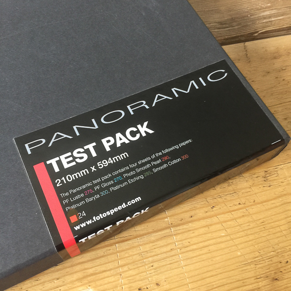
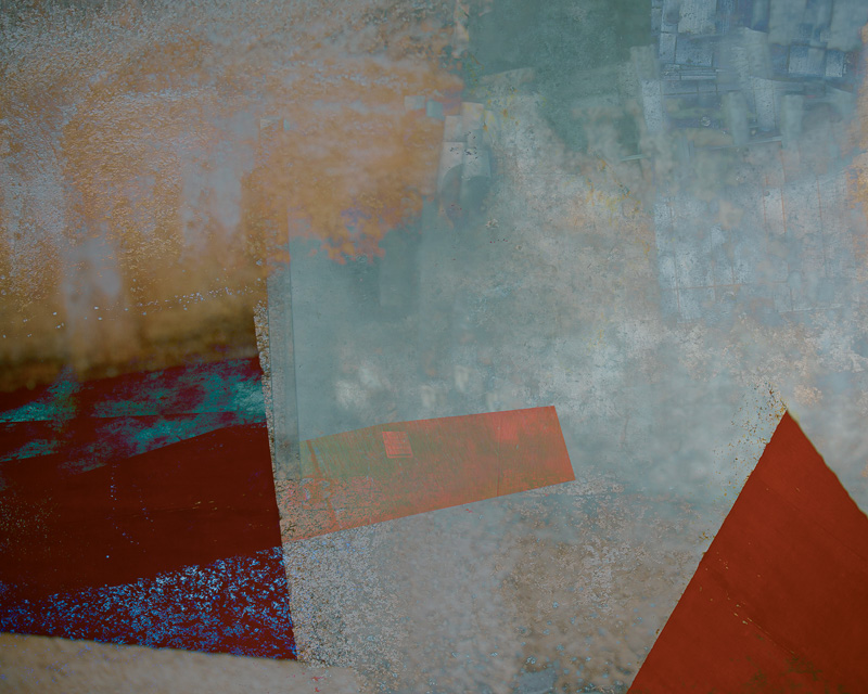
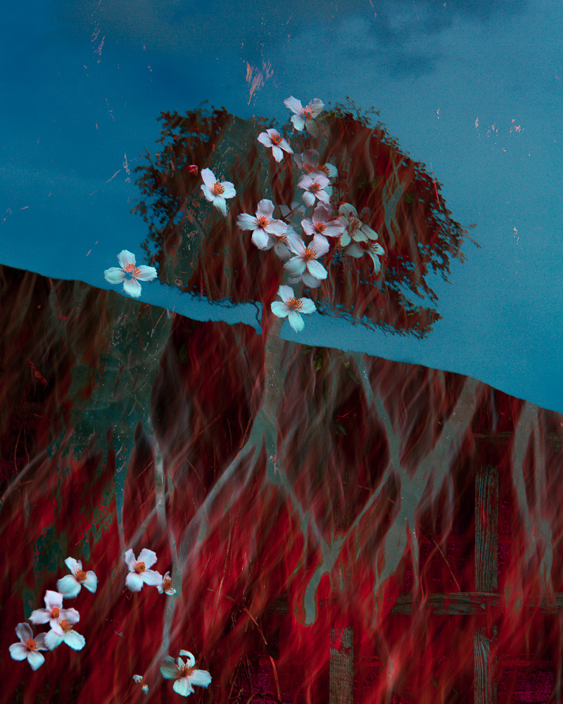
I actually lost count of the iterations we went through, but I was sent, I think, seven batches of paper to test in all. It was the seventh – the paper which has now become the paper I use almost exclusively, Cotton Etching 305 – which I finally gave the approval for to bear my name. The one which met all of the criteria on my list. The only thing in the end I wanted to change, and where Toby had to call a halt, was with the surface texture. If you look very carefully at matt papers you will see a repetition in the texture. This is because it is made by a mechanical process. I asked if this could be randomised. Apparently it could. If the paper was handmade. As you can imagine this would have made it so expensive it wouldn’t have viable and so I had to concede on that one point (and I have to admit I was being very fussy as it is barely noticeable).

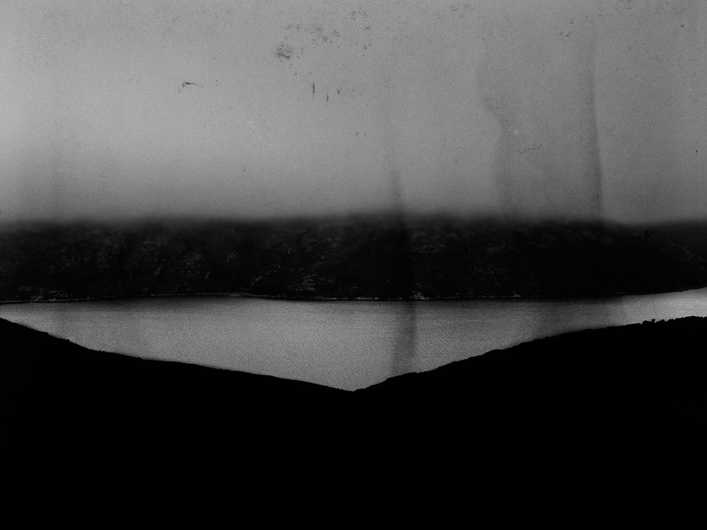
I have to applaud the team at Fotospeed and the people they work with for being able to achieve this. Technically it really is no mean feat. If you are used to printing on fine art matt papers you will know and understand just how tricky they can be at times. How occasionally getting the colours to sing can be difficult. You will also know how hard it can be to get really wonderful rich deep blacks from them is. They can have a tendency to ‘flatten’ our work and give it a milkiness, to almost suck some of the life out of it if we don’t know what we are doing. Even if we do know what we are doing with our printing, with many images getting the colour and contrast right sometimes is just impossible.

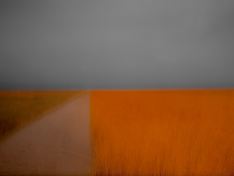
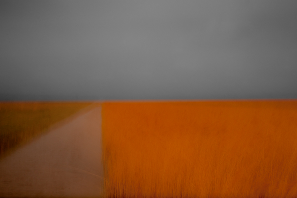
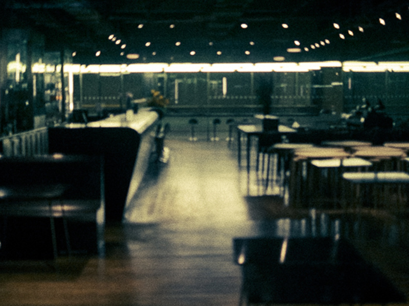
If this has been your experience, I would urge you to try some Cotton Etching 305. I continue to be amazed at how easy it is to print on. I am achieving blacks I have never been able to render on a matt paper before. The colours in my images really sing out like never before. Even with the generic profiles from the Fotospeed website you should get good results. If you use their free customers profile service this will get even better as your colour gamut will widen and the performance of the paper will increase. You may feel I am just over-hyping the paper because the box has my name on it. If so, I would urge you to take a look at THIS REVIEW in Photography News. (quick quote – “The paper’s all-round ability to handle such a wide range of subject matter, contrast range and different degrees of saturation and so capably was a nice surprise. Some textured fine art finishes are less good with rich images with deep blacks, but no such shortcomings here. Apologies if this is all rather gushy, but honestly there wasn’t a print that I was unhappy with so I had little to have a moan at.”)

As for handling of the paper, a couple of tips I can pass on. Firstly, store the boxes flat. This prevents curling on the leading edge which can cause ink to catch and mark the paper. I also use a ‘rocket blower’ to blow over the print surface of the paper to make sure there are no cotton fibres adhering. It is very frustrating to hold up your print to see these drop away leaving a small unprinted area beneath them. It is good to allow the print to cure for at least a few minutes or longer before any extensive handling after printing. Check the colours and contrast over by a window, preferably with bright overcast daylight, rather than side by side at your computer monitor. This is a better test for how beautiful your print is and how it will look when displayed in real life.

I hope you enjoy trying Cotton Etching 305. I now use it for almost every print I make. Valda Bailey and I also use it for virtually all the prints we make for clients in our bespoke printing service for photographers and artists who don’t have their own printer, or who want prints larger than their printer is capable of. (full details of our service HERE).

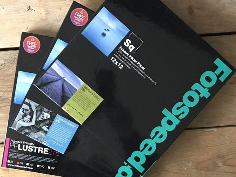
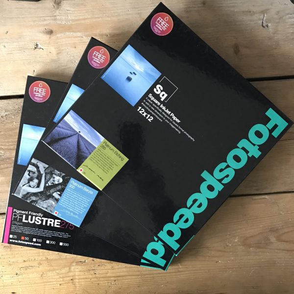
To help you if you would like to try it out, or if you already love it and would like to stock up, the very nice people at Fotospeed have given me a 15% discount code to pass on to you. PLEASE NOTE, this code is only valid for 30 days from Tuesday 24th July 2018 and it should apply not just to Cotton Etching 305 but to all their papers (but why would you want anything other than Cotton Etching now??). Just put your paper in your basket and apply the code on checkout. The discount will only be applied right at the end. DISCOUNT CODE – Doug15NL – I do hope you enjoy using the paper as much as I do. It has changed my printing forever.

And who knows, maybe this year is Newcastle’s year? Howay the lads!

Hyperborea – The Lands of the North.

©Chris Friel – From ‘After’

It is impossible to visit the Hebrides and not be affected by them at some deeply elemental level. A place of ever changing moods, sculpted and formed by the wind and sea over millennia, it carves itself into your soul. At times the white sands of the beaches, the teal and turquoise of the waves seduce and beguile. In a heartbeat, though, she transforms. The islands can become a place of deep and abiding melancholy, of exhilarating storms which purge and restore. No wonder artists, poets, musicians and now, laterly, photographers, have been drawn again and again to ‘Hyperborea’. This mythical location ‘beyond the north wind’, identified by some as the Isle of Lewis.

‘Hyperborea – The Lands of the North’ is the title given to a group exhibition currently on display on Harris & Lewis, at the An Lanntair arts centre in Stornoway, the capital of the Island. Curated by Alex Boyd, it features the work not only of Alex himself (a photographer working in antique processes, striving to capture the essence of the northern lands, his work in the exhibition is entitled ‘Dark Mountains|Silent Islands’) but also the epic, insightful and truly moving work of landscape and documentary photographer Ragnar Axelsson entitled ‘Faces of the North’ along with a moving collection of images by photographic artist Chris Friel.

His contribution to the exhibition, a project comprised of 49 images entitled ‘After’, is a truly heartfelt and moving response to the loss of his dear son, Joe, who took his own life in early 2016 following a struggle with mental illness. Joe loved the Hebrides and so it was to here that Chris returned to make images in just one day in the place they had shared together. Running in conjunction with the images in Chris’s part of the exhibition is a video of images made by Chris on Lewis in August 2017 entitled ‘Still’ accompanied by a piece of music composed in Joes memory by Matthew Herbert, entitled ‘Be Still’ and recorded at the North Sea Jazz Festival on 9 July 2017. You can see the images and listen to the piece HERE

I had the privilege of printing the 49 images which make up Chris Friel’s ‘After’ collection in the exhibition. To work closely with Chris throughout this creative process was an honour. The images are so personal to Chris and it was essential to me that I did my very best to interpret the work exactly as Chris wanted. To give you an insight of the creative process, of how I work with Chris, how we chose the paper we used for the exhibition (in the end, Fotospeed Platinum Baryta) and also how I prepare the images for print in Lightroom, I have created two short videos. These take you through the process from start to finish and I hope you find them both interesting and that you also might learn a few tips from them too to help you with printing your work.


One positive thing that has come from the awful tragedy of Joes death is the fund set up by Chris and his family through the Just Giving website which is dedicated to Joe and is raising funds for the Young Minds Trust, a very worthwhile cause which aims to help young people struggling with mental illness. The families goal was to raise £16000, a £1000 for every year of Joes life, but at the time of writing in October 2017 the generosity of family and friends has raised a wonderful £44,376. Please visit the web page HERE to see a video created by Chris about Joe and to donate to the charity. You can also see the book Chris created with the images in the exhibition along with his personal images from Joes life. Entitled ‘Joe’, and curated with the help of Joseph Wright, it was a beautiful testament to his son. View it HERE. The book is not available for purchase. You can also vote on the Just Giving site for Joes fundraising page to receive recognition with an award. Please vote for it HERE.

You can see the images for the book ‘Joe’, HERE on Chris’s website. The landscape images from the book were then used as the source by Chris as the basis for the exhibition but he did further work on them and you can view the finished work as collection HERE.

I would like to urge you, if you have any chance at all to visit the exhibition, you will not be disappointed. It is on now and runs until 4th November 2017. You can find full details HERE.

You can buy Chris Friel’s prints through my website from THIS PAGE

I would also like to thank the great team at Fotospeed for their help and support throughout preparing for this exhibition.

Working with Fotospeeds New Square Fine Art Papers

Fotospeed

The new Fotospeed 12 x 12 inch square paper range

Many of us love making images in the square format. We either ‘see’ our photographs that way and compose for them in the field, often aided by the clever way many digital cameras these days allow us to display a square mask on the rear view screen. I love this feature and use it all the time on my Fuji X-Pro 2. Shooting in raw, I still have the option back in the studio to use the entire sensor area, but in the field it is so helpful to see the image on the screen cropped square. It makes composition so much easier. (If you shoot in jpeg, the file will be square and the data beyond the boundaries of the square is lost forever).

Printing With Fotospeed’s Panoramic Papers & Creating Custom Paper Templates in Lightroom

Fotospeed Panoramic

20150907-IMG_1369

Fotospeed are the only fine art paper company I am aware of who provide us with custom made panoramic papers. I shoot a lot of panoramas in my work, both combining exposures in software (now a feature of Lightroom CC as well as Photoshop, a welcome development) and by cropping into a single image to a ratio which yields an image with the characteristic panoramic ‘letterbox’ format. I am not a lover of really wide angle lenses having grown tired of the distortion they produce. I prefer, when I want to show the wide sweep of the landscape, to reveal it in a panorama. (I know wide angle lenses can be used to inject drama into images, but again, I am finding myself moving towards quieter, less dramatic images in my work and so I have sold on my super wide lenses now due to lack of use.

Hard Proofing Techniques – A Practical Example

Chris Friel
©Chris Friel

©Chris Friel

Today I had a client order for one of Chris Friels prints (the image above) to prepare and thought it would make a good subject for a blog post on hard proofing techniques.

Chris’s images can be very hard to print. He uses strong colours with low contrast and they look best printed on very matt paper. My paper of choice for most of his work is Fotospeeds superb Platinum Etching – a heavy-weight matt paper with a gentle texture which gives landscapes and many other types of images a beautiful feel and ‘presence’. Matt papers do bring with them challenges though. The matt surface reduces the gamut of colours they can display and so it can often take some work to translate what you are seeing on your screen on to the paper, even with a fully colour managed workflow. You can check out Fotospeeds papers on their website HERE – they are a great company to deal with.

My first experiences with Fotospeed papers & lessons learned about soft proofing

soft proofing

"After Hours"

I have long used Ilford Gallerie Gold Fibre Silk as my paper of choice for my monochrome prints and Hahnemuhle 308 Photorag for most of my colour prints. I was happy with the Ilford, but the Hahnemuhle was causing me issues. Despite being a beautiful paper, with a lovely texture, it frequently got jammed in my Epson R2880 printer or picked up roller pinch marks. I also found, despite being air blown before printing, that it would shed fibres after printing, leaving white areas on the image. It is an expensive paper and these frustrations got the better of me.

Working for Light & Land with Charlie Waite and his team of photographers I saw how they used Fotospeed papers. I went to see Charlie’s exhibition, currently on at the National Theatre in London (If you haven’t been, go, it’s wonderful – allow an hour to enjoy it) and he had printed it all on Fotospeed Platinum Etching 285. I was stunned by the prints, being sure the paper choice had enhanced Charlie’s sublime photographs. I was also aware of Joe Cornish high regard for the Smooth Cotton White 300, printing his work on this paper. This encouraged me to investigate their products further.

My first purchase was Platinum Etching 285. From the first image I printed I was hooked. It ran smoothly in the printer without shedding fibres and the colours and tones were a near perfect match to what I was seeing on my screen. The soft Matt texture was ideal for the style of the image.

The above image "After Hours", printed on Fotospeed Platinum Etching 285

My next print job with Fotospeed papers was more important. Not only was it for a client, rather than a print for myself, but also the images were Chris Friels, rather than my own. I always feel a greater sense of responsibility printing the work of another photographer, trying to realise their vision for the image.

If you are familiar with Chris’s work you will know he uses extreme dark tones and some intense colours. This makes them challenging to print. This job proved to be true to form. The first image I tried was in grey tones with a very slight magenta/lilac tone. This I felt was the easiest of the three, to get me started.

I always print from Lightroom, loving the controls there. I had no worries over the colours so didn’t soft proof the image and went straight to print. It came out bright magenta. And I mean BRIGHT! My immediate thought was a cartridge had run out, throwing off the colour balance. I replaced three cartridges showing low levels and hit print again. Same result!

mmm... Magenta!

Now I was perplexed. I soft proofed the image but apart from an issue with some deep blacks it wasn’t showing any issues. Then I realised I hadn’t downloaded the ICC profile for the Platinum Etching paper from Fotospeed, I had it set to Hahnemuhle 308 PhotoRag. (I’m ashamed to say) That must be it! I remedied that, hit print again. Same problem. Now I was worried. What was going on.

iPhone shot of my computer screen to show what the image SHOULD have looked like!

I decided to follow Fotospeeds printing instructions (Typical man, only refer to the manual as a last resort). Their instructions apply to Photoshop so I decided to give it a try and did to the letter what they recommend. This got to the root of the problem. It reminded me of a bug I read about somewhere. I had 16 bit output checked in my original prints as I am usually printing from tiffs. However this particular image of Chris’s was shot as an 8 bit JPEG. The Fotospeed instructions showed the 16 bit option turned off, this reminded me of the issue so I deselected it. The print was perfect. Lesson learned.

The three stages - On the right the magenta madness, in the centre an improved print but still a magenta cast. On the left the final print (wrapped for dispatch in archive sleeve - but you can see the colours are matching the original image).

I was on a roll now and moved to the second image. This image was made up of extreme colours so I soft proofed in Photoshop. This showed that almost nothing in the image was printable!!! I tried my usual soft proofing techniques to pull the colours into gamut but they were so far out it ruined the image. The colours differed too much from the original and went very flat, losing vibrancy. Not an option. So I tried changing the rendering intent from Perceptive to Relative (see this post for more details on rendering intents) but this didn’t help either.

Hard to see from this iPhone shot but the left image is printed on Platinum Etching 285, a matt paper (with a beautiful texture but narrower gamut capabilities), the print on the right which is on Platinum Baryta was able to cope with the bright, rich reds in the original file. The Etching muted these to a duller more burnt orange with less vibrancy. Showing that paper choice can affect the appearance of the final print colours & contrast.

My next option solved the problem. I switched the paper (And the ICC profile) from Platinum Etching 285, which is a matt paper, to Fotospeeds Platinum Baryta. Why did I do this? Because matt paper is only able to display a very limited range of colours (a gamut of colours) than lustre papers. Gloss papers can display an even wider colour gamut. So if ever you have issues getting the colours right on matt paper, try moving to a lustre or gloss paper (remembering to switch ICC profiles in your print software). Often this will fix the issue. Fotospeeds Baryta paper had a gamut wide enough that I didn’t have to make any colour adjustments in soft proofing. The image printed beautifully.

Then on to the third and final image, another with extreme colours. This time, using the Baryta paper I soft proofed with no issues and it printed first time.

This whole process taught me several lessons. Firstly, I need to always check I have the correct ICC profile loaded for the paper I am using. Secondly, to use soft proofing to check the paper can handle the colour gamut. If the gamut is an issue, to make changes in software or to move to a different paper with the ability to display a wider gamut of colours.

The big lesson for me, though, was how much easier it was to work on the image to get it right for printing in Photoshop. I hate to say this. I have always loved printing from Lightroom and it does print beautifully. I also like how easy it is in Lightroom to set up page layout templates.

However, I found Photoshop is much better at making colour tweaks to an image to pull colours into gamut without spoiling the whole image. You can be very targeted in the colour ranges you work with, whereas Lightroom doesn’t allow you to be as precise. I Also preferred the way Photoshop displays the image with the papers ICC profile applied to simulate the print. The other thing I liked was sizing the print in Photoshop. So I have moved from being a die hard lover of Lightroom for printing to someone who will use Photoshop for tricky prints in future. I guess it is all about personal preferences and also using the right tool for the job. I definitely think that for difficult prints, Photoshop is the tool to use.

Printed on Platinum Etching 285 - Beautiful subtle tones

(One nice feature I will miss from Lightroom if I soft proof in Photoshop is something the soft proof virtual copy does for us. When we soft proof in Lightroom it offers to create a virtual copy if the file with the soft proofing adjustments, so that our master file remains unchanged. A great thing about this virtual copy is that it embeds the ICC paper profile into itself for the paper we are proofing for. Then when you print it automatically communicates this profile to the printer along with the rendering intent you proofed for. This is clever stuff and a benefit of soft proofing in Lightroom)

A lesson I have learned, which explains a lot, since doing this print job concerns the visible gamut warning in Photoshop and Lightroom. I have always used this thinking it was an accurate warning of colours which the printer would be unable to reproduce on my chosen paper. However, I must admit, I have often found (and told my students) it often is best to go ahead and print even if the gamut warning is indicating an issue with some colours as the resulting print is often fine. I put this down to the rendering intent doing a good job at replacing those out of gamut colours with close replacements. However, further reading has revealed that the gamut warning system used by Adobe is rather old and predates ICC colour management. It was designed for a graphic arts based workflow rather than photography and modern fine art printers actually will have no issues rendering those colours. What is actually of more importance now is the contrast ratio of monitors compared to papers. Many monitors are set to a contrast ratio of 500:1 or similar whereas gloss paper is closer to 200:1 with matt and lustre papers running even lower than that. Soft proofing should focus on correcting contrast issues and tweaking colours to bring them back to a correct state in soft proofing with the gamut warning turned off in most cases. I am going to try this and see how I get on.

I have now switched my studio over to using the Fotospeed range of papers exclusively because I have been so impressed with them. I will blog about each type I use as I put them through their paces and I am pleased to be working closely with the guys at Fotospeed too. They are a long established company and really know their stuff.

Another printed on Fotospeed Platinum Etching 285 (and its an ICM image so its supposed to look like that 🙂

Soft proofing is a big subject and will make a huge difference to the quality of your prints. It’s one of the things I cover in my Lightroom and Photoshop workshops and will be dealing with on my print workshops with Master Printer, Jack Lowe. The next Jack Lowe workshop is fully booked but if you would like to go on the no-obligation short list to hear of future dates, please just click THIS LINK TO EMAIL ME.

I am pleased to say that from now on in my Lightroom and Photoshop workshops (which I hold in my home studio) you will go home with a free print on one of Fotospeeds beautiful papers (perhaps one of mine, or one of your own) along with the knowledge of how to make beautiful prints of your own work too.

You will find available workshop dates ON THIS PAGE or, please CLICK THIS LINK and drop me an email if you would like more details or would like to book a one to one session with me.

You can find full details about and buy Fotospeed papers HERE – I recommend you give them a try.