I don’t know about you, but I love to print my favourite images. It seems such a shame that so many images today lie unseen on hard drives, when really an image is not fully realised until it is printed. There is just something about holding a well made print in the hand which brings out the full beauty of an image.
For many, though, printing is a bit of a dark art and there is much confusion about ICC profiles, paper profiles, gamuts and such like that can be daunting. One area that seems to cause confusion and is not well understood by many is ‘rendering intents’.
Before I begin, a disclaimer. I am not a colour scientist, not do I claim to be a world expert on colour management. My understanding is based on my own learning. I am sure there may well be much more to what I explain below and so if you are an expert, please feel free to add some comments below the post to add to (or correct) what I have said. I am keen to learn!
Rendering intents is a system built into ICC profiles that we see in print dialogues and we are asked to make a decision about which one to use. There are four main rendering intents and, in reality, only two are of real interest to us as photographers.
The usual advice we are given is to ‘try both and see which you prefer’ (I have even said this myself), but it is not really a very satisfactory way of working. Much better to understand what they are and what they do, then we can make a well informed decision and understand what effect they will have on the results.
Firstly, its important to say, we are dealing with the fine tuning of colour management here. Often you can print an image using both of the main rendering intents and it is hard for us to see any difference between them. At other times, though, it can make a huge difference to how our final print will look.
So what are they? As I mentioned, they are built in to ICC profiles. These profiles are the way different devices (cameras, computers and printers for example) communicate the colour (Hue, saturation and luminance) of each pixel an image to each other in an effort to maintain colour consistency.
Rendering intents are there for those situations when we have pixels of certain colours in our image which go beyond the capabilities of the ICC colour space we are working in. Briefly, colour spaces are, for example, sRGB or Adobe RGB, and each space is used for a different purpose. sRGB is the space used for monitors and ‘the internet’, for example, it is a smaller colour space than Adobe RGB, capable of displaying far fewer shades of colour. The range of colours a profile can display is galled its ‘Gamut’.
So situations arise where, if your image has a wide range of colours which exceeds those of the colour space you are printing in or exporting to (say, to upload an image to your website) then the profile needs a ‘map’. This map tells it what colours to swap the colours it can’t reproduce for. So, if you have been working in Adobe RGB (or ProPhoto RGB) and now are about to upload an image to your website which requires the file to be converted to sRGB so that it displays properly on the (uncalibrated) monitors of your websites visitors from all over the world, the profile needs to know how to handle these ‘out of gamut’ colours. You might have a green which displays fine in Adobe RGB but isn’t available in sRGB and so the profile asks you to choose a ‘rendering intent’. This is the map which tells it, when it sees this particular shade of green that it can’t display then change it to this other shade of green which it can show.
Its a bit like having a recipe book for Indian food. It might show a list of rare spices but, knowing they may not be available in your country, it says ‘if spice X is unavailable, then spice Y will do nicely’.
Its this ‘nicely’ bit that causes the issue.
Each rendering intent is a different type of map, a different way of substituting one colour for another, and like spices in a curry – we all have our own tastes. Some like them hot, others aromatic and so the substitute choice can be critical. So to make the right choice for us we need to understand how each rendering intent is programmed and how it is likely to affect the results in our images, especially prints or images uploaded to the web.
No rendering intent will be perfect and you can’t really say that one is ideal to use all the time. This is because each is a compromise and will affect the colours in our image differently. Depending on the image and our goals for that image, we need to choose the right intent, or map.
So what are they and what does each one do;
1. Perceptual Intent – This can compress or expand the full gamut of colours in the source profile in order to make them fit into the destination profile. What on earth does that mean in reality? Perceptual intent is designed to maintain the relationships between colours and often gives a more natural look to the final image. It should be noted that this can mean that it also alters colours which are in the destination profiles gamut already (so they don’t actually NEED to change). It does this to maintain the balance between all the colours in the image and to keep everything looking natural.
It should also be noted that each companies perceptual intent mapping in its own ICC profiles are unique to that company, so the same image put through different company profiles using this intent can produce quite different results.
Perceptual Intent, then, is often the best one to use if both saturation and the relationship between colours is of primary concern to us.
2.The second and other most common intent (indeed Adobe Lightroom ONLY allows a choice between Perceptual and Relative Colourmetric intents) is Relative Colourmetric Intent. This does not allow colours which are in gamut in the destination profile to be changed, they must stay unaltered. It only alters out of gamut colours. Additionally, it only alters these just enough to bring them in to gamut so the relationship between colours in our images change. (Most natural colours which have not been enhanced or played with too much in software, will fit into the gamut of inkjet printers – it is mainly colours which we have enhanced which cause issues).
This rendering intent does not reduce saturation, whereas Perceptual intent can. However, this intent can drastically alter the way an image looks to our eyes as regards the way the colours relate to each other.
Relative Intent is often the best to use if tonal relationships are more important to us in the image then the exact colours, and certainly in black and white printing this is probably the case.
(if you are making a big jump, from ProPhoto to sRGB profiles then, even if the profile offers you two choices of rendering intent, in actual fact it will only use Relative Colourmetric to do the mapping of out of gamut colours).
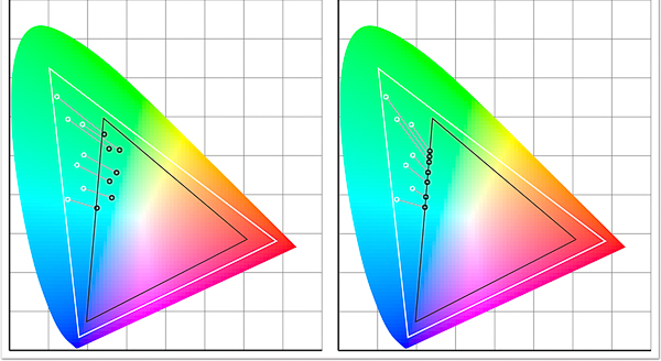
In the illustration above you can see an approximation of what is happening with each rendering intent. The white dots are the colours in the original image profile which are out of gamut in the destination profile. The lines lead from them showing how each is mapped into the new profile resulting in the destination colour at the black dot. In the left illustration we can see the Perceptual Intent at work. Notice how the colours all maintain their relationships to each other (spacings) for a natural look. In the right hand image we see the effect of Relative Intent mapping the colours. They are only pulled as far as each needs to be pulled to just get them in gamut and this alters how they look in relationship to each other.
It might seem from this that Perceptual is the logical choice in all situations, but it isn’t. Sometimes Relative does a more effective job, especially where tonality is more important.
The other two intents which are of less interest to us are
3.Saturation Intent – This is designed to give priority, as you would expect, to saturation of colour but in doing so, to get colours into a new gamut, will sacrifice hue and lightness of colours. It is of most use in technical printing when hue and lightness are not really important, but when saturation is, such as when printing mathematical charts and graphs.
4. Absolute Colourmetric Rendering Intent – This is a tricky one to describe but bases its calculations on the white point. It is used, for example, when converting to CMYK for images to be printed on papers which are below bright white (maybe a bit yellowy) and so it can show the effect of this on colours. Not generally something we, as photographers, have to worry about. But it is something that graphic designers and printers lay awake at night worrying about.
After all this is said, the only real way to know which is best for a particular image is to soft proof it in both relative and perceptual intents and choose the one we prefer for that image. In some cases the difference will be hard to see, in others it will be huge.
I hope this helps you understand a bit more about rendering intents and the need for us to focus on perceptual and relative intents in our work as photographers.
Remember – Perceptual is all about maintaining colour balance and saturation (and I think you will find in most colour photography this is the one you will find works best as it keeps your image as close to how you intended it to look as possible in most cases). Relative is more focused on tonal relationships and so will probably be your choice when printing in black and white or when printing in colour when the tones are more important than the exact shades.
(P.S. I will to be running another Print Masterclass workshop with master printer Jack Lowe in the New Year. These run over two days with Jack and I helping you to really understand and master colour management, soft proofing and printing. Jack has been a printer for over 15 years and is recognised world-wide as a master of his trade, used by many artists and professional fine art photographers for printing their work for exhibitions and portfolios. If you would like to join the no obligation shortlist, please just CLICK HERE to email me and I will add you to the list.)

