Tag: lightroom

Working with Fotospeeds New Square Fine Art Papers

Fotospeed

The new Fotospeed 12 x 12 inch square paper range

Many of us love making images in the square format. We either ‘see’ our photographs that way and compose for them in the field, often aided by the clever way many digital cameras these days allow us to display a square mask on the rear view screen. I love this feature and use it all the time on my Fuji X-Pro 2. Shooting in raw, I still have the option back in the studio to use the entire sensor area, but in the field it is so helpful to see the image on the screen cropped square. It makes composition so much easier. (If you shoot in jpeg, the file will be square and the data beyond the boundaries of the square is lost forever).

Sleeklens Landscape Plugin Review

Sleeklens

I was contacted recently by sleeklens.com who asked me to put one of their plugin packs for Adobe Photoshop through its paces. They make plugins for all types of photography, particularly portraiture and architecture but they also have a pack designed for landscape photographers so it seemed appropriate to give that a try. I opted for the Photoshop version, although they do a Lightroom version of all their plugins too for those who like to keep their workflows just within the Lightroom environment.

Printing With Fotospeed’s Panoramic Papers & Creating Custom Paper Templates in Lightroom

Fotospeed Panoramic

20150907-IMG_1369

Fotospeed are the only fine art paper company I am aware of who provide us with custom made panoramic papers. I shoot a lot of panoramas in my work, both combining exposures in software (now a feature of Lightroom CC as well as Photoshop, a welcome development) and by cropping into a single image to a ratio which yields an image with the characteristic panoramic ‘letterbox’ format. I am not a lover of really wide angle lenses having grown tired of the distortion they produce. I prefer, when I want to show the wide sweep of the landscape, to reveal it in a panorama. (I know wide angle lenses can be used to inject drama into images, but again, I am finding myself moving towards quieter, less dramatic images in my work and so I have sold on my super wide lenses now due to lack of use.

Hard Proofing Techniques – A Practical Example

Chris Friel
©Chris Friel

©Chris Friel

Today I had a client order for one of Chris Friels prints (the image above) to prepare and thought it would make a good subject for a blog post on hard proofing techniques.

Chris’s images can be very hard to print. He uses strong colours with low contrast and they look best printed on very matt paper. My paper of choice for most of his work is Fotospeeds superb Platinum Etching – a heavy-weight matt paper with a gentle texture which gives landscapes and many other types of images a beautiful feel and ‘presence’. Matt papers do bring with them challenges though. The matt surface reduces the gamut of colours they can display and so it can often take some work to translate what you are seeing on your screen on to the paper, even with a fully colour managed workflow. You can check out Fotospeeds papers on their website HERE – they are a great company to deal with.

My first experiences with Fotospeed papers & lessons learned about soft proofing

soft proofing

"After Hours"

I have long used Ilford Gallerie Gold Fibre Silk as my paper of choice for my monochrome prints and Hahnemuhle 308 Photorag for most of my colour prints. I was happy with the Ilford, but the Hahnemuhle was causing me issues. Despite being a beautiful paper, with a lovely texture, it frequently got jammed in my Epson R2880 printer or picked up roller pinch marks. I also found, despite being air blown before printing, that it would shed fibres after printing, leaving white areas on the image. It is an expensive paper and these frustrations got the better of me.

Working for Light & Land with Charlie Waite and his team of photographers I saw how they used Fotospeed papers. I went to see Charlie’s exhibition, currently on at the National Theatre in London (If you haven’t been, go, it’s wonderful – allow an hour to enjoy it) and he had printed it all on Fotospeed Platinum Etching 285. I was stunned by the prints, being sure the paper choice had enhanced Charlie’s sublime photographs. I was also aware of Joe Cornish high regard for the Smooth Cotton White 300, printing his work on this paper. This encouraged me to investigate their products further.

My first purchase was Platinum Etching 285. From the first image I printed I was hooked. It ran smoothly in the printer without shedding fibres and the colours and tones were a near perfect match to what I was seeing on my screen. The soft Matt texture was ideal for the style of the image.

The above image "After Hours", printed on Fotospeed Platinum Etching 285

My next print job with Fotospeed papers was more important. Not only was it for a client, rather than a print for myself, but also the images were Chris Friels, rather than my own. I always feel a greater sense of responsibility printing the work of another photographer, trying to realise their vision for the image.

If you are familiar with Chris’s work you will know he uses extreme dark tones and some intense colours. This makes them challenging to print. This job proved to be true to form. The first image I tried was in grey tones with a very slight magenta/lilac tone. This I felt was the easiest of the three, to get me started.

I always print from Lightroom, loving the controls there. I had no worries over the colours so didn’t soft proof the image and went straight to print. It came out bright magenta. And I mean BRIGHT! My immediate thought was a cartridge had run out, throwing off the colour balance. I replaced three cartridges showing low levels and hit print again. Same result!

mmm... Magenta!

Now I was perplexed. I soft proofed the image but apart from an issue with some deep blacks it wasn’t showing any issues. Then I realised I hadn’t downloaded the ICC profile for the Platinum Etching paper from Fotospeed, I had it set to Hahnemuhle 308 PhotoRag. (I’m ashamed to say) That must be it! I remedied that, hit print again. Same problem. Now I was worried. What was going on.

iPhone shot of my computer screen to show what the image SHOULD have looked like!

I decided to follow Fotospeeds printing instructions (Typical man, only refer to the manual as a last resort). Their instructions apply to Photoshop so I decided to give it a try and did to the letter what they recommend. This got to the root of the problem. It reminded me of a bug I read about somewhere. I had 16 bit output checked in my original prints as I am usually printing from tiffs. However this particular image of Chris’s was shot as an 8 bit JPEG. The Fotospeed instructions showed the 16 bit option turned off, this reminded me of the issue so I deselected it. The print was perfect. Lesson learned.

The three stages - On the right the magenta madness, in the centre an improved print but still a magenta cast. On the left the final print (wrapped for dispatch in archive sleeve - but you can see the colours are matching the original image).

I was on a roll now and moved to the second image. This image was made up of extreme colours so I soft proofed in Photoshop. This showed that almost nothing in the image was printable!!! I tried my usual soft proofing techniques to pull the colours into gamut but they were so far out it ruined the image. The colours differed too much from the original and went very flat, losing vibrancy. Not an option. So I tried changing the rendering intent from Perceptive to Relative (see this post for more details on rendering intents) but this didn’t help either.

Hard to see from this iPhone shot but the left image is printed on Platinum Etching 285, a matt paper (with a beautiful texture but narrower gamut capabilities), the print on the right which is on Platinum Baryta was able to cope with the bright, rich reds in the original file. The Etching muted these to a duller more burnt orange with less vibrancy. Showing that paper choice can affect the appearance of the final print colours & contrast.

My next option solved the problem. I switched the paper (And the ICC profile) from Platinum Etching 285, which is a matt paper, to Fotospeeds Platinum Baryta. Why did I do this? Because matt paper is only able to display a very limited range of colours (a gamut of colours) than lustre papers. Gloss papers can display an even wider colour gamut. So if ever you have issues getting the colours right on matt paper, try moving to a lustre or gloss paper (remembering to switch ICC profiles in your print software). Often this will fix the issue. Fotospeeds Baryta paper had a gamut wide enough that I didn’t have to make any colour adjustments in soft proofing. The image printed beautifully.

Then on to the third and final image, another with extreme colours. This time, using the Baryta paper I soft proofed with no issues and it printed first time.

This whole process taught me several lessons. Firstly, I need to always check I have the correct ICC profile loaded for the paper I am using. Secondly, to use soft proofing to check the paper can handle the colour gamut. If the gamut is an issue, to make changes in software or to move to a different paper with the ability to display a wider gamut of colours.

The big lesson for me, though, was how much easier it was to work on the image to get it right for printing in Photoshop. I hate to say this. I have always loved printing from Lightroom and it does print beautifully. I also like how easy it is in Lightroom to set up page layout templates.

However, I found Photoshop is much better at making colour tweaks to an image to pull colours into gamut without spoiling the whole image. You can be very targeted in the colour ranges you work with, whereas Lightroom doesn’t allow you to be as precise. I Also preferred the way Photoshop displays the image with the papers ICC profile applied to simulate the print. The other thing I liked was sizing the print in Photoshop. So I have moved from being a die hard lover of Lightroom for printing to someone who will use Photoshop for tricky prints in future. I guess it is all about personal preferences and also using the right tool for the job. I definitely think that for difficult prints, Photoshop is the tool to use.

Printed on Platinum Etching 285 - Beautiful subtle tones

(One nice feature I will miss from Lightroom if I soft proof in Photoshop is something the soft proof virtual copy does for us. When we soft proof in Lightroom it offers to create a virtual copy if the file with the soft proofing adjustments, so that our master file remains unchanged. A great thing about this virtual copy is that it embeds the ICC paper profile into itself for the paper we are proofing for. Then when you print it automatically communicates this profile to the printer along with the rendering intent you proofed for. This is clever stuff and a benefit of soft proofing in Lightroom)

A lesson I have learned, which explains a lot, since doing this print job concerns the visible gamut warning in Photoshop and Lightroom. I have always used this thinking it was an accurate warning of colours which the printer would be unable to reproduce on my chosen paper. However, I must admit, I have often found (and told my students) it often is best to go ahead and print even if the gamut warning is indicating an issue with some colours as the resulting print is often fine. I put this down to the rendering intent doing a good job at replacing those out of gamut colours with close replacements. However, further reading has revealed that the gamut warning system used by Adobe is rather old and predates ICC colour management. It was designed for a graphic arts based workflow rather than photography and modern fine art printers actually will have no issues rendering those colours. What is actually of more importance now is the contrast ratio of monitors compared to papers. Many monitors are set to a contrast ratio of 500:1 or similar whereas gloss paper is closer to 200:1 with matt and lustre papers running even lower than that. Soft proofing should focus on correcting contrast issues and tweaking colours to bring them back to a correct state in soft proofing with the gamut warning turned off in most cases. I am going to try this and see how I get on.

I have now switched my studio over to using the Fotospeed range of papers exclusively because I have been so impressed with them. I will blog about each type I use as I put them through their paces and I am pleased to be working closely with the guys at Fotospeed too. They are a long established company and really know their stuff.

Another printed on Fotospeed Platinum Etching 285 (and its an ICM image so its supposed to look like that 🙂

Soft proofing is a big subject and will make a huge difference to the quality of your prints. It’s one of the things I cover in my Lightroom and Photoshop workshops and will be dealing with on my print workshops with Master Printer, Jack Lowe. The next Jack Lowe workshop is fully booked but if you would like to go on the no-obligation short list to hear of future dates, please just click THIS LINK TO EMAIL ME.

I am pleased to say that from now on in my Lightroom and Photoshop workshops (which I hold in my home studio) you will go home with a free print on one of Fotospeeds beautiful papers (perhaps one of mine, or one of your own) along with the knowledge of how to make beautiful prints of your own work too.

You will find available workshop dates ON THIS PAGE or, please CLICK THIS LINK and drop me an email if you would like more details or would like to book a one to one session with me.

You can find full details about and buy Fotospeed papers HERE – I recommend you give them a try.

What Are ‘Rendering Intents’ and How Should I Use Them?

Rendering Intents

I don’t know about you, but I love to print my favourite images. It seems such a shame that so many images today lie unseen on hard drives, when really an image is not fully realised until it is printed. There is just something about holding a well made print in the hand which brings out the full beauty of an image.

For many, though, printing is a bit of a dark art and there is much confusion about ICC profiles, paper profiles, gamuts and such like that can be daunting. One area that seems to cause confusion and is not well understood by many is ‘rendering intents’.

Before I begin, a disclaimer. I am not a colour scientist, not do I claim to be a world expert on colour management. My understanding is based on my own learning. I am sure there may well be much more to what I explain below and so if you are an expert, please feel free to add some comments below the post to add to (or correct) what I have said. I am keen to learn!

Rendering intents is a system built into ICC profiles that we see in print dialogues and we are asked to make a decision about which one to use. There are four main rendering intents and, in reality, only two are of real interest to us as photographers.

The usual advice we are given is to ‘try both and see which you prefer’ (I have even said this myself), but it is not really a very satisfactory way of working. Much better to understand what they are and what they do, then we can make a well informed decision and understand what effect they will have on the results.

Firstly, its important to say, we are dealing with the fine tuning of colour management here. Often you can print an image using both of the main rendering intents and it is hard for us to see any difference between them. At other times, though, it can make a huge difference to how our final print will look.

So what are they? As I mentioned, they are built in to ICC profiles. These profiles are the way different devices (cameras, computers and printers for example) communicate the colour (Hue, saturation and luminance) of each pixel an image to each other in an effort to maintain colour consistency.

Rendering intents are there for those situations when we have pixels of certain colours in our image which go beyond the capabilities of the ICC colour space we are working in. Briefly, colour spaces are, for example, sRGB or Adobe RGB, and each space is used for a different purpose. sRGB is the space used for monitors and ‘the internet’, for example, it is a smaller colour space than Adobe RGB, capable of displaying far fewer shades of colour. The range of colours a profile can display is galled its ‘Gamut’.

So situations arise where, if your image has a wide range of colours which exceeds those of the colour space you are printing in or exporting to (say, to upload an image to your website) then the profile needs a ‘map’. This map tells it what colours to swap the colours it can’t reproduce for. So, if you have been working in Adobe RGB (or ProPhoto RGB) and now are about to upload an image to your website which requires the file to be converted to sRGB so that it displays properly on the (uncalibrated) monitors of your websites visitors from all over the world, the profile needs to know how to handle these ‘out of gamut’ colours. You might have a green which displays fine in Adobe RGB but isn’t available in sRGB and so the profile asks you to choose a ‘rendering intent’. This is the map which tells it, when it sees this particular shade of green that it can’t display then change it to this other shade of green which it can show.

Its a bit like having a recipe book for Indian food. It might show a list of rare spices but, knowing they may not be available in your country, it says ‘if spice X is unavailable, then spice Y will do nicely’.

Its this ‘nicely’ bit that causes the issue.

Each rendering intent is a different type of map, a different way of substituting one colour for another, and like spices in a curry – we all have our own tastes. Some like them hot, others aromatic and so the substitute choice can be critical. So to make the right choice for us we need to understand how each rendering intent is programmed and how it is likely to affect the results in our images, especially prints or images uploaded to the web.

No rendering intent will be perfect and you can’t really say that one is ideal to use all the time. This is because each is a compromise and will affect the colours in our image differently. Depending on the image and our goals for that image, we need to choose the right intent, or map.

So what are they and what does each one do;

1. Perceptual Intent – This can compress or expand the full gamut of colours in the source profile in order to make them fit into the destination profile. What on earth does that mean in reality? Perceptual intent is designed to maintain the relationships between colours and often gives a more natural look to the final image. It should be noted that this can mean that it also alters colours which are in the destination profiles gamut already (so they don’t actually NEED to change). It does this to maintain the balance between all the colours in the image and to keep everything looking natural.

It should also be noted that each companies perceptual intent mapping in its own ICC profiles are unique to that company, so the same image put through different company profiles using this intent can produce quite different results.

Perceptual Intent, then, is often the best one to use if both saturation and the relationship between colours is of primary concern to us.

2.The second and other most common intent (indeed Adobe Lightroom ONLY allows a choice between Perceptual and Relative Colourmetric intents) is Relative Colourmetric Intent. This does not allow colours which are in gamut in the destination profile to be changed, they must stay unaltered. It only alters out of gamut colours. Additionally, it only alters these just enough to bring them in to gamut so the relationship between colours in our images change. (Most natural colours which have not been enhanced or played with too much in software, will fit into the gamut of inkjet printers – it is mainly colours which we have enhanced which cause issues).

This rendering intent does not reduce saturation, whereas Perceptual intent can. However, this intent can drastically alter the way an image looks to our eyes as regards the way the colours relate to each other.

Relative Intent is often the best to use if tonal relationships are more important to us in the image then the exact colours, and certainly in black and white printing this is probably the case.

(if you are making a big jump, from ProPhoto to sRGB profiles then, even if the profile offers you two choices of rendering intent, in actual fact it will only use Relative Colourmetric to do the mapping of out of gamut colours).

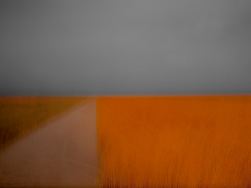
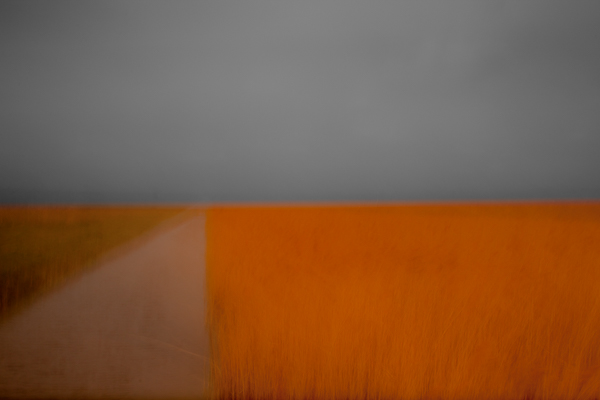
In the illustration above you can see an approximation of what is happening with each rendering intent. The white dots are the colours in the original image profile which are out of gamut in the destination profile. The lines lead from them showing how each is mapped into the new profile resulting in the destination colour at the black dot. In the left illustration we can see the Perceptual Intent at work. Notice how the colours all maintain their relationships to each other (spacings) for a natural look. In the right hand image we see the effect of Relative Intent mapping the colours. They are only pulled as far as each needs to be pulled to just get them in gamut and this alters how they look in relationship to each other.

It might seem from this that Perceptual is the logical choice in all situations, but it isn’t. Sometimes Relative does a more effective job, especially where tonality is more important.

The other two intents which are of less interest to us are

3.Saturation Intent – This is designed to give priority, as you would expect, to saturation of colour but in doing so, to get colours into a new gamut, will sacrifice hue and lightness of colours. It is of most use in technical printing when hue and lightness are not really important, but when saturation is, such as when printing mathematical charts and graphs.

4. Absolute Colourmetric Rendering Intent – This is a tricky one to describe but bases its calculations on the white point. It is used, for example, when converting to CMYK for images to be printed on papers which are below bright white (maybe a bit yellowy) and so it can show the effect of this on colours. Not generally something we, as photographers, have to worry about. But it is something that graphic designers and printers lay awake at night worrying about.

After all this is said, the only real way to know which is best for a particular image is to soft proof it in both relative and perceptual intents and choose the one we prefer for that image. In some cases the difference will be hard to see, in others it will be huge.

I hope this helps you understand a bit more about rendering intents and the need for us to focus on perceptual and relative intents in our work as photographers.

Remember – Perceptual is all about maintaining colour balance and saturation (and I think you will find in most colour photography this is the one you will find works best as it keeps your image as close to how you intended it to look as possible in most cases). Relative is more focused on tonal relationships and so will probably be your choice when printing in black and white or when printing in colour when the tones are more important than the exact shades.

(P.S. I will to be running another Print Masterclass workshop with master printer Jack Lowe in the New Year. These run over two days with Jack and I helping you to really understand and master colour management, soft proofing and printing. Jack has been a printer for over 15 years and is recognised world-wide as a master of his trade, used by many artists and professional fine art photographers for printing their work for exhibitions and portfolios. If you would like to join the no obligation shortlist, please just CLICK HERE to email me and I will add you to the list.)

Creative Photography Webinars with Onlandscape

Creative Photography Webinars

I made three hour long videos for OnLandscape magazine in 2013 and they are now available via YouTube.

I have collected them together here for you to watch (and enjoy?)

Part I – a discussion of my creative/alternative technique images and approach (the echo on Tim’s mike is removed after about a minute)

Part II – A session filmed with me working live in the field showing camera techniques

Part III – The final video where I demonstrate my Adobe Lightroom and Photoshop techniques for processing these types of images

I hope you find these videos useful.

How do I create Panoramas?

Panoramas

Before getting in to answering this question I just wanted to mention I am running a “Capture-to-Computer” workshop in Skegness, Lincolnshire on Saturday 21st January 2012. One place is taken but there is one free place left. The basis of the workshop is creative and artistic photography – blur, ICM (Intentional Camera Movement) and textures. The morning will be spent with me showing you the techniques for shooting this style of image and then after a meal (included) I will spend the second half of the workshop showing you how to process these images in Lightroom and Photoshop. If you would like to book the second place the price is £149. Please drop me a message and I will organise it for you. Right, now on with the business of making panoramas!

I love panoramic images and with modern digital cameras and software they are easy to make. I find myself rejecting the use of super wide lenses in favour of making panoramas more and more in my photography. I am not keen on the heavy distortion that comes with the super wides and the converging verticals they create. With a panorama I can get in even more width and maintain a natural looking image with far less distortion.

You can by purpose made panoramic tripod heads, such as the Panosaurus, which are designed to rotate the camera on the ‘nodal point’. If the camera is rotated while held on this point and kept absolutely level will allow it to create almost perfect panoramas with little distortion and a very natural look. However the heads are expensive and you either have to have them fitted to a dedicated tripod or be prepared to switch heads in the field, and few of us are that dedicated or have the backpack space to carry two tripod heads.

There are two very acceptable alternatives which are ideal for most of us and I use both in my image making. I will cover both methods here. You can use a tilt and shift lens (the expensive but easier option) or you can use a standard prime or zoom lens. Both require stitching images together in software and both produce great images if done carefully.

So, if you want to make high quality panoramas, how should you go about it? The first step is to get your tripod as level as possible and make sure the camera is as level as possible on the head. This is far better than angling the camera slightly upwards or downwards. The more our of level the tripod and camera are, the more distorted the final image and the area you will need to crop away from the edges of the pano will be larger. I use the small round level bubble on the top of my tripod below the head to level the tripod itself. This can be fiddly as you need to tweak the leg lengths to get it right but it is worth doing. I then level the camera on the head using my hotshot spirit level.

Next is getting the settings in the camera right before you start shooting. It is critical that nothing changes between shots or you will not be able to seamlessly stitch the image. Turn off auto focusing on your lens so the focus point does not change between shots. Switch the white balance to daylight so it doesn’t alter between shots. Zoom out further than you want to to allow for cropping the stitched image which you will have to do to a greater or lesser extent. Don’t frame the image as you want it to finally appear as some of the edges will be lost. Start the panorama further to the left or right than you want to for the same reason. I use the camera in portrait orientation for panoramas to give a larger file size and more depth for cropping (unless I am using a tilt and shift lens, but I will come to that later).

Working in aperture priority or manual, choose one area of the pano to set your exposure and focus. The exposure is often the tricky part, especially around dawn and dusk or when the scene has high contrast. I tend to aim to set my exposure based on the area of the pano which is almost the brightest. I take a test shot to get the histogram across to the right. You have to accept then, that as the camera moves to wares the darker area of the pano it will begin to under expose but we can tweak this later in the software to balance the image. I set my neutral density graduated filters for the same frame as the one I use to set the exposure. You have to accept that as you take the other frames the positioning of the grad may not be quite perfect, especially if the land rises or falls across the width of the range of shots but it will look worse if you try and move the grad up and down for each image. (I prefer to use soft grads for panos to make the transition line less obvious).Do not use a polarising filter when doing panos as this will cause havoc with the look of each frame and you won’t be able to stitch the images acceptably. Focus hyper focally or on a point very close to the base of the frame. I usually use f16 for panoramas to give a bit more latitude on depth of field, whereas in my other landscape work I am usually trying to get the aperture to f13 or f11.

Once you are all set up rotate the camera to the left or right hand end of the pano sequence. Remember go further left, or right, than you want to include in the final image you have in mind. I then take a single shot with my hand in front of the lens with my thumb up. This tells me the next image is the start of a pano sequence. Once I have taken the final shot in the sequence I take another with my thumb down. This indicates the end of a sequence. Believe me, you will be pleased you did when you get home as it can be hard to tell which images are for panos.

Take the first shot and then rotate the camera for the next as quickly as possible. The absolutely critical thing to remember is to overlap each frame by at least 30%. It is better to overlap by 50% than to go lower than 30%. The more data and overlap Photoshop has to work with the better the quality of the panorama you will get. The reason for working quickly during the sequence shooting is to minimise movement of objects in the pano. Anything moving makes it harder for the software to do the stitch, so scudding clouds, branches of trees blowing in the wind and so on can cause issues.

Don’t forget, panoramas don’t have to be horizontal. For a really different type of image use the same system but shoot vertically. Vertical panoramas look great on the wall.

Back at home on the computer there is some very specific things you can do to make the panorama stitching go well. I use Lightroom to work on my raw files so the screenshots below will show that, along with Photoshop for the stitching but Elements works in just the same way although the menu items might be in slightly different places. You can also get specific panorama stitching software but I have never used this so can’t comment on it.

Import the raw files into Lightroom. Do not allow the import dialog box to apply any changes to the images on import such as adjusting white balance or applying some preset as this will make stitching difficult or impossible to do seamlessly. It is vital you don’t do any work on them whatsoever before they are stitched. Find the sequence of images and shift click to elect them (this is when the thumbs up and thumbs down shots are a big help, but obviously don’t include them in the stitch!). Right click the selected images and select Edit in >> Merge to panorama in Photoshop. (see screenshot below)


This will open Photoshop (or Elements) with the following dialog box open


On the left hand side select the Auto  radio button and in the centre area of the window you will see the list of raw files you are using. Click OK. Now just leave Photoshop to do its thing. It will take a while depending on how many raw files you are stitching and how fast your computer is. On slower machines you will have tome to go and make coffee :).

Once stitched the image will look something like this;

Now you can see why cropping is required. In the layers panel you can see how Photoshop has stacked the three images and then masked them to achieve the stitch. The next step is to flatten the layers and then crop the image to the panoramic shape, losing all of the irregular edges. I then save this image as a tiff (or psd, if you prefer) and take it back into Lightroom. Now you can start making adjustments to the exposure, contrast, clarity and so on because now it will be across the whole image and will look right.

Once you have made the adjustments you want in Lightroom, move the image back to Photoshop for any final tweaks and adjustments there, and you are done.

The process is identical with Tilt and Shift lenses, with a few differences. Firstly, when doing horizontal panos you keep the camera in Landscape orientation. You make the sequence of images by using the shift mechanism and make three images, one shifted all the way to the left, one in the centre position and the final one shifted all the way to the right. All the information above about levelling and camera settings still apply and the stitching process is identical, you just need the three shots. The advantage of this method is the overlap the TSE lens produces is way beyond 30% so the stitch works well and the amount that needs to be cropped away is usually less as the lens tends to give a clean stitch if the tripod and camera have been set level.


So, why not have a go next time you are out with your camera. They are great fun to make and can be quite addictive. Enjoy!


New Digital Photography Workshops for Winter/Spring 2012

digital workshop

Here is the new winter/spring 2012 workshop schedule for my digital photography workshops.

I am introducing a range of new workshops and locations for 2012. You will also see I have teamed up with two more very talented photographers as co-leaders on some special locations. I will be posting full details of these workshops on my website in a few days time and soon you will be able to book and pay online via PayPal. Direct booking via email will still be available.

As a special offer for the new season I am offering the first ten who book and pay their deposits a 10% discount off of the cost of a workshop in the schedule. This does not apply to Capture-to-Computer workshops but will apply to one-to-ones. (just four reduced places now remaining)

If your family or friends are struggling to buy the perfect gift for you, why not suggest they buy you one of my gift vouchers. They can select any value they wish from £10 upwards and it can be redeemed against any workshop, one-to-one or Capture-to-Computer workshop of your choice. If the value of the vooucher exceeds your chosen workshop I will refund the difference or it can be credited towards another workshop. If the workshop exceeds the value of the voucher you can use it in part payment. I even send you a blank greetings card with the voucher with one of my images on for you to present the gift to a loved one.

JANUARY

6th & 7th – ‘Coast & Castles’ Northumberland, with Antony Spencer (now a Light & Land tour leader). Two days photographing the spectacular coast of Northumberland so beloved of photographers like Joe Cornish, including three castle locations. £149 per day or £125 per day if booking both days. Includes breakfast. Does not include accomodation.

13th – Capture-to-Computer’, Yorkshire Coast, Yorkshire Limited to two people & includes breakfast. £149 per person

16th – Black & White Landscapes, Peak District. Includes processing in Silver EfEx Pro & Photoshop. Includes breakfast. £70 per person

22nd – Beginners introduction to your camera, Clumber Park, Nottinghamshire. Three hours approx. Any camera no matter how basic. £35 per person

23rd – Complex Compositions – Bole HIll Quarry, Peak District. Includes breakfast. £70 per person

30th – Peak District (New Locations) includes breakfast. £70 per person

FEBRUARY

11th – Lakeland Landscapes. A day spent photographing classic lakeland locations. Includes breakfast. £70 per person.

18th – Northumberland. A day photographing the finest coastal locations in Northumberland. Includes breakfast. £70 per person.

24th – Capture-to-Computer, Somerset coast. Limited to two people and includes breakfast. £149 per person

25th – Black & White Photography, including long exposures, with co-leader & mono specialist, Paul Wheeler. Weston-Super-Mare. Inlcudes breakfast & ‘how-to’ pdf’s. £99 per person.

29th – Peak District Landscapes, Half day, including refreshments. £45 per person.

MARCH

3rd – North East Coast – Nature & Industry – Saltburn & Paddys Hole. £70 per person including breakfast

5th – Peak Woodlands, Bole Hill Quarry. Includes breakfast. £70 per person

9th – Capture-to-Computer – Yorkshire Coast for Seascapes & Long Exposures. Includes breakfast. Limited to two people. £149 per person

10th – Long Exposures, Yorkshire Coast with long exposure specialist, Noel Clegg. Includes breakfast. £99 per person.

17th – Capture-to-Computer, Spurn Point, Yorkshire. Limited to two people, includes breakfast. £149 per person.

18th – Beginners introduction to your camera, Clumber Park, Nottinghamshire. Three hours approx. Any camera no matter how basic. £35 per person

APRIL

2nd – Peak District Landscapes, with Antony Spencer. £125 per person, includes breakfast.

3rd – Peak District Landscapes, with Antony Spencer. £125 per person, includes breakfast.

10th – Private macro workshop for members of the Nottingham Photographic Society.

13th – Bole Hill Quarry, Peak District woodland landscapes, half day, including refreshments. £45 per person

22nd – Peak Landscapes, half day to sunset, including refreshments. £45 per person

28th – Bluebells in Ashridge Forest, Buckinghamshire with co-leader Tim Smalley. Includes breakfast. £99 per person.

I look forward to seeing you on a workshop soon

Best wishes

Doug

Some recent testimonials from customers;

“Just wanted to say a huge thank you for a fantastic weekend!”

“I thought all the venues were spot on and enjoyed the fact that both of you brought so many different skills and knowledge to the event.”

“Since I started doing “serious” photography about 7 or 8 years ago I’ve been on at least half-a-dozen workshops or courses. I gained more from this one day than I have from all the others put together.”

How do I put a watermark on my photos?

I get asked this a lot by students so here is a post to provide the answer – it works in Photoshop or Elements (and the print and export modules of Lightroom have a custom function to add one also).

Watermarking your images is not a foolproof way to stop people using them without your permission. Some will ignore it and use it anyway. Others will spend a few minutes in Photoshop and remove it – with basic cloning skills it is usually not hard to do.

What watermarking your pictures does do is put off some who would steal your images and just emphasizes that it is against your wishes.

More effective is converting the image to 72ppi and reducing the size to say 1000 pixels on the longest side before uploading them. This makes the image unusable in any printed form. It will still display perfectly on a screen as these work at 72ppi – but printing will be useless. If you are using Flickr to display your images you can also switch off the ‘all sizes’ option in your account preferences which will make it much harder for people to steal your photos.

Anyway, on with the tutorial. There are two ways of doing this – by creating an Action or by making a Copyright brush. I tend to use the brush method.

1. In Photoshop create a new blank document. (click file, new). This should put a blank white page in front of you.

2. Next create a new blank layer

3. Select the Type tool to type your text – in my case I would then select a font and font size and type – Copyright 2010 © Doug Chinnery – (you can hold down the Alt key and type 0169 on the number keypad and this will inset the copyright symbol automatically)

4. When you are happy with it select the Rectangular Marquee tool by pressing the M key and drag a rectangle around your line of text.

5. Then go into the Edit menu and select ‘define brush preset’. When the dialog box opens give your brush a name (not a name like ‘Dave’ or ‘Debbie’ but call it Copyright Brush for example.) Then click OK.

6. Now in your brush presets drop down box you will find your copyright brush at the bottom of the grid. It will looked all squashed up but don’t worry, it will display correctly when you use it.

7. To use it, open a photo you want to copyright and add a new blank layer to it.

8. Select either white or black as your foreground colour – press D to set black and white as the foreground and background colours then press the X key to swap them if necessary. I use white mostly unless the image is very bright so white won’t stand out, then I use black.

9. Press B to get the brush tool selected and up on the options bar drop down the brush toolbox and click on your copyright tool brush at the very end of the set.

10. Use the [ or ] keys to make the brush bigger or smaller

11. Click on your image where you want the copyright info to be.

12. The in the layers palette on the blank layer with your copyright brush info use the opacity slider to adjust how the strong the brush is – you can really fade it out so it isn’t distracting or have it more prominent if you prefer.

13. When you are happy, flatten the image.

14. Remember to save the file with a different name so it doesn’t overwrite your master file – otherwise your original file will have your copyright info plastered across it – not good if you want to print it and hand it on your wall!!

I hope this info is helpful?

If you prefer to use Actions then record the above being done but instead of creating a new document just put a blank layer on a photo, type your copyright info, and set the opacity, flatten the image and then stop the action recording. Then it is just a case of running the action on future images – the only problem with this is that it will put the copyright info in the same place and at the same opacity on every image and sometimes this doesn’t look right., but the choice is yours.