
"After Hours"
I have long used Ilford Gallerie Gold Fibre Silk as my paper of choice for my monochrome prints and Hahnemuhle 308 Photorag for most of my colour prints. I was happy with the Ilford, but the Hahnemuhle was causing me issues. Despite being a beautiful paper, with a lovely texture, it frequently got jammed in my Epson R2880 printer or picked up roller pinch marks. I also found, despite being air blown before printing, that it would shed fibres after printing, leaving white areas on the image. It is an expensive paper and these frustrations got the better of me.
Working for Light & Land with Charlie Waite and his team of photographers I saw how they used Fotospeed papers. I went to see Charlie’s exhibition, currently on at the National Theatre in London (If you haven’t been, go, it’s wonderful – allow an hour to enjoy it) and he had printed it all on Fotospeed Platinum Etching 285. I was stunned by the prints, being sure the paper choice had enhanced Charlie’s sublime photographs. I was also aware of Joe Cornish high regard for the Smooth Cotton White 300, printing his work on this paper. This encouraged me to investigate their products further.
My first purchase was Platinum Etching 285. From the first image I printed I was hooked. It ran smoothly in the printer without shedding fibres and the colours and tones were a near perfect match to what I was seeing on my screen. The soft Matt texture was ideal for the style of the image.

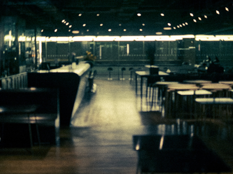
The above image "After Hours", printed on Fotospeed Platinum Etching 285
My next print job with Fotospeed papers was more important. Not only was it for a client, rather than a print for myself, but also the images were Chris Friels, rather than my own. I always feel a greater sense of responsibility printing the work of another photographer, trying to realise their vision for the image.
If you are familiar with Chris’s work you will know he uses extreme dark tones and some intense colours. This makes them challenging to print. This job proved to be true to form. The first image I tried was in grey tones with a very slight magenta/lilac tone. This I felt was the easiest of the three, to get me started.
I always print from Lightroom, loving the controls there. I had no worries over the colours so didn’t soft proof the image and went straight to print. It came out bright magenta. And I mean BRIGHT! My immediate thought was a cartridge had run out, throwing off the colour balance. I replaced three cartridges showing low levels and hit print again. Same result!

mmm... Magenta!
Now I was perplexed. I soft proofed the image but apart from an issue with some deep blacks it wasn’t showing any issues. Then I realised I hadn’t downloaded the ICC profile for the Platinum Etching paper from Fotospeed, I had it set to Hahnemuhle 308 PhotoRag. (I’m ashamed to say) That must be it! I remedied that, hit print again. Same problem. Now I was worried. What was going on.

iPhone shot of my computer screen to show what the image SHOULD have looked like!
I decided to follow Fotospeeds printing instructions (Typical man, only refer to the manual as a last resort). Their instructions apply to Photoshop so I decided to give it a try and did to the letter what they recommend. This got to the root of the problem. It reminded me of a bug I read about somewhere. I had 16 bit output checked in my original prints as I am usually printing from tiffs. However this particular image of Chris’s was shot as an 8 bit JPEG. The Fotospeed instructions showed the 16 bit option turned off, this reminded me of the issue so I deselected it. The print was perfect. Lesson learned.

The three stages - On the right the magenta madness, in the centre an improved print but still a magenta cast. On the left the final print (wrapped for dispatch in archive sleeve - but you can see the colours are matching the original image).
I was on a roll now and moved to the second image. This image was made up of extreme colours so I soft proofed in Photoshop. This showed that almost nothing in the image was printable!!! I tried my usual soft proofing techniques to pull the colours into gamut but they were so far out it ruined the image. The colours differed too much from the original and went very flat, losing vibrancy. Not an option. So I tried changing the rendering intent from Perceptive to Relative (see this post for more details on rendering intents) but this didn’t help either.

Hard to see from this iPhone shot but the left image is printed on Platinum Etching 285, a matt paper (with a beautiful texture but narrower gamut capabilities), the print on the right which is on Platinum Baryta was able to cope with the bright, rich reds in the original file. The Etching muted these to a duller more burnt orange with less vibrancy. Showing that paper choice can affect the appearance of the final print colours & contrast.
My next option solved the problem. I switched the paper (And the ICC profile) from Platinum Etching 285, which is a matt paper, to Fotospeeds Platinum Baryta. Why did I do this? Because matt paper is only able to display a very limited range of colours (a gamut of colours) than lustre papers. Gloss papers can display an even wider colour gamut. So if ever you have issues getting the colours right on matt paper, try moving to a lustre or gloss paper (remembering to switch ICC profiles in your print software). Often this will fix the issue. Fotospeeds Baryta paper had a gamut wide enough that I didn’t have to make any colour adjustments in soft proofing. The image printed beautifully.
Then on to the third and final image, another with extreme colours. This time, using the Baryta paper I soft proofed with no issues and it printed first time.
This whole process taught me several lessons. Firstly, I need to always check I have the correct ICC profile loaded for the paper I am using. Secondly, to use soft proofing to check the paper can handle the colour gamut. If the gamut is an issue, to make changes in software or to move to a different paper with the ability to display a wider gamut of colours.
The big lesson for me, though, was how much easier it was to work on the image to get it right for printing in Photoshop. I hate to say this. I have always loved printing from Lightroom and it does print beautifully. I also like how easy it is in Lightroom to set up page layout templates.
However, I found Photoshop is much better at making colour tweaks to an image to pull colours into gamut without spoiling the whole image. You can be very targeted in the colour ranges you work with, whereas Lightroom doesn’t allow you to be as precise. I Also preferred the way Photoshop displays the image with the papers ICC profile applied to simulate the print. The other thing I liked was sizing the print in Photoshop. So I have moved from being a die hard lover of Lightroom for printing to someone who will use Photoshop for tricky prints in future. I guess it is all about personal preferences and also using the right tool for the job. I definitely think that for difficult prints, Photoshop is the tool to use.

Printed on Platinum Etching 285 - Beautiful subtle tones
(One nice feature I will miss from Lightroom if I soft proof in Photoshop is something the soft proof virtual copy does for us. When we soft proof in Lightroom it offers to create a virtual copy if the file with the soft proofing adjustments, so that our master file remains unchanged. A great thing about this virtual copy is that it embeds the ICC paper profile into itself for the paper we are proofing for. Then when you print it automatically communicates this profile to the printer along with the rendering intent you proofed for. This is clever stuff and a benefit of soft proofing in Lightroom)
A lesson I have learned, which explains a lot, since doing this print job concerns the visible gamut warning in Photoshop and Lightroom. I have always used this thinking it was an accurate warning of colours which the printer would be unable to reproduce on my chosen paper. However, I must admit, I have often found (and told my students) it often is best to go ahead and print even if the gamut warning is indicating an issue with some colours as the resulting print is often fine. I put this down to the rendering intent doing a good job at replacing those out of gamut colours with close replacements. However, further reading has revealed that the gamut warning system used by Adobe is rather old and predates ICC colour management. It was designed for a graphic arts based workflow rather than photography and modern fine art printers actually will have no issues rendering those colours. What is actually of more importance now is the contrast ratio of monitors compared to papers. Many monitors are set to a contrast ratio of 500:1 or similar whereas gloss paper is closer to 200:1 with matt and lustre papers running even lower than that. Soft proofing should focus on correcting contrast issues and tweaking colours to bring them back to a correct state in soft proofing with the gamut warning turned off in most cases. I am going to try this and see how I get on.
I have now switched my studio over to using the Fotospeed range of papers exclusively because I have been so impressed with them. I will blog about each type I use as I put them through their paces and I am pleased to be working closely with the guys at Fotospeed too. They are a long established company and really know their stuff.

Another printed on Fotospeed Platinum Etching 285 (and its an ICM image so its supposed to look like that 🙂
Soft proofing is a big subject and will make a huge difference to the quality of your prints. It’s one of the things I cover in my Lightroom and Photoshop workshops and will be dealing with on my print workshops with Master Printer, Jack Lowe. The next Jack Lowe workshop is fully booked but if you would like to go on the no-obligation short list to hear of future dates, please just click THIS LINK TO EMAIL ME.
I am pleased to say that from now on in my Lightroom and Photoshop workshops (which I hold in my home studio) you will go home with a free print on one of Fotospeeds beautiful papers (perhaps one of mine, or one of your own) along with the knowledge of how to make beautiful prints of your own work too.
You will find available workshop dates ON THIS PAGE or, please CLICK THIS LINK and drop me an email if you would like more details or would like to book a one to one session with me.
You can find full details about and buy Fotospeed papers HERE – I recommend you give them a try.
