Tag: adobe

Printing With Fotospeed’s Panoramic Papers & Creating Custom Paper Templates in Lightroom

Fotospeed Panoramic

20150907-IMG_1369

Fotospeed are the only fine art paper company I am aware of who provide us with custom made panoramic papers. I shoot a lot of panoramas in my work, both combining exposures in software (now a feature of Lightroom CC as well as Photoshop, a welcome development) and by cropping into a single image to a ratio which yields an image with the characteristic panoramic ‘letterbox’ format. I am not a lover of really wide angle lenses having grown tired of the distortion they produce. I prefer, when I want to show the wide sweep of the landscape, to reveal it in a panorama. (I know wide angle lenses can be used to inject drama into images, but again, I am finding myself moving towards quieter, less dramatic images in my work and so I have sold on my super wide lenses now due to lack of use.

Amazing one day only deal on Adobe Elements 11 on Amazon

This is just a very quick post as I have just found out Amazon are doing a one day deal on Adobe Photoshop Elements 11 today (10.12.12). They have the full official version for £32.97 which is way below half price for a superb piece of software which has almost everything we need as photographers and is a huge saving over the full version of Photoshop. You can check it out HERE – so grab yourself a real bargain.

How do I create Panoramas?

Panoramas

Before getting in to answering this question I just wanted to mention I am running a “Capture-to-Computer” workshop in Skegness, Lincolnshire on Saturday 21st January 2012. One place is taken but there is one free place left. The basis of the workshop is creative and artistic photography – blur, ICM (Intentional Camera Movement) and textures. The morning will be spent with me showing you the techniques for shooting this style of image and then after a meal (included) I will spend the second half of the workshop showing you how to process these images in Lightroom and Photoshop. If you would like to book the second place the price is £149. Please drop me a message and I will organise it for you. Right, now on with the business of making panoramas!

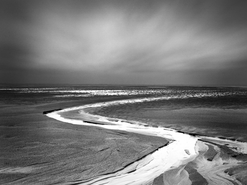
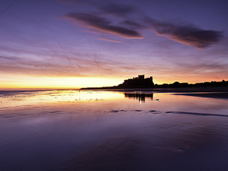
I love panoramic images and with modern digital cameras and software they are easy to make. I find myself rejecting the use of super wide lenses in favour of making panoramas more and more in my photography. I am not keen on the heavy distortion that comes with the super wides and the converging verticals they create. With a panorama I can get in even more width and maintain a natural looking image with far less distortion.

You can by purpose made panoramic tripod heads, such as the Panosaurus, which are designed to rotate the camera on the ‘nodal point’. If the camera is rotated while held on this point and kept absolutely level will allow it to create almost perfect panoramas with little distortion and a very natural look. However the heads are expensive and you either have to have them fitted to a dedicated tripod or be prepared to switch heads in the field, and few of us are that dedicated or have the backpack space to carry two tripod heads.

There are two very acceptable alternatives which are ideal for most of us and I use both in my image making. I will cover both methods here. You can use a tilt and shift lens (the expensive but easier option) or you can use a standard prime or zoom lens. Both require stitching images together in software and both produce great images if done carefully.

So, if you want to make high quality panoramas, how should you go about it? The first step is to get your tripod as level as possible and make sure the camera is as level as possible on the head. This is far better than angling the camera slightly upwards or downwards. The more our of level the tripod and camera are, the more distorted the final image and the area you will need to crop away from the edges of the pano will be larger. I use the small round level bubble on the top of my tripod below the head to level the tripod itself. This can be fiddly as you need to tweak the leg lengths to get it right but it is worth doing. I then level the camera on the head using my hotshot spirit level.

Next is getting the settings in the camera right before you start shooting. It is critical that nothing changes between shots or you will not be able to seamlessly stitch the image. Turn off auto focusing on your lens so the focus point does not change between shots. Switch the white balance to daylight so it doesn’t alter between shots. Zoom out further than you want to to allow for cropping the stitched image which you will have to do to a greater or lesser extent. Don’t frame the image as you want it to finally appear as some of the edges will be lost. Start the panorama further to the left or right than you want to for the same reason. I use the camera in portrait orientation for panoramas to give a larger file size and more depth for cropping (unless I am using a tilt and shift lens, but I will come to that later).

Working in aperture priority or manual, choose one area of the pano to set your exposure and focus. The exposure is often the tricky part, especially around dawn and dusk or when the scene has high contrast. I tend to aim to set my exposure based on the area of the pano which is almost the brightest. I take a test shot to get the histogram across to the right. You have to accept then, that as the camera moves to wares the darker area of the pano it will begin to under expose but we can tweak this later in the software to balance the image. I set my neutral density graduated filters for the same frame as the one I use to set the exposure. You have to accept that as you take the other frames the positioning of the grad may not be quite perfect, especially if the land rises or falls across the width of the range of shots but it will look worse if you try and move the grad up and down for each image. (I prefer to use soft grads for panos to make the transition line less obvious).Do not use a polarising filter when doing panos as this will cause havoc with the look of each frame and you won’t be able to stitch the images acceptably. Focus hyper focally or on a point very close to the base of the frame. I usually use f16 for panoramas to give a bit more latitude on depth of field, whereas in my other landscape work I am usually trying to get the aperture to f13 or f11.

Once you are all set up rotate the camera to the left or right hand end of the pano sequence. Remember go further left, or right, than you want to include in the final image you have in mind. I then take a single shot with my hand in front of the lens with my thumb up. This tells me the next image is the start of a pano sequence. Once I have taken the final shot in the sequence I take another with my thumb down. This indicates the end of a sequence. Believe me, you will be pleased you did when you get home as it can be hard to tell which images are for panos.

Take the first shot and then rotate the camera for the next as quickly as possible. The absolutely critical thing to remember is to overlap each frame by at least 30%. It is better to overlap by 50% than to go lower than 30%. The more data and overlap Photoshop has to work with the better the quality of the panorama you will get. The reason for working quickly during the sequence shooting is to minimise movement of objects in the pano. Anything moving makes it harder for the software to do the stitch, so scudding clouds, branches of trees blowing in the wind and so on can cause issues.

Don’t forget, panoramas don’t have to be horizontal. For a really different type of image use the same system but shoot vertically. Vertical panoramas look great on the wall.

Back at home on the computer there is some very specific things you can do to make the panorama stitching go well. I use Lightroom to work on my raw files so the screenshots below will show that, along with Photoshop for the stitching but Elements works in just the same way although the menu items might be in slightly different places. You can also get specific panorama stitching software but I have never used this so can’t comment on it.

Import the raw files into Lightroom. Do not allow the import dialog box to apply any changes to the images on import such as adjusting white balance or applying some preset as this will make stitching difficult or impossible to do seamlessly. It is vital you don’t do any work on them whatsoever before they are stitched. Find the sequence of images and shift click to elect them (this is when the thumbs up and thumbs down shots are a big help, but obviously don’t include them in the stitch!). Right click the selected images and select Edit in >> Merge to panorama in Photoshop. (see screenshot below)


This will open Photoshop (or Elements) with the following dialog box open


On the left hand side select the Auto  radio button and in the centre area of the window you will see the list of raw files you are using. Click OK. Now just leave Photoshop to do its thing. It will take a while depending on how many raw files you are stitching and how fast your computer is. On slower machines you will have tome to go and make coffee :).

Once stitched the image will look something like this;

Now you can see why cropping is required. In the layers panel you can see how Photoshop has stacked the three images and then masked them to achieve the stitch. The next step is to flatten the layers and then crop the image to the panoramic shape, losing all of the irregular edges. I then save this image as a tiff (or psd, if you prefer) and take it back into Lightroom. Now you can start making adjustments to the exposure, contrast, clarity and so on because now it will be across the whole image and will look right.

Once you have made the adjustments you want in Lightroom, move the image back to Photoshop for any final tweaks and adjustments there, and you are done.

The process is identical with Tilt and Shift lenses, with a few differences. Firstly, when doing horizontal panos you keep the camera in Landscape orientation. You make the sequence of images by using the shift mechanism and make three images, one shifted all the way to the left, one in the centre position and the final one shifted all the way to the right. All the information above about levelling and camera settings still apply and the stitching process is identical, you just need the three shots. The advantage of this method is the overlap the TSE lens produces is way beyond 30% so the stitch works well and the amount that needs to be cropped away is usually less as the lens tends to give a clean stitch if the tripod and camera have been set level.


So, why not have a go next time you are out with your camera. They are great fun to make and can be quite addictive. Enjoy!


How do I dodge and burn in Photoshop?

dodge burn


Dodging and burning is a technique which harks back to the days of film and darkroom developing. In the darkroom film users employ strange techniques to darken areas of their prints and lighten others to improve the look of the image. For those of us working digitally it falls to Photoshop to act as our digital darkroom to achieve the same effect.

‘Dodging’ refers to the lightening process while ‘Burning’ is the darkening of areas in the image. I remember which is which by thinking that burning an object blackens it, so burning = darkening. The goal is to introduce contrast into the image in such a way that the impression is of light falling on the subject in very controlled ways, highlighting the beauty or key aspects of the image. In my photograph above (and I have selected an extreme example rather than a subtle one) you will see I have burned the tractor tracks, areas of the clouds and areas of the surface of the wheat. To contrast with this I have dodged areas of cloud and highlighted the light falling on the barn with dodging. I was aiming for a dramatic image.

The biggest tip I can give you with this process is to do it very gradually, to be patient. Most people I see using this technique want to see dramatic effects too quickly and end up spoiling their image by creating a patchy look. The process is simple but it takes time and the vision to visualise the final result before you start. It is not good to approach it in a random way and hope the end result is going to be effective.

Now to the process. Firstly convert your image to black and white using your preferred method, either in Photoshop or a plugin such as Silver EfEx Pro 2. At the conversion stage, beware making the image too contrasty as you are going to tune the contrast carefully using the dodge and burn tools. Open the mono image in Photoshop.

Duplicate the background layer by selecting it in the layers panel and pressing cmd+J (windows = ctrl+J). Always do this and dodge and burn this new layer so that if you make a mistake you can always delete it an start again without spoiling the base layer. The layers panel should now look like the image below.


I decide whether to start with dodging or burning depending on the image but in reality it usually doesn’t matter which you start with as you will be alternating between the two. The image below shows the flyout toolbox from the main toolbox which shows the two tools.


I am going to select the burn tool first. The icon looks like a clenched fist. (don’t ask me why). The next step is to set the burn brush up correctly. This is done on the top toolbar as in the image below.

You will see I have selected a very soft brush and set the hardness to zero. This really feathers the effect and helps prevent hard edges to the burned areas. In the range drop down box you can see I have selected ‘shadows’. This is something important to understand when dodging and burning. The tones you select in this box tell the brush the only tones to affect. So if shadows is selected when you brush over pixels in the image the brush will only darken shadow, the darkest, pixels. It won’t touch mid-tones or highlights. Similarly, if you select mid-tones then only they will be darkened. Shadows and highlights will be unaffected. The same applies to the dodge brush. In most cases the other thing to remember is do not burn highlights and do not dodge shadows. If you do it usually gives the pixels a ‘damaged’ look because the change is too dramatic. Stick to burning shadows and mid-tones and dodging mid-tones and highlights.

The next vital thing to note in the above screenshot is the exposure level I have selected. In the shot above it is at 3%. This is where most people go wrong, they set the percentage too high. I work between 1 and 5%. I never go higher than 5% and rarely use that. I am usual working between 1 and 3%. When you use this setting the effect builds up very slowly and delicately giving you control. If you go higher you loose control and damage the image.

Now size the brush using the [ ] keys as usual and start brushing over the image. Use large flowing strokes. Avoid at all costs scrubbing away wit the brush at small areas as this soon creates a blotchy look. Keep switching between dodging and burning and build both together gradually. Keep changing between working on the shadows, mid-tones and highlights. Keep turning the layer on and off by clicking the ‘eye-con’ on the layers pane so you can see how far you are going and how far you have come. Work towards your pre-visualised goal. Take your time and don’t overdo it!

Here is my image. The first screen shot shows the basic mono conversion. The second it the dodged and burned final image. I have created a vignette to draw the eye to the water flow. I have brightened the water to give sparkle and punch and added a bit more drama to the sky.

Most mono film photographers would not consider printing an image without some dodging and burning to enhance it. Read what Ansel Adams wrote about this process as part of his print making to see how important he felt it was. He was a master of the technique. I hope you enjoy practising the effect and feel sure your mono images will improve dramatically as a result.

To learn much more about dodging and burning and all the other aspects of mono image making, why not consider coming on one of my specialist mono workshops where we work on thinking in mono, composing for mono and then processing to make mono images full of drama, light and character. You will find full details on the workshops pages of my website.


How do I put a simple border around my images?

I get asked a lot how to put a simple frame border around images, like this one. It is very simple.

These instructions apply to Photoshop, but also work in Elements and no doubt you can work out a similar way if you use some other software. For Elements and others the menu locations may be different but the commands similar.

1. Prepare your photo as usual – the border is the last thing to add.

2. Click the Image Menu and select Canvas Size

3. Make sure the ‘Relative’ box is ticked

4. In the Height and Width box enter a figure – I work in metric so I usually first put in, say 0.2 cm in each box

5. Make sure the centre box in the icon below this is selected (the one with arrows all round it – you will see what I mean when you are there!)

6. In the Canvas Extension drop down box select a colour – in this example above, I chose White – usually, depending on the colours in the image, white or black work best for this inner pin stripe.

7. Click Okay

Now you will see the fine border around your image.

Repeat the process above to add the thicker, outer frame but increase the dimensions to suit what you want – I often use 7, 9, 11 or even 13cm – I find odd numbers work best.

You can experiment with several borders of varying thicknesses – it sometimes looks good to put a 0.2cm white, then a 0.2cm black followed by a 11cm White and finish the outer edge with another 0.2cm black border.

If you are uploading to Flickr and want a white outer border it is always best to put a fine black border around as the page background on Flickr is white and this fine outer pinstripe defines your white border – otherwise it is lost on the page.

Combine a border with a signature – the instructions for which I blogged here a few days ago, and you are developing your own signed piece of artwork

How do I re-size images for Alamy?

Many people how to get their images prepared for Alamy, especially their request for 48mb images. It is a bit confusing, so here is my method using Photoshop – but if you use Elements or some other software it may help you too.

The file you upload doesn’t have to be 48MB in itself – but has to be able to be converted by their customer to a 48mb TIFF.

This means you have to upscale the size of the file yourself before sending it as a jpeg.

To do this – Make sure you shoot in RAW (although jpeg, may work – it’s just I always shoot in RAW) and work on the image in Photoshop in 16 bit colour (which you will be automatically if you have opened the RAW file in Photoshop via Lightroom or Canon Camera RAW software) , cloning out dust, tweaking the levels etc (For stock libraries, don’t saturate the colours or do any sharpening – they want their customers to be able to do this to their own tastes/needs).

Then, when all is done, click the Image menu and select Image Size

In that dialog box make sure all three tick boxes are ticked and that ‘Bicubic Smoother’ is selected in the drop down box. Set the resolution to 300 pixels per inch (240 pixels minimum)

In the top width and height windows make the longest edge (depending on if the image is portrait or landscape orientation) around 5000 pixels – you will need to play with this figure to get the right length for your camera – the aim is to get the pixels dimensions figure at the top of the box to 96mb or above – but get as close to 96mb – as the higher you go the more chance there is of the quality deteriorating. Click okay.

Now click the Image menu again – select mode and select 8 bits

This will halve the file size (from 96mb to the magic 48mb). Now save in the normal way as the highest quality jpeg. The jpeg will vary in size depending on the type of image, how many colours in it etc and could be 8mb up to 16mb or more – but probably never above 20mb. The important thing is Alamy can now convert it back to a 96mb TIFF or PSD file for their customer.

I hope this demistifies the process for you?

And I haven’t forgotten I said I would do a tutorial on adding titles to your borders in Photoshop – it’s just this question came up from one of my students and as I had written it all down for him, I thought you could use it too.

Happy shooting!

How do I put a watermark on my photos?

I get asked this a lot by students so here is a post to provide the answer – it works in Photoshop or Elements (and the print and export modules of Lightroom have a custom function to add one also).

Watermarking your images is not a foolproof way to stop people using them without your permission. Some will ignore it and use it anyway. Others will spend a few minutes in Photoshop and remove it – with basic cloning skills it is usually not hard to do.

What watermarking your pictures does do is put off some who would steal your images and just emphasizes that it is against your wishes.

More effective is converting the image to 72ppi and reducing the size to say 1000 pixels on the longest side before uploading them. This makes the image unusable in any printed form. It will still display perfectly on a screen as these work at 72ppi – but printing will be useless. If you are using Flickr to display your images you can also switch off the ‘all sizes’ option in your account preferences which will make it much harder for people to steal your photos.

Anyway, on with the tutorial. There are two ways of doing this – by creating an Action or by making a Copyright brush. I tend to use the brush method.

1. In Photoshop create a new blank document. (click file, new). This should put a blank white page in front of you.

2. Next create a new blank layer

3. Select the Type tool to type your text – in my case I would then select a font and font size and type – Copyright 2010 © Doug Chinnery – (you can hold down the Alt key and type 0169 on the number keypad and this will inset the copyright symbol automatically)

4. When you are happy with it select the Rectangular Marquee tool by pressing the M key and drag a rectangle around your line of text.

5. Then go into the Edit menu and select ‘define brush preset’. When the dialog box opens give your brush a name (not a name like ‘Dave’ or ‘Debbie’ but call it Copyright Brush for example.) Then click OK.

6. Now in your brush presets drop down box you will find your copyright brush at the bottom of the grid. It will looked all squashed up but don’t worry, it will display correctly when you use it.

7. To use it, open a photo you want to copyright and add a new blank layer to it.

8. Select either white or black as your foreground colour – press D to set black and white as the foreground and background colours then press the X key to swap them if necessary. I use white mostly unless the image is very bright so white won’t stand out, then I use black.

9. Press B to get the brush tool selected and up on the options bar drop down the brush toolbox and click on your copyright tool brush at the very end of the set.

10. Use the [ or ] keys to make the brush bigger or smaller

11. Click on your image where you want the copyright info to be.

12. The in the layers palette on the blank layer with your copyright brush info use the opacity slider to adjust how the strong the brush is – you can really fade it out so it isn’t distracting or have it more prominent if you prefer.

13. When you are happy, flatten the image.

14. Remember to save the file with a different name so it doesn’t overwrite your master file – otherwise your original file will have your copyright info plastered across it – not good if you want to print it and hand it on your wall!!

I hope this info is helpful?

If you prefer to use Actions then record the above being done but instead of creating a new document just put a blank layer on a photo, type your copyright info, and set the opacity, flatten the image and then stop the action recording. Then it is just a case of running the action on future images – the only problem with this is that it will put the copyright info in the same place and at the same opacity on every image and sometimes this doesn’t look right., but the choice is yours.

High Pass Sharpening

I was so impressed with the quality of sharpening that Chris Upton had used on his images in his exhibition (Masters of Vision, now finished) I decided I needed to re-evaluate my sharpening workflow.

I do not sharpen the psd file I create from my RAW file. I hold that psd file as an unsharpened master. You need to sharpen images to different extents depending on how it will be used. You would sharpen an image differently to be printed on canvas than you would if it was going to be printed on gloss paper. If you were then going to show it on a website it would need a different amount of sharpening also. So I hold my psd as a master and create jpegs from it, sharpen them according to use and then once the jpeg has been used I delete it – there is no need to keep it taking up disk space as I can recreate another from the master psd at any time.

Chris Upton reminded me about ‘High Pass Sharpening’. I had used this in the past but had somehow drifted back to the usual Unsharp Mask (USM) sharpening that most people use. The difficulty with USM is it increases any noise in the image as it works on adding contrast to edges in the image.

High Pass sharpening has the advantage that it is performed on a separate layer so it can be masked out of some areas and it can be strengthened or reduced in effect by using the opacity slider. If you don’t like it, it can be deleted and you can turn the layer on and off to check the effect.

So how do you do it. It is very easy

1. Duplicate your image (press ctrl-J)

2. Select Filter>>Other>>High Pass

3. Set the radius to 10

4. Click OK

5. Change the blending mode of the layer to Hard Light

6. Zoom in to 100% to be able to judge the next step

7. Experiment with setting the opacity slider on the layer anywhere from about 20% to 70% to get the amount of sharpening you are after.

8. If some areas do not need sharpening or need to be softer then use a mask and set the opacity of the brush to remove the level of sharpening to the extent you want.

This sharpening process could improve your images a great deal.