Tag: photograph

How do I create light trail images?

light trails

Westminster by Night

Have you ever wondered how to go about capturing light trails? They look dramatic and add a dynamic feel to urban images and are easy to capture.

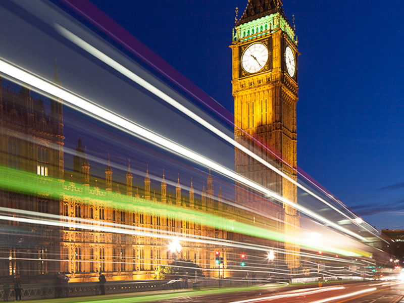
Before I go into technique there is an important factor about this image which lifts it above many light trail shots. The Sky. Its not just a case of shooting at night. In fact the ideal time is a short 15 minute period shortly after the sun has set. For architectural photographers and those after light trails this is the prime time to shoot. If you look at the image you will see the sky is not black, there is still some residual light (twilight) in the sky. In this brief period of minutes the light in the sky balances perfectly with artificial light which is why it is so perfect for capturing architecture and light trails. You can still shoot the light trails when the sky is black but the images won’t be quite as attractive. Have a browse of the finest architectural night photography and you will see the photographer works in this evening twilight period (or gets up early as a similar is experienced some time before sunrise).

Lets say you are in position at the right time. Get there well in advance so you can sort your composition out and get your exposure right before twilight. It is very frustrating to miss the brief twilight window becuase you weren’t in position and set up in time. Needless to say you need to be on a tripod with a remote shutter release. No graduated neutral density filters are needed as the camera can cope with the dynamic range of the image by this time. You may need a standard non-graduated neutral density filter (perhaps a 2-stop) to slow the exposure down if you are getting too short an exposure for the effect you are after (alternatively, you could use a narrower aperture, say, f16. I would avoid using f22 unless I was forced as the image quality will degrade due to ‘diffraction’, but thats another whole issue!)

For these images the lenght of the exposure is as important, if not a little more important, than depth of field. For my shot of Westminster I worked at f11 (which gave me sufficient DOF and kept me close to the sweet spot of the lens (around f8 would be about perfect). At ISO 100 (for the lowest noise possible), this gave me an exposure time of 4 seconds on my 24mm TSE lens. (As I was using a tilt and shift lens, I could have worked at f8 and used the tilt mechanism to give me the depth of field I needed but I was working quickly and didn’t want to complicate matters).

I test out several shutter speeds before the light gets to its best so that I am ready. The speed of the traffic and the brightness of the lights will dictate the length of exposure. Faster moving vehicles need a shorter shutter speed than slower vehicles. In my case, timing was vital. I could have shot when just cars were passing but I found it was worth waiting for a bus to appear as this gave a wider stripe of lights because of the upstairs windows. I fired the shutter, using a handheld remote release, a fraction of a second before the bus entered the frame. A few buses later, I had my image, the light dropped and it was time to head off for more night shots around London.

If you would like to master low light and night photography, why not join me on one of my London Night Workshops. We even have a London Black Cab to drive us around all of the best locations all night. Drop me an email if you are interested as these are selling out before I can list them on my website.

How do I put a simple border around my images?

I get asked a lot how to put a simple frame border around images, like this one. It is very simple.

These instructions apply to Photoshop, but also work in Elements and no doubt you can work out a similar way if you use some other software. For Elements and others the menu locations may be different but the commands similar.

1. Prepare your photo as usual – the border is the last thing to add.

2. Click the Image Menu and select Canvas Size

3. Make sure the ‘Relative’ box is ticked

4. In the Height and Width box enter a figure – I work in metric so I usually first put in, say 0.2 cm in each box

5. Make sure the centre box in the icon below this is selected (the one with arrows all round it – you will see what I mean when you are there!)

6. In the Canvas Extension drop down box select a colour – in this example above, I chose White – usually, depending on the colours in the image, white or black work best for this inner pin stripe.

7. Click Okay

Now you will see the fine border around your image.

Repeat the process above to add the thicker, outer frame but increase the dimensions to suit what you want – I often use 7, 9, 11 or even 13cm – I find odd numbers work best.

You can experiment with several borders of varying thicknesses – it sometimes looks good to put a 0.2cm white, then a 0.2cm black followed by a 11cm White and finish the outer edge with another 0.2cm black border.

If you are uploading to Flickr and want a white outer border it is always best to put a fine black border around as the page background on Flickr is white and this fine outer pinstripe defines your white border – otherwise it is lost on the page.

Combine a border with a signature – the instructions for which I blogged here a few days ago, and you are developing your own signed piece of artwork

How do I put a watermark on my photos?

I get asked this a lot by students so here is a post to provide the answer – it works in Photoshop or Elements (and the print and export modules of Lightroom have a custom function to add one also).

Watermarking your images is not a foolproof way to stop people using them without your permission. Some will ignore it and use it anyway. Others will spend a few minutes in Photoshop and remove it – with basic cloning skills it is usually not hard to do.

What watermarking your pictures does do is put off some who would steal your images and just emphasizes that it is against your wishes.

More effective is converting the image to 72ppi and reducing the size to say 1000 pixels on the longest side before uploading them. This makes the image unusable in any printed form. It will still display perfectly on a screen as these work at 72ppi – but printing will be useless. If you are using Flickr to display your images you can also switch off the ‘all sizes’ option in your account preferences which will make it much harder for people to steal your photos.

Anyway, on with the tutorial. There are two ways of doing this – by creating an Action or by making a Copyright brush. I tend to use the brush method.

1. In Photoshop create a new blank document. (click file, new). This should put a blank white page in front of you.

2. Next create a new blank layer

3. Select the Type tool to type your text – in my case I would then select a font and font size and type – Copyright 2010 © Doug Chinnery – (you can hold down the Alt key and type 0169 on the number keypad and this will inset the copyright symbol automatically)

4. When you are happy with it select the Rectangular Marquee tool by pressing the M key and drag a rectangle around your line of text.

5. Then go into the Edit menu and select ‘define brush preset’. When the dialog box opens give your brush a name (not a name like ‘Dave’ or ‘Debbie’ but call it Copyright Brush for example.) Then click OK.

6. Now in your brush presets drop down box you will find your copyright brush at the bottom of the grid. It will looked all squashed up but don’t worry, it will display correctly when you use it.

7. To use it, open a photo you want to copyright and add a new blank layer to it.

8. Select either white or black as your foreground colour – press D to set black and white as the foreground and background colours then press the X key to swap them if necessary. I use white mostly unless the image is very bright so white won’t stand out, then I use black.

9. Press B to get the brush tool selected and up on the options bar drop down the brush toolbox and click on your copyright tool brush at the very end of the set.

10. Use the [ or ] keys to make the brush bigger or smaller

11. Click on your image where you want the copyright info to be.

12. The in the layers palette on the blank layer with your copyright brush info use the opacity slider to adjust how the strong the brush is – you can really fade it out so it isn’t distracting or have it more prominent if you prefer.

13. When you are happy, flatten the image.

14. Remember to save the file with a different name so it doesn’t overwrite your master file – otherwise your original file will have your copyright info plastered across it – not good if you want to print it and hand it on your wall!!

I hope this info is helpful?

If you prefer to use Actions then record the above being done but instead of creating a new document just put a blank layer on a photo, type your copyright info, and set the opacity, flatten the image and then stop the action recording. Then it is just a case of running the action on future images – the only problem with this is that it will put the copyright info in the same place and at the same opacity on every image and sometimes this doesn’t look right., but the choice is yours.

High Pass Sharpening

I was so impressed with the quality of sharpening that Chris Upton had used on his images in his exhibition (Masters of Vision, now finished) I decided I needed to re-evaluate my sharpening workflow.

I do not sharpen the psd file I create from my RAW file. I hold that psd file as an unsharpened master. You need to sharpen images to different extents depending on how it will be used. You would sharpen an image differently to be printed on canvas than you would if it was going to be printed on gloss paper. If you were then going to show it on a website it would need a different amount of sharpening also. So I hold my psd as a master and create jpegs from it, sharpen them according to use and then once the jpeg has been used I delete it – there is no need to keep it taking up disk space as I can recreate another from the master psd at any time.

Chris Upton reminded me about ‘High Pass Sharpening’. I had used this in the past but had somehow drifted back to the usual Unsharp Mask (USM) sharpening that most people use. The difficulty with USM is it increases any noise in the image as it works on adding contrast to edges in the image.

High Pass sharpening has the advantage that it is performed on a separate layer so it can be masked out of some areas and it can be strengthened or reduced in effect by using the opacity slider. If you don’t like it, it can be deleted and you can turn the layer on and off to check the effect.

So how do you do it. It is very easy

1. Duplicate your image (press ctrl-J)

2. Select Filter>>Other>>High Pass

3. Set the radius to 10

4. Click OK

5. Change the blending mode of the layer to Hard Light

6. Zoom in to 100% to be able to judge the next step

7. Experiment with setting the opacity slider on the layer anywhere from about 20% to 70% to get the amount of sharpening you are after.

8. If some areas do not need sharpening or need to be softer then use a mask and set the opacity of the brush to remove the level of sharpening to the extent you want.

This sharpening process could improve your images a great deal.