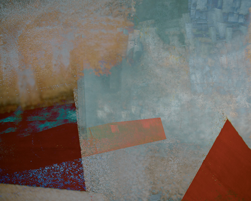
Some things in life only come along once. The genius of Bob Dylan. Newcastle United winning something (still waiting). My mother in law being lost for words. (also still waiting). A phone call from Toby, the very nice boss at Fotospeed asking if I might possibly be interested in working with them to design my very own perfect ‘signature’ fine art paper. (actually happened – still pinching myself).
That call came almost two years ago now – making a new paper from scratch is not a quick process and it took me almost a nano second to accept the offer. Which photographer and printer wouldn’t? Here was a chance to work along with acknowledged experts in the field to come up with what is essentially my very own perfect paper for my art. A dream come true, because I had used many of the fine Fotospeed papers quite happily for years and loved them, but always there are those little tweaks I would like to make – a little more texture, a little whiter base, a little more weight and so on. Now I had my chance.
So how does it work, this paper designing business? Sadly, all visions I had of me donning a lab coat and goggles were soon put to bed. I wasn’t going to be allowed anywhere near chemicals, or big machines. I think the very nice folk at Fotospeed felt that was just a little too risky, especially when they saw the manic glint in my eyes. Rather, I was sat down in a darkened room, behind layers of security and…. well no, not that either. In fact, it all began with a very long and detailed cross examination about what I wanted from my paper. I was quizzed on my images, what I wanted to bring out of them, their characteristics, what I felt was missing from not only the Fotospeed range but also from fine art papers in general. I was basically asked what my dream paper would be. So what did my specification look like?
I had a vision along these lines;
1. It had to be a matt paper.
2. It had to be heavy. I wanted a paper with substance.
3. I wanted a heavy texture.
4. I preferred a pure white base colour. So that colours were rendered naturally.
5. I wanted it to make soft, gentle images to look soft and gentle.
6. When printing images full of texture and detail it needed to render them sharply.
8. I wanted it to have a high cotton content and to be of archival quality.
9. It needed to be acid free and be suitable for dye based and pigment inks.
10. I really wanted it to handle a very wide colour gamut and produce faithful colours.
11. Finally, for a matt paper it had to deliver sumptuous deep, rich blacks.
By this point, the nice people at Fotospeed were looking a little queasy. I understood why. To ask all of this from one paper, especially a high cotton content matt paper was a very tall order. They were in for a long night. It turned out to be a long year. I think they ate a lot of pizza and drank a lot of coffee.
I actually lost count of the iterations we went through, but I was sent, I think, seven batches of paper to test in all. It was the seventh – the paper which has now become the paper I use almost exclusively, Cotton Etching 305 – which I finally gave the approval for to bear my name. The one which met all of the criteria on my list. The only thing in the end I wanted to change, and where Toby had to call a halt, was with the surface texture. If you look very carefully at matt papers you will see a repetition in the texture. This is because it is made by a mechanical process. I asked if this could be randomised. Apparently it could. If the paper was handmade. As you can imagine this would have made it so expensive it wouldn’t have viable and so I had to concede on that one point (and I have to admit I was being very fussy as it is barely noticeable).
I have to applaud the team at Fotospeed and the people they work with for being able to achieve this. Technically it really is no mean feat. If you are used to printing on fine art matt papers you will know and understand just how tricky they can be at times. How occasionally getting the colours to sing can be difficult. You will also know how hard it can be to get really wonderful rich deep blacks from them is. They can have a tendency to ‘flatten’ our work and give it a milkiness, to almost suck some of the life out of it if we don’t know what we are doing. Even if we do know what we are doing with our printing, with many images getting the colour and contrast right sometimes is just impossible.
If this has been your experience, I would urge you to try some Cotton Etching 305. I continue to be amazed at how easy it is to print on. I am achieving blacks I have never been able to render on a matt paper before. The colours in my images really sing out like never before. Even with the generic profiles from the Fotospeed website you should get good results. If you use their free customers profile service this will get even better as your colour gamut will widen and the performance of the paper will increase. You may feel I am just over-hyping the paper because the box has my name on it. If so, I would urge you to take a look at THIS REVIEW in Photography News. (quick quote – “The paper’s all-round ability to handle such a wide range of subject matter, contrast range and different degrees of saturation and so capably was a nice surprise. Some textured fine art finishes are less good with rich images with deep blacks, but no such shortcomings here. Apologies if this is all rather gushy, but honestly there wasn’t a print that I was unhappy with so I had little to have a moan at.”)
As for handling of the paper, a couple of tips I can pass on. Firstly, store the boxes flat. This prevents curling on the leading edge which can cause ink to catch and mark the paper. I also use a ‘rocket blower’ to blow over the print surface of the paper to make sure there are no cotton fibres adhering. It is very frustrating to hold up your print to see these drop away leaving a small unprinted area beneath them. It is good to allow the print to cure for at least a few minutes or longer before any extensive handling after printing. Check the colours and contrast over by a window, preferably with bright overcast daylight, rather than side by side at your computer monitor. This is a better test for how beautiful your print is and how it will look when displayed in real life.
I hope you enjoy trying Cotton Etching 305. I now use it for almost every print I make. Valda Bailey and I also use it for virtually all the prints we make for clients in our bespoke printing service for photographers and artists who don’t have their own printer, or who want prints larger than their printer is capable of. (full details of our service HERE).
To help you if you would like to try it out, or if you already love it and would like to stock up, the very nice people at Fotospeed have given me a 15% discount code to pass on to you. PLEASE NOTE, this code is only valid for 30 days from Tuesday 24th July 2018 and it should apply not just to Cotton Etching 305 but to all their papers (but why would you want anything other than Cotton Etching now??). Just put your paper in your basket and apply the code on checkout. The discount will only be applied right at the end. DISCOUNT CODE – Doug15NL – I do hope you enjoy using the paper as much as I do. It has changed my printing forever.
And who knows, maybe this year is Newcastle’s year? Howay the lads!


